| Image |
Comment |
| 03/23/2011 08:24:43 AM |
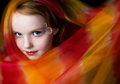
Librodized by timfythetooComment: I'm so glad you posted your unedited image. It shows us that these shots are not ONLY about the editing steps--your unedited image is a super shot too.
I do tend to agree with some of the other commentators, though, that the lip stick was perhaps a bit too much. Though that's perhaps Manny's style, so who are we to fault you? Great work! |
 Photographer found comment helpful. Photographer found comment helpful. |
| 03/23/2011 01:14:41 AM |
librodogby posthumousComment: I also gave this a 9. made me chuckle for a a good ten seconds. I liked it cause of the expression first-its one you'd see very frequently. and secondly I thought it was a not of a commentry about how bizarre a thing it is to dress dogs in human-esque stuff--a pet peeve of mine. I genuinely enjoyed it, thanks :-)
|
| Photographer found comment helpful. |
| 03/22/2011 07:33:18 PM |
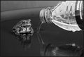
Make Your Own Futureby LydiaComment: Great image. Not a big fan of the background on this if I'm honest. I think a wider basin would have increased the negative space and drawn the eye more to our friend here. Still 7 though. |
| Photographer found comment helpful. |
| 03/21/2011 08:39:28 PM |
|
| Photographer found comment helpful. |
| 03/21/2011 08:38:22 PM |
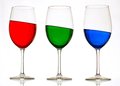
RGBby onepurpleroseComment: Nice shot. And crispness. And the colours are great.
I think you need a bigger backdrop though :) It didn't bother me too much at the start but after looking at this for a few minutes it's all I can see. |
| Photographer found comment helpful. |
| 03/21/2011 08:22:17 PM |
mysteryby posthumousComment: Smells like a posthumous ribbon to me... unless of course this is posthumous... in which case... are you allowed give it to yourself? :)
Love this. |
| Photographer found comment helpful. |
| 03/21/2011 08:10:07 PM |
Ode to Reincarnated Ideasby bspurgeonComment: Wonderful. Bound to do well and get a posthumous ribbon. I can't actually place what it is I like about this. I think it's the curves, and stacks of tones.
Fav'd.
10'd. |
| Photographer found comment helpful. |
| 03/21/2011 08:06:34 PM |
Graceful Landing...by sekarmalathyComment: My. Isn't this something. I think I'd have preferred this an instant sooner before the liquids hit the flat.
Love the lighting and everything. Great work! |
| Photographer found comment helpful. |
| 03/21/2011 02:58:07 PM |
Cityscape at Night with Reflectionsby vladoComment: Very nice.
One thing I might have done is used some lens distortion software (or aligned perhaps) the image so that the right-most tower is parallel with the border of the image. Not a huge deal, of course. Nice image. |
| Photographer found comment helpful. |
| 03/21/2011 02:55:22 PM |
|
| Photographer found comment helpful. |
Home -
Challenges -
Community -
League -
Photos -
Cameras -
Lenses -
Learn -
Help -
Terms of Use -
Privacy -
Top ^
DPChallenge, and website content and design, Copyright © 2001-2026 Challenging Technologies, LLC.
All digital photo copyrights belong to the photographers and may not be used without permission.
Current Server Time: 06/25/2026 06:55:25 PM EDT.