| Image |
Comment |
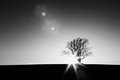
| 04/04/2011 02:32:21 PM |
Beaconby amaurerComment: Lovely. I don't mind the lens flare here, or the grittiness. I think they add to it.
I wonder if you would have been permitted to straighten the horizon for this. A flat line might have more impact. Just what I might have done--not saying it would have made it better or anything :-) 7 |
 Photographer found comment helpful. Photographer found comment helpful. |
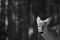
| 04/04/2011 11:52:28 AM |
Stareby MagnumphotographyComment: Nice shot, with gorgeous bokeh and details on the animal. These things are all subjective, but I think there's probably a bit too much negative space for the image. Still, it's "gorgeous" negative space so how bad? :) |
| Photographer found comment helpful. |
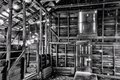
| 04/04/2011 10:51:48 AM |
Abandonedby wetlandComment: Nice shot with a lot of depth. I find there's a lot to look at here, which isn't a bad thing. I love the bright light coming in through the gaps in the woodwork. |
| Photographer found comment helpful. |
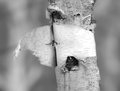
| 04/04/2011 10:43:14 AM |
Shedding Birch Barkby EnlightenedComment: This is really really nice. DOF captures the bark, but is narrow enough for a gorgeous soft bokeh. Textures and tones aplenty on the tree.
Really nice work. |
| Photographer found comment helpful. |
| 04/04/2011 10:40:14 AM |
The Wind Beneath My Wings by onepurpleroseComment: "I learned that birds like crossiants and I should have my shutter on 1/500"
Haha. That really made me chuckle!
And I like the shot. And the composure makes it seem like we're looking to where the bird looks. It's a nice, crisp, simple shot. Good work! :) |
| Photographer found comment helpful. |
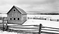
| 04/04/2011 10:33:13 AM |
winter barnby bigskyeyeComment: It's incredibly difficult to get good balance of detail on snow, sky and buildings. I like the composure of this, but the ground feels a little washed out, and incredibly for negative space, tends to draw my eye towards it. |
| Photographer found comment helpful. |
| 04/04/2011 10:24:51 AM |
Runneth Overby vawendyComment: What kind of dog do you have?
Beat me well in this one! Great shot and crop, though. I'm always nervous about using non-standard ratios, but this works very well.
Congrats on top 10! |
| Photographer found comment helpful. |
| 03/30/2011 03:18:28 AM |
|
| Photographer found comment helpful. |
| 03/30/2011 02:40:54 AM |
FOREby MinsoPhotoComment: I disagree with the person who said the background should have been brighter. The contrast between that and the ball really makes the ball stand out, and reinforces it as the focal point.
There was something about this that didn't seem... right to me, and I can't put my finger on it. First I thought it was that it wasn't sharp, which it is, or perhaps its the lighting. Maybe it's the dark patch of ball by the second t on its branding. Something about this didn't stand right with me, so I didn't vote on it until I found out what. Which I still haven't. Maybe a darker tee? This is really annoying me, actually, that I can't figure out what it is about this shot that's getting to me! Ahhh!
Not a bad score. Good job. |
| Photographer found comment helpful. |
| 03/28/2011 01:19:38 PM |
In The Night Gardenby rooumComment: It's a great shot. And I'm gonna score it high because I can't fault anything on it, but I don't think I like it much.
To me the tones, darks, split in green to brown, position of the baby... they all suggest sadness and a sense of mortality, or sickness or morbidity to me. Tones and darks--classic portrayal of this. The shift from green on the left to brown on the right--symbolises crossing from life to death to me. The position of the baby makes me think it fell from the tree, that it's very still, and perhaps dead :( The mushroom (least I think it's a mushroom) by his left foot is a fungus, which is something that suggests death to me too, for some reason, reinforcing the theme stronger. And the blurredness of the brown area conveys uncertainty about the afterlife.
In all these ways I can't stop staring at the shot. So it's an excellent image for the challenge--the child is the focus, but the background, tones, colours, slight desaturation... they all support it magnificently. It's incredibly captivating, deep and thought provoking shot. But I don't like it because, well, nobody likes thinking of dying babies to be fair. I don't know if I'm making sense here, but it's getting a 9 from me. Maybe a 10... I'll think about it before rollover. I get so much from it. And that'd mean it'll get a favourite from me... which is odd in an image I don't like, eh? :)
Though perhaps I'm reading too much into it.
Best of luck with it! Such a provoking image is rare to see here, I think. |
| Photographer found comment helpful. |
Home -
Challenges -
Community -
League -
Photos -
Cameras -
Lenses -
Learn -
Help -
Terms of Use -
Privacy -
Top ^
DPChallenge, and website content and design, Copyright © 2001-2026 Challenging Technologies, LLC.
All digital photo copyrights belong to the photographers and may not be used without permission.
Current Server Time: 06/25/2026 08:51:19 PM EDT.