| Image |
Comment |
| 05/12/2011 07:54:27 AM |
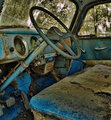
Insideby SEGComment: I like old cars and images of them. This is an interesting shot. Shows the age of the car. It's lack of use. I love how in the segments of the window that you can see out of the view outside looks bleak and dark. The broken pedal too adds a lot.
There's something about this though. I think the image feels too bright to me. It screams out of age and wear at me, and I feel a bit confused about why that's accompanied by bright lighting. It's probably a personal thing though. It might work for others.
In terms of the point of view it reminds me of the angle you might have when looking for something under the seat. Which has an amusing feel when coupled in with the age of the car (probably not intended, but it's what ran through my head when I saw the image, so I might as well say it!)
I gave it 6. I think I would have given it more had it been darker. Perhaps, though, it was more difficult to show the darkness with basic editing. |
 Photographer found comment helpful. Photographer found comment helpful. |
| 05/11/2011 03:19:44 PM |
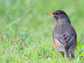
On the Ground Floorby vawendyComment: At I guess I'd say  vawendy vawendy's?
Is that one of your American robins? Nice and clear. Like the crop, and off centerness. And sharpness. And look. Nice image. Love the black of its eye! |
| Photographer found comment helpful. |
| 05/11/2011 03:09:39 PM |
|
| Photographer found comment helpful. |
| 05/11/2011 03:04:05 PM |
|
| Photographer found comment helpful. |
| 05/11/2011 02:18:19 PM |
|
| Photographer found comment helpful. |
| 05/11/2011 02:07:29 PM |
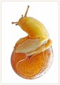
Gastropodaby LydiaComment: Is that a snail from the underside? Nice idea! It's hard to say, but I think I'd've liked a deeper DOF for this. But excellent POV! I like the border and high-key background too. |
| Photographer found comment helpful. |
| 05/11/2011 10:50:19 AM |
reflectionsby kichuComment: Very well done! 7+ and 4th! Awesome. Congrats on the HM! |
| Photographer found comment helpful. |
| 05/09/2011 08:53:43 AM |
Newby chellezfotozComment: I think this would have done really well in the bokeh competition! It's really good. |
| Photographer found comment helpful. |
| 05/08/2011 08:13:44 AM |
|
| Photographer found comment helpful. |
| 05/07/2011 08:52:08 AM |
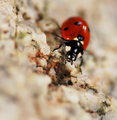
I'm a Ladyby chellezfotozComment: I'm surprised you didn't get any comments, so I figure I might try to break tradition here.
I don't have a really good idea what bokeh is (or rather I can't describe it very well), but I do think that this image is more about a narrow depth of field than about the bokeh effect.
The background in good bokeh (I think) reinforces the subject. Look at the top scoring images. The backgrounds are beautiful. Soft. The background is what boasts, emphasises, and launches your subject at whoever's looking at it. Bokeh isn't just about things or sections of the image being out of focus. It's about the out of focus-ness supporting the rest of your picture to focus your eye on a focal point or subject.
Your background is nice and soft too, but I think that as you can see the plane of focus it pulls your attention away from the subject which is the opposite of what bokeh should do. Do you see what I mean?
You didn't get a bad score. But I think it would have scored better in a narrow depth of field competition.
Also, if possible I think you should try to export images to as wide as possible (800px). Larger images tend to do better... or rather smaller images might find it harder to score higher. |
| Photographer found comment helpful. |
Home -
Challenges -
Community -
League -
Photos -
Cameras -
Lenses -
Learn -
Help -
Terms of Use -
Privacy -
Top ^
DPChallenge, and website content and design, Copyright © 2001-2026 Challenging Technologies, LLC.
All digital photo copyrights belong to the photographers and may not be used without permission.
Current Server Time: 06/26/2026 01:22:17 PM EDT.