| Image |
Comment |
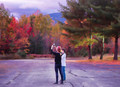
| 11/06/2016 08:17:25 PM |
Sunkissedby jomariComment: Lots of good stuff going on here, but it's score is in tiny violin territory. The lovely red/orange colors lead the way, boldly saturated, but not to the point of losing detail. The main subjects are nicely separated by shallow DOF and there's a strong diagonal through the frame. What I think is missing, though, is a strong central subject. My eye tends to rest on the lower of the two sharply focused leaves and despite the great texture and color, it's not compelling enough for me to hang around and keep looking. |
 Photographer found comment helpful. Photographer found comment helpful. |
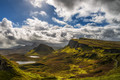
| 11/06/2016 07:01:56 PM |
Gaelic light by KroburgComment: What a spectacular vista and a dramatic sky! I like that it's not overly saturated and the tonal range is good without losing contrast or appearing overly processed. Nice work! |
| Photographer found comment helpful. |
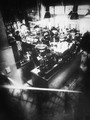
| 11/06/2016 02:45:04 PM |
passing timeby NiallOTuamaComment: Such a distinct style you've developed and used here to great effect. Definitely among my top picks! |
| Photographer found comment helpful. |
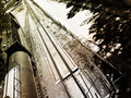
| 11/06/2016 02:42:02 PM |
The grand staircase by markwileyComment: Love the sense of dizzying perspective AND the person at the bottom edge interacting with the camera. |
| Photographer found comment helpful. |
| 11/05/2016 07:59:31 PM |
|
| Photographer found comment helpful. |
| 11/05/2016 07:57:29 PM |
|
| Photographer found comment helpful. |
| 11/05/2016 06:51:13 PM |
|
| Photographer found comment helpful. |
| 11/05/2016 06:49:50 PM |
Stonesby hajekaComment: Fabulous. My top pick. The manhole cover is perfectly placed. |
| Photographer found comment helpful. |
| 11/05/2016 06:38:46 PM |
Shooting foliageby lei_73Comment: I've never seen purple asphalt before, but it works well here as part of a fantasy color palette of iridescent autumn. Nicely done. |
| Photographer found comment helpful. |
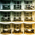
| 11/05/2016 06:36:43 PM |
Second Tuesday Every Monthby LydiaComment: This is a strong image for me. Didn't score this challenge, but would have ranked this high. Put me in the camp of not disturbed by the gradient colors, and clear that the railing in front of faces is the distraction. To me the color cast is a counter balance to the sameness of the repeating balconies. There the same, but with a different mood in each one. I'd expect the inhabitants of each unit to be in some way defined by the colors. Congrats and kudos! |
| Photographer found comment helpful. |
Home -
Challenges -
Community -
League -
Photos -
Cameras -
Lenses -
Learn -
Help -
Terms of Use -
Privacy -
Top ^
DPChallenge, and website content and design, Copyright © 2001-2026 Challenging Technologies, LLC.
All digital photo copyrights belong to the photographers and may not be used without permission.
Current Server Time: 05/07/2026 09:54:35 AM EDT.