|
|
|
Showing 481 - 490 of ~1025 |
| Image |
Comment |
| 11/02/2012 06:30:58 AM | Away by gyabanComment: Originally posted by Neat:
I picked this as yours, I gave you an 8, lovely stuff, would of been higher if there was not so much white in the foreground.
So yes to answer Alex's question, I really thought you had a disdain for black and white photography! |
Thanks Anita! I don't know why you would think that, I have several B/W photos in my portfolio, including portraits, still lifes, landscapes. No disdain at all. No love either: I consider B/W and colors as 2 different tools, and I use the one that works the best with what I want to achieve.
|
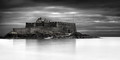
| 11/02/2012 06:23:29 AM | Awayby gyabanComment: Originally posted by Alexkc:
So I was right, it is Saint-Malo :)
I've been there with the low tide and I reached the fortress.
The different ruleset are only a small detail for the blue ribbon catcher ;)
But this time I have a question for you: while your usual photos are almost always very colorful, your landscapes are often in B/W, why? |
Thank you very much Alessandro!
In fact this photo is not in B/W: the fortress has some color in it. It is very desaturated though, but I didn't like the plain B/W version in that case.
I tend to use B/W in 2 different ways: by design (when I decide the photo will be in B/W before pressing the shutter, because I believe it will be stronger that way) or by default (when I don't find any convincing solution to manage colors: B/W is the easy fix). For this photo it was by default: the light was extremely flat that day (I had to heavily dodge/burn things to bring back something to look at), colors were really boring despite my different tries, so in the end I went with that solution.
It's true that I usually prefer color over B/W, simply due to the fact there is more information, more things to look at (unless I deliberately chose to go with a minimalistic approach, then B/W becomes a serious option). Moreover, processing wise, color gives you more flexibility, more possibilities to play with: even in Advanced Editing, each shape in the photo can have its own color modified independently (which I often do to end up with a very controlled whole), while when you're in B/W you can only adjust luminosity. |
| 11/01/2012 05:31:59 PM | Outtakes of a Still Lifeby Samantha_TComment: Congratulations Samantha, much deserved win :-) My wife is jealous of your bra's size, I am jealous of Jason's body, but we both admire your photo skills and creativity! |  Photographer found comment helpful. Photographer found comment helpful. |
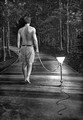
| 10/19/2012 06:10:51 PM | I Love Lampby LydiaComment: Very fun entry Lydia, congrats on the HM :-) I definitely love when you let your imagination flow! | | Photographer found comment helpful. |
| 10/19/2012 02:24:23 AM | Don't Make Me Pull The Leashby VenserComment: Great idea and composition, the perspective obviously makes the shot. I think I would have adjusted the DoF a bit to get the pet entirely in focus, but you perhaps ran out of time for that, or you simply prefer it like that. Either way, you clearly showed that a good idea is really what's important in such challenges, so thanks for that and congrats on the HM! Message edited by author 2012-10-19 02:39:32. | | Photographer found comment helpful. |
| 10/19/2012 02:19:43 AM | Have you walked your chair today? by vawendyComment: Congratulations Wendy! It was a risk to go with something else than rocks (I know that the challenge description allowed for that, but not everyone pays attention), and it works beautifully well. Great job on the balloon strings too! | | Photographer found comment helpful. |
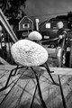
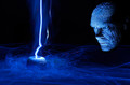
| 10/19/2012 02:16:28 AM | Pet Rock - The Creation by hesitantComment: I really love the texture on the face, just terrific. The light painting job is also very cool. Congrats on the ribbon! | | Photographer found comment helpful. |
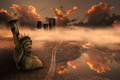
| 10/12/2012 07:49:09 AM | Once upon a time there was the ocean hereby Alex_PetriniComment: I really wish you had some more time to polish this one (especially the statue). I am convinced it has a great potential, as the general mood and colors work brilliantly together. The sky is superb too. Moreover, the caravan is fantastic, I really like this exile in the middle of nowhere. You need to find a way to make your baby sleep more ;-) | | Photographer found comment helpful. |
| 10/12/2012 07:39:28 AM | lord don't let me goby jmritzComment: Very nice John. Dark and creepy, muddy colors, perfect. I even love the grain, and wish there was some on the 'man part' too! Your work is a great source of inspiration, and you show here the versatility of your talent. Congrats. | | Photographer found comment helpful. |
| 10/12/2012 07:28:42 AM | The New World begins. Again.by LydiaComment: Very, very nice Lydia! I really like that one. The place was worth the search, it works greatly in that challenge. The light beams also help to render a dusty atmosphere, and the bones are just creepy :-) Congratulations. | | Photographer found comment helpful. |
|
Showing 481 - 490 of ~1025 |
Home -
Challenges -
Community -
League -
Photos -
Cameras -
Lenses -
Learn -
Help -
Terms of Use -
Privacy -
Top ^
DPChallenge, and website content and design, Copyright © 2001-2026 Challenging Technologies, LLC.
All digital photo copyrights belong to the photographers and may not be used without permission.
Current Server Time: 07/21/2026 06:27:43 PM EDT.
|