| Image |
Comment |
| 10/22/2002 12:39:00 AM |
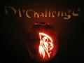
The Grim Reaperby NitenComment: REALLY cool jack-o-lantern. Wanna come do mine for me? Did u try a different f# to get the words in sharper focus? Maybe it isn't possible - did u use a candle or light? A flickering candle would have made that really hard I guess. I like the color of the pumpkin. Tryin to think of suggestions...maybe you could have somehow made the bg darker. Used a black fabric or something? I dunno, but it's darn good as is. 7 ~indigo997 |
 Photographer found comment helpful. Photographer found comment helpful. |
| 10/21/2002 10:13:00 PM |
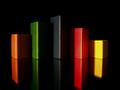
Triscapeby FrooberComment: I really like this. The colors and lines are cool. Nice use of lighting. I'd prefer to have the "top" of the reflections in the shot tho. Also, why is there a double edge on the reflections? It looks like a movement blur and tricks my eyes. Very strange ;o) ~indi |
| Photographer found comment helpful. |
| 10/21/2002 02:46:00 AM |
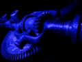
GearWerkzby mcmurmaComment: Cool perspective. I like the color and you did a nice job with the lighting. I like when the subject fades into the bg. The subject just doesn't do a lot for me. Great technically, very good at meeting challenge....I couldnt come up with a good subject either ;oP ~indi |
| Photographer found comment helpful. |
| 10/22/2002 01:00:00 AM |
Lit upby GotchaComment: Don't quite understand the title. This is a funny picture tho. I suck at comments. ~indi |
| Photographer found comment helpful. |
| 10/22/2002 01:14:00 AM |
Nobody Caresby RichiComment: Awe. How sad. I think this could be more dramatic if you could have somehow blocked the light reaching the back wall. Also, did you try diffusing the light any? It seems really hot on his head. Just a couple of technical nitpicks. Also, there appear to be a lot of artifacts on my monitor. Nice choice of subjects (seemed to be a big problem in this challenge). ~indigo997 |
| 10/22/2002 11:47:00 PM |
Greenby karmatComment: Funny. Is that posterboard? The pic looks very posterized for some reason. It just adds to the effect tho. The colors and shapes are very appealing. Nice job. ~indi |
| Photographer found comment helpful. |
| 10/22/2002 01:30:00 AM |
Memories of a romantic getaway ...by dimitriiComment: I really like the idea here. The setting isn't all that great. Shooting closer (cutting out most of the room) and getting rid of the ugly bedspread would help. Even just a close up of her on a pillow with part of a sheet over her - not even seeing the light - would be nice. ~indigo997 |
| 10/22/2002 12:31:00 AM |
Cosmosby JeanComment: I really like the lighting. Very nice colors. Focus seems a little soft. 8 ~indigo997 |
| 10/22/2002 12:41:00 AM |
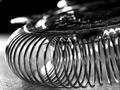
Reincarnated Slinkyby CreativeFlyPhotoComment: Nice lighting and composition. Interesting form. More DOF might be nice. You almost made an abstract out of a common household item. Cool idea. 7 ~indi |
| Photographer found comment helpful. |
| 10/22/2002 01:07:00 AM |
Daily Cocktailby ManicComment: Very dramatic. I really like when the subject just fades into the background. Niiiiiiiice shot. ~indi |
Home -
Challenges -
Community -
League -
Photos -
Cameras -
Lenses -
Learn -
Help -
Terms of Use -
Privacy -
Top ^
DPChallenge, and website content and design, Copyright © 2001-2026 Challenging Technologies, LLC.
All digital photo copyrights belong to the photographers and may not be used without permission.
Current Server Time: 07/18/2026 04:24:28 PM EDT.