| Image |
Comment |
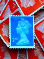
| 11/26/2002 01:12:06 PM |
Royal Blueby MarklaneComment: Unlike a lot of ppl, I tend to like technical shots more than emotional ones. This is very nice. I like the idea and the execution. It's grown on me since the first time I viewed it. |
 Photographer found comment helpful. Photographer found comment helpful. |
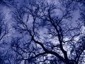
| 11/29/2002 08:26:23 PM |
Reaching the Fractalsby paganiniComment: Gorgeous purple/blue color. This didn't turn out to be an original idea, but I like your execution the best. Very pretty. |
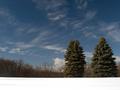
| 12/01/2002 09:20:51 PM |
Blue Sky, Blue Spruce, White Snowby alanfreedComment: The snow looks overexposed which gives the illusion that the photo just has a white border along the bottom. I think a foreground subject would help - something just left of the middle maybe. A snowman, footprints, a sled....I dunno. |
| Photographer found comment helpful. |
| 12/01/2002 09:23:17 AM |
Bubblesby JamieWillmottComment: This reminds me of my macro shot. I love the color. It seems too dark tho, and doesn't really have a "subject" so my eye keeps searching around with nowhere to land. |
| Photographer found comment helpful. |
| 12/01/2002 09:45:14 PM |
Soaring on Blueby gradbertComment: Very nice composition. I like the lines/angle. The wing blends in a little too well with the sky. |
| 11/26/2002 05:21:56 AM |
Dumb Nurseby derekleungComment: Very good idea. Points for originality and humor. Very good technically. I'm afraid that the subject, no matter how well done, just isn't going to make a pretty picture which is what seems to get points around here. |
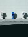
| 12/01/2002 02:40:13 PM |
Outstandingby crabappl3Comment: This is cute. I'm not sure that I agree with your decision not to make this a landscape. I do like the layers created by the 3 vertical areas, but I think that you could show it just as well without so much empty space. It's also a tad off center with more space on the right. If you're going to make a symmetrical shot then you probably want to watch that. |
| Photographer found comment helpful. |
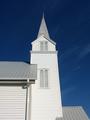
| 12/01/2002 02:50:56 PM |
Steeple Bluesby darbComment: Great sky color. Lighting on the church is a tad too bright, but you did a pretty good job exposing it anyway. Nice composition and lines. |
| 12/01/2002 08:45:14 PM |
Into the Blue...by LadyLinComment: Nice capture. Extra point for stopping the motion so well. Good composition tho I think I'd prefer this without the fog as it makes the whole shot rather grey instead of blue. I just have a preference for strong colors. |
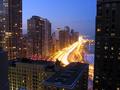
| 12/01/2002 03:49:58 PM |
The Drakeby pstuhrComment: Nice shot. I like the view and your decision on the shutter speed. The building on the right seems a little too dark and heavy for the rest of the image maybe. |
Home -
Challenges -
Community -
League -
Photos -
Cameras -
Lenses -
Learn -
Help -
Terms of Use -
Privacy -
Top ^
DPChallenge, and website content and design, Copyright © 2001-2026 Challenging Technologies, LLC.
All digital photo copyrights belong to the photographers and may not be used without permission.
Current Server Time: 07/18/2026 06:03:04 PM EDT.