| Image |
Comment |
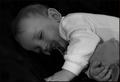
| 01/13/2003 01:15:11 AM |
Brahm's Lullabyby karmatComment: Why the long exposure? I love the song and really like the photo (gave it a 7), but it did have a few things that bother me. Mainly, the focus seems soft which I don't like for some reason. Not sure why because it is a soft, sleepy photo. Maybe it's the black and white making me want crisper lines.
I also think that both hands should be in the shot - maybe he would have let you move it a little closer to her face even. Otherwise, the composition is great. I'd like to compare this to the color and know why you chose black and white. The white clothing seems to draw too much attention. Maybe try something not quite so bright and use a little more lighting on him. It's a beautiful shot of such a sweet little boy - worth perfecting. I think people just didn't know what to say about it b/c there aren't any glaring problems. It's just a sweet photo. Even if you had ended up in last place, you'll probably appreciate this shot more than all your higher scoring shots in a few years. |
 Photographer found comment helpful. Photographer found comment helpful. |
| 01/13/2003 12:47:32 AM |
WINTER by Tori Amosby indigo997Comment: I cropped this out of a larger shot (there wasn't any more room on the right side though). The girl stepped into the shot just as I was taking it and left before I had a chance to move the camera and reshoot. I personally liked the addition so I chose this one instead of one without her. Of course, I would have positioned her differently given the chance. I was pretty far away though (using a tele lens) and not about to chase down a girl and her boyfriend to ask if I could take her photo. |
| 01/13/2003 12:32:28 AM |
High Jumpby imagesloyolaComment: awesome shot but i wanna see it much much bigger. beautiful colors. just cant appreciate it at this size |
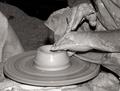
| 12/23/2002 01:54:50 PM |
Playing with Mudby indigo997Comment: I don't actually have an occupation and didn't really take a photo for the challenge. I do like doing arts and crafts, however, and have done pottery in the past. I think it's a good representation of what I would like to be doing. The title is more of what I'm doing lately as I seem to be spending most time babysitting and cleaning up messes.
I took this photo at a local walk-through nativity. It was in the church basement - taken from about 15 feet away and with a flash. |
| 12/21/2002 02:10:33 PM |
Merry Kissmas!by karmatComment: This is cute, but daaaaaaaaaang if that isn't a whole lotta white! It feels sort of like the kiss is just pushed down in the corner. I think you basically already got a lot of good feedback. I don't agree that it needs more saturation. I think the lighting is a little too harsh for that reflective foil though. Did you try diffusing it? It also bugs me that the white tag blends into the background.
I was wondering if you couldn't do some sort of photo using more than one kiss that would really USE the negative space. Perhaps with a cute title. Sort of like a greeting card, with two kisses that want to kiss but there's a lot of space between them? I dunno ... |
| Photographer found comment helpful. |
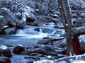
| 12/21/2002 02:02:02 PM |
light's ebbby aelithComment: The difference is subtle, but I do like it better. I think you could even crop more off the bottom if you wanted - maybe a square crop so that the tree isn't so close to the center of the shot. |
| Photographer found comment helpful. |
| 12/18/2002 11:12:27 PM |
light's ebbby aelithComment: Don't you just hate getting the same comment over and over again? :o)
I guess you just have to think that there must be something to it. I do think that this is a very nice setting. I like the lines of the shore and the tree in the water although I wonder if you couldn't have aimed a little more to the left.
I really do wish the lighting were stronger. The top (back) part of the photo has lost a lot of detail because of the darkness. The evening sun on the right, back bank is very nice. If you could have gotten this in the whole scene then it would be lovely. I also agree that you should crop the bottom of the shot. The new cropping rules are great in that you can pick the shape that works best for the picture. Good focus.
Basically, you already got some very good feedback on this shot. I do like the composition better than your motion shot even if this one is dark. |
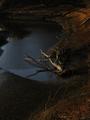
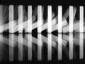
| 12/18/2002 11:12:19 PM |
All fall downby snsComment: I like the abstractness of this photo. I agree that you should have found a way to make the reflection line across the bottom more horizontal, but it would be cool also if you took it the opposite direction and used a sharper angle to the dominoes so that they went from large to small moving left to right. I know it can be tough when your shot has an "evil twin" in the challenge. That seems to help one and hurt the other, but you were lucky to be on the receiving end.
I think that the comment about them looking like they are standing up has to do with the lighting and long exposure. A second synch flash might have helped the "after" image be stronger than the "before". I had to find a way to fake that for my motion shot.
Nitpick: It would be nice if you could have achieved more even lighting as there seems to be sort of a spot-light effect going on. The lighting is strongest in the center.
Overall, it is obviously a strong image that many people liked. I like the black and white, but actually prefer more organic lines. The strong verticals are just a little too stark for my personal taste, but I can appreciate the photo and the work that went into it. |
| 12/16/2002 11:27:50 PM |
Linksby jjbeguinComment: Wow. The member challenge certainly got a lot more feedback than the open challenge, but here's some more for ya...
You obviously have a very nice photo here. Competition was stiff in this challenge.
Composition is great. I am so glad that we have the new cropping rules because this is an excellent example of where a rectangular shot just wouldn't be as strong. The diagonal and placement of the open link are great. Part of what makes this image so strong is how close you got to the subject. Exposure is good. You've made an interesting photo out of a mundane object which is quite an accomplishment.
Minor gripes: The lack of focus in the bottom right corner is distracting - especially because it is one of the few light colored spots and, therefore, draws the eye. Overall, I wonder if the focus couldn't be even sharper. Texture shots don't often work well with post-processing sharpening, but maybe you could have tried something different during shooting. It is helpful if you include the aperture, shutter, and iso in the photo details.
I agree with the frame comments. I'm not sure that such a bright color is the best choice - especially since it further accentuates that lower corner. |
| Photographer found comment helpful. |
| 12/16/2002 11:27:37 PM |
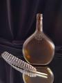
Turkey Feather Still Lifeby KazComment: HEY!
Please include iso, shutter, and aperture in your photo info. I think it can help everyone learn.
You have a lot of comments already, but I'll throw in my two cents.
First, I too am wondering a little about the combination. This isn't actually a wild turkey bottle is it? That's really the only connection I could guess.
Usually it's a good idea to use odd numbers in still lifes. The reflection of the bottle almost creates a third subject or else this would really seem a bit weird. For that reason, I really like the inclusion of the mirror.
I do like the draping of the background material, but there does seem to be quite a bit of noise in the darker areas of the shot. Some cameras can't handle low light well, but it would help to know the iso and shutter speed.
I like the angle of the feather and don't even mind the position of the bottle, but the composition is a little off.
I hate to jump on the "rule of thirds" bandwagon, but I think that it might help here. The primary focal point seems to be where the bottle and feather meet which is very centered. I also think that a different perspective and crop could help. The upper empty area isn't really adding a lot to the shot. Maybe poining the camera down more so that there is less space above the bottle and even more reflection showing would help.
I took this into photoshop and ran auto levels. It moved the black point (darkening the shadows) some which added more drama to the shot. I also like a little more saturation to bring out the nice color of the bottle. |
| Photographer found comment helpful. |
Home -
Challenges -
Community -
League -
Photos -
Cameras -
Lenses -
Learn -
Help -
Terms of Use -
Privacy -
Top ^
DPChallenge, and website content and design, Copyright © 2001-2026 Challenging Technologies, LLC.
All digital photo copyrights belong to the photographers and may not be used without permission.
Current Server Time: 07/18/2026 02:20:33 PM EDT.