| Image |
Comment |
| 01/14/2003 12:56:00 AM |
Forgottenby spidermanComment: Great color. I like the placement of the ... err... thing. Would be even cooler without the white sky. |
 Photographer found comment helpful. Photographer found comment helpful. |
| 01/14/2003 12:52:52 AM |
He likes itby lumbusComment: I like the lighting on the area in the center. I wish the sky weren't so white though. The trees are interesting without leaves, but I think this would be much prettier in the fall or summer. Cute title. |
| Photographer found comment helpful. |
| 01/14/2003 12:50:15 AM |
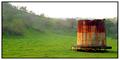
Dead Of Winterby jmsetzlerComment: Haunting image. I really like the contrast and composition. Cool cool tones. Is it IR? That bright white side of the building bothers me, but I love how the sky gradually fades. |
| 01/14/2003 12:48:08 AM |
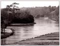
Pains Hill Cobhamby redfigComment: I like the color/tone a lot. Nice lines move the eye into the image. Some detail has been lost in the shadows. |
| Photographer found comment helpful. |
| 01/14/2003 12:44:46 AM |
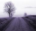
Road to Fogginessby kiwinessComment: Beautiful color/tone. Nice composition. I especially love how the ridge in the background is just peeking out of the fog. |
| Photographer found comment helpful. |
| 01/14/2003 12:43:32 AM |
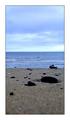
Beach Stabilityby arnitComment: Awesome awesome use of DOF. Beautiful colors. I love the layers, color, and lighting. Beautiful, and I hope it isn't penalized for not being a traditional landscape. |
| Photographer found comment helpful. |
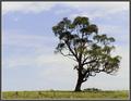
| 01/14/2003 12:41:31 AM |
Windswept Treeby lisaeComment: Awesome tree. I like all the space around it. Focus seems soft to me, and I'd prefer a little more ground. Nice colors. 7 |
| Photographer found comment helpful. |
| 01/14/2003 12:36:56 AM |
Man in the Mirrorby dodobirdComment: I like this idea a lot. I have to agree about the white wall though. You can always buy some $1-a-yard fabric and tack up to the wall when needed. I also think that the subjects could be placed a little better. The boy could be higher and more "in" the shot. Also, the mirror is too low and that tiny bit of finger in the bottom corner is distracting. Lighting should also be more even and diffuse on both. I think this is just one of those instances in which a little more time and effort could have made a big difference. Of course, it's not always worth the time and effort just to move up half a point in the scoring. I'm wondering why you used such a slow shutter speed and low aperture #. I understand that you wanted the reflection blurred, but ... |
| Photographer found comment helpful. |
| 01/14/2003 12:22:21 AM |
I saw the light - Hank Williamsby andlbComment: This is a nice composition. My main gripe is the reflection/glare along the top half. TThat strip of reflection along the top prevents this from being as strong as it could be. It might help some to adjust the black level and play with the saturation some as that area just seems rather washed out. You can always watch for things like this and grab someone around to stand and block the reflection. For that reason, it's also a good idea to wear black when you might be shooting through glass :o) I'd like to see this with the lights actually. I'm not sure how much control you had over the conditions but you could have also tried a different setting with fewer distracting reflections. |
| 01/14/2003 12:08:27 AM |
Love Letters (Natalie Cole)by mcraelComment: My first impression of this is that it is too dark. There are also quite a few competing subjects. I think that you should eliminate some of them. That might make it lose some of the emotional meaning for you, but could make it a stronger image for the viewer. The lace on the table and background also contribute to the busy nature of the shot. The whole frame is really filled up with things to look at which leaves one wondering exactly what the real subject is. I would try a vertical shot with maybe a black background/table with only a candle and the stack of letters, possibly also a photo or an open letter if it is lit well enough to be seen. The flowers aren't really needed though. Make sure that the letters are well lit and then the light can fade out into the surrounding darkness. |
Home -
Challenges -
Community -
League -
Photos -
Cameras -
Lenses -
Learn -
Help -
Terms of Use -
Privacy -
Top ^
DPChallenge, and website content and design, Copyright © 2001-2026 Challenging Technologies, LLC.
All digital photo copyrights belong to the photographers and may not be used without permission.
Current Server Time: 07/18/2026 10:21:31 PM EDT.