| Image |
Comment |
| 01/21/2003 04:53:09 PM |
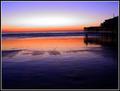
Sands of Timeby RoninComment: YAY! I got assigned a shot that I really like! :o)
This was one of my 10s for the challenge so I'm not sure how constructive I can really be. I just think that the colors are awesome. The reflection of the sky on the wet sand is beautiful. I would maybe like to see even more of the building silhouette, but I wouldn't want any cropped off the left side b/c of that great white oval of light in the sky. Maybe you could have moved to the right to achieve that.
I really like that the horizon isn't centered - that bugs me to no end. The sand seems to have more color gradation than the sky so I think it was a good choice to put the extra room there instead of above. I'm sorry that I can't offer more suggestions, but I just think it's gorgeous as is. |
 Photographer found comment helpful. Photographer found comment helpful. |
| 01/21/2003 04:39:09 PM |
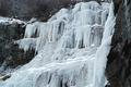
Wall of Winterby YomiComment: HEY! I'm from Utah originally. That looks really cold.
The ice formation is really cool, but I agree that the perspective isn't the best. I suppose there is probably some sort of pool or something that prevents you from getting really good angles though. I'd also like to see more of the surroundings just for comparison. I like that you've filled up the frame, but it's often hard to judge how good the crop is without knowing what the photographer was dealing with. It feels like the bottom has been cut off a little too much.
Ice and snow can be an exposure nightmare, and you've done a fairly good job with it. There are a few "hot" spots on the ice, but not bad. This photo is still color, right? It looks almost B&W except for that one patch of grass. Since the color isn't adding much anyway, you might try changing it to B&W and then doing some quadtones to see what other looks you come up with. The B&W just feels a little dead to me and doesn't add to the coldness IMO. Maybe a blue cast or something would work. You did a great job of finding an interesting subject and, without being there, it's really hard to judge whether or not you could have taken a better shot of it. It would be really cool to have something in this photo for size comparison to actually see how big the fall is. Maybe a person looking up at it? Again, not sure what's possible since I haven't been there. Overall, nice shot with very few problems. |
| Photographer found comment helpful. |
| 01/20/2003 02:47:41 PM |
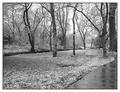
Winter Serenityby crabappl3Comment: Well... That's quite a snow for Texas! This photo doesn't really have any glaring problems, but it isn't as strong as many of the other submissions. It IS rather understated and serene which doesn't help it stand out from the crowd. I really like the sidewalk, but it just isn't very obvious in B&W. I actually think that you could move a little, showing more of the sidewalk, and make it a stronger element in the image. I'm still not sure that I like this in black and white. Did you take it in color and then convert it? B&W can often add drama to a landscape, but IMO it makes this photo seem a little too lifeless and blah. Since you obviously have ready access to this site, I would suggest going back in spring, summer (maybe even during a rain shower), and fall to take the same shot from the same spot. Putting them side by side and showing how much it changes would be very interesting. |
| Photographer found comment helpful. |
| 01/20/2003 01:01:51 AM |
Romeo & Juliet Love Theme (A Time for Us)by KarenBComment: Just a quick thought on why I didn't score this a 10. Excellent composition. Perfect focus and DOF. The color cast bothers me though. I don't think I'd really like it with bright white, black, and red, but I'm not crazy about the pinks either so... |
| Photographer found comment helpful. |
| 01/20/2003 12:50:15 AM |
|
| 01/20/2003 12:48:24 AM |
look rightby neoathematrixComment: Loved those signs in London - very helpful b/c I ALWAYS look left!! Great idea .. coulda been executed a bit better as I can't really read it like this. |
| Photographer found comment helpful. |
| 01/20/2003 12:37:04 AM |
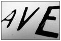
Avenueby mciComment: love how different this is from the rest. cool, simple, black and white. think i'd rather have white and then black on the border. |
| Photographer found comment helpful. |
| 01/20/2003 12:14:58 AM |
The Strong, Silent Typeby indigo997Comment: I actually chose this time of day on purpose so that I could get that shadow. I like the layering it creates. I took this from outside a fence while my bf stopped on the road. Maybe next time I'll brave the barbed wire so that I can move to the right a little for a better composition. Winter is just NOT the prettiest time of year to photograph my region. There are also trees just off the left side of the frame so that is why it is cropped just where it is on that side. I did use a polarizer to help the sky, and I did up the saturation a bit. Winter is just too blah. |
| 01/15/2003 01:37:25 AM |
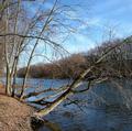
At the Rivers Bendby dodobirdComment: Tough competition on this challenge AND it isn't the best season for landscape shots around here. I think you found a decent location but maybe not the perfect composition. I like the blue in the sky. I'm sure you know about the silly rule of thirds and I think that it would help if you had something in one of those intersections. There isn't really a focal point for me. The bank and river lines go back into the shot and the point where they converge - far down river - would be a good point to place in one of the intersections. You'd have to change your location/perspective though. Basically, you have all these nice lines created by the trees, but they are all just leading out of the frame instead of leading you TO something. I don't see any obvious technical problems though. That's good. Once you have the technical aspects down, you can focus more on the creative and compositional side of photography. |
| Photographer found comment helpful. |
| 01/14/2003 11:23:01 PM |
Life on the L-edgeby catpixelComment: In a way, I think this was one of the less inspired ways to interpret the challenge. People probably had a hard time coming up with ideas and don't always appreciate someone taking the easy way out. I like the building in the background and think that you could have shown more of it or found somewhere else to put the book - making it a little less prominent in the shot. The lighting is definitely too harsh. You don't need a shutter speed anywhere near that fast so you probably didn't need to use the flash if that is what you did. I'm really not sure what else you could have done with this shot. Technically, the only major problem is the lighting. It's the subject that is a little too bland IMO. |
Home -
Challenges -
Community -
League -
Photos -
Cameras -
Lenses -
Learn -
Help -
Terms of Use -
Privacy -
Top ^
DPChallenge, and website content and design, Copyright © 2001-2026 Challenging Technologies, LLC.
All digital photo copyrights belong to the photographers and may not be used without permission.
Current Server Time: 07/18/2026 04:21:36 PM EDT.