| Image |
Comment |
| 02/10/2003 11:52:34 PM |
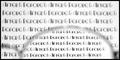
Before and After I put on my Glasses by AzrifelComment: Wow! Now that's what I call a photographer's comment. I don't vote in the member's challenges so I didn't see this until it popped up on the front page of all places! Congrats.
It's such a simple shot, but very effective. I do really like that font by the way. It fits the challenge so we'll move on to technical aspects. I really like the blur vs. non blur, but it bothers me that the frames are so out of focus. I guess it's impossible to have the part inside the frames in focus and have the frames in focus, not to mention that it wouldn't make much sense since you wouldn't wear glasses that make things blurry... but it just takes a little more thought to actually figure out that what you are seeing is a pair of glasses. I really like the composition. The wide horizontal works very well. The fact that you only show part of the lens doesn't help me figure out what it is I'm seeing, but I wouldn't change that. Good even lighting, but the white does seem a little too grey. I don't know if it's the actual print on the paper or the photo, but the letters in focus have diagonal jaggies on my screen. I like the simple black frame as well. A good example of a frame that works. It is a good shot that was obviously well received. That's a great score. Good idea and good execution so I don't think there's much more I can say. |
 Photographer found comment helpful. Photographer found comment helpful. |
| 02/10/2003 03:24:18 AM |
|
| 02/10/2003 03:22:42 AM |
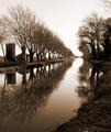
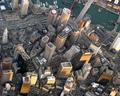
1 Mile from Bostonby av8orboyComment: COOOOL. The area where I used to live is just off to the right of this picture I think. :( I miss Boston. Cool shot. Low enough to still make out everything. |
| Photographer found comment helpful. |
| 02/10/2003 03:18:28 AM |
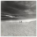
Specks and the Universeby greenem2Comment: I just can't take any more Waldo pics so I'm coming over to the members challenge to treat myself. This is gorgeous. I think it'd look really pretty if you hand colored it and printed on watercolor paper. Gorgeous. |
| Photographer found comment helpful. |
| 02/10/2003 01:23:56 AM |
Oh, my!by gogaComment: Adorable pic. Doesn't meet the challenge b/c he isn't hidden! 7 |
| 02/10/2003 12:43:01 AM |
Shop Til You Drop (at IKEA)by smellyfish1002Comment: OMG. They wouldn't let me take my camera in the IKEA store. Something about ripping off their designs?? I dunno, but this is cute. I always shop at IKEA in Sweden. |
| 02/10/2003 12:40:02 AM |
return of the ghostby billyComment: I see the hidden person, but you do know that you're supposed to have a hidden person in a shot with no people. right? I only subtract one, but I bet it affects your score. Too bad cause it's kinda cool. |
| Photographer found comment helpful. |
| 02/10/2003 12:14:33 AM |
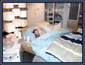
My Angelby indigo997Comment: I barely got this uploaded before the cut off. It took me forever to get her to sleep Sunday night! After I had a chance to look through the shots and play with them in PS, I uploaded a b&w version to photosig that I like a lot more. Pictures from my camera are meant to have a little sharpening during processing, but I chose not to do it with this one because I thought the softness actually helped the quiet, angelic mood of it. I used one light with cloth in front of it. Couldn't figure out how to pose the wings without editing out a string or something so I had to balance them on her back with the back wing bent down to anchor them. |
| 02/09/2003 08:42:00 PM |
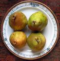
pear to pearby PingupinguComment: Nice camera :) This photo didn't really jump out at me during voting. It's a decent shot, but not the most interesting subject to me. Nothing really stands out - I don't say "wow, look at those color or that perspective or those lines or that texture". Pears are a pretty good subject actually, but I don't think that the plate helps anything. They don't even look to be centered on it. Lighting is decent tho the shadows in the center are a little dark. I think the four pears might have had more impact on a solid color bg with some dramatic lighting. The square also isn't very obvious - which probably affected the score. Keep practicing with your camera - it's capable of great shots. This one probably didn't deserve such a low score, but it's always a matter of finding the right subject. |
| 02/09/2003 06:42:04 PM |
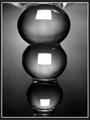
Distorted Squaresby MaYzComment: I really like this picture. Is it glass? It's such a unique way of looking at it AND a great picture. Great lighting and tones. The b&w is great. Even the frame is good. It's very artsy and would look good framed in someone's loft. I'm actually impressed that it did so well with this crowd considering that so many of them are just average folks who like pictures of sunsets and kittens more than anything abstract. I'm sorry that I don't really have more to suggest. I'd actually like to see the white squares a little less bright so that they don't jump out so much. I also don't really think that THE subject is square, but there are squares in the shot. I'm really impressed with this picture and glad that it got a decent score. |
| Photographer found comment helpful. |
Home -
Challenges -
Community -
League -
Photos -
Cameras -
Lenses -
Learn -
Help -
Terms of Use -
Privacy -
Top ^
DPChallenge, and website content and design, Copyright © 2001-2026 Challenging Technologies, LLC.
All digital photo copyrights belong to the photographers and may not be used without permission.
Current Server Time: 07/17/2026 12:32:52 PM EDT.