|
|
|
Showing 241 - 250 of ~991 |
| Image |
Comment |
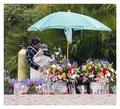
| 02/25/2003 05:57:21 AM | A Mothers Loveby TarbiniComment: Hello!
This is a nice capture on your part. It looks more like a grab shot than anything too thought out in advanced. That sort of thing is usually harder to perfect because you don't have as much time to think. I think you did a nice job under those circumstances, but for the sake of this critique I'm going to assume that you could stage it and take the time to perfect it.
Composition: It's a bit busy. My eyes are drawn to the colorful flowers and then to the umbrella (because it is so large, colorful, and centered). Context is nice, but it should add to the shot instead of BEING the shot. Maybe a different angle, closer to the subject, would help. The helium tank is also distracting since it is so close to the woman. It might be possible to move so that it is hidden behind her. If you had really good focus and enough resolution then you could just crop really close around her - leaving just some flowers and part of the umbrella. The focus should be on the two of them and this moment that they are sharing, but instead you're left wandering around in this busy, colorful image.
Technically: Focus is soft. I'm not really sure where (or if) it locked because everything looks a little too soft. Did you already try using an unsharp filter on it? Exposure is good although the woman's face is a bit dark ... maybe if you had been closer and exposed for her then it would be better.
I do think this is a good representation of the challenge and probably was a spur-of-the-moment catch (in which case you can't do a lot to improve it). It got a very decent score, and I think you should be happy with it. |  Photographer found comment helpful. Photographer found comment helpful. |
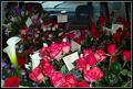
| 02/25/2003 02:46:31 AM | Love.....Ready to be Delivered!by DougPazComment: ARGHH. OK. I wrote a critique and then it didn't send so here we go again if I can remember...
It sounds like you had fun, and you got a decent score. I think that the main issue with this shot is that it's more of a snapshot to document something rather than the set-up, thought out type of shot that most people consider high quality photography. For what it is, it's really good. I like that the interior of the vehicle adds context. The lighting is uneven of course, but it was a dreary day. You could've used a longer shutter speed instead of the flash that it looks like you used. That would probably require a tripod though so I'm not sure it's worth it.
If you wanted to really take advantage of the opportunity, you could've tried to fit in even more flowers so that no boxes showed and put another tall arrangement just behind the passenger seat. Then you could've filled the frame with the flowers. The lighting would bother me more that way though b/c I would think it was set-up and assume you could control the lighting.
I'm not sure where the focus locked, but everything looks rather soft. It isn't so bad as to be bothersome really though. Another low-light problem b/c you had to use such a low f# to get a high enough shutter speed to avoid shake.
I think that's about it. It amazes me how much money people spend on flowers, and yet I still really enjoy getting them too. ;P |
| 02/24/2003 04:08:33 AM | Happy Hallmark...er...St. Valentine's Dayby zadoreComment: Hey! Very nice shot.
The frame works well with this. Composition is good. I actually like the square crop and the placement of the bear within the frame. If there were a way to move the bear closer and angle the roses so that they are on a different plane, then it might be worth trying.
Focus is good. It's a very clear, crisp image. The black and white with the red works to create a classic, professional looking shot.
Lighting is good. There is a bright area on the bear's face that has lost some detail and the shadows on the left side of the roses and the side of the bear's ribbon are too dark, but fill lighting could be tricky. I really like the drama created by this lighting setup - the tonal range is great - so I'm not sure it's worth the tradeoff.
High quality shot with no distractions. Nice, seamless background. I don't think you could take a much better shot of this subject.
There is something a little sad about the photo. The desaturation along with the wilted roses suggest a bitter sweet sort of love. If this were on a card, I'd expect it to say I miss you.
Great shot although I'm a little surprised that it got the high score it deserves just because it is a stuffed animal. |
| 02/19/2003 07:07:46 PM | Empty Stadiumby AmieeComment: HEY! Congratulations on submitting to this very tough challenge.
IMO, this photo just isn't a very strong shot on its own. It does fit the challenge though. Of course some complain that he is too easy to find, and others complain that it's too hard to even tell that it's a person... obviously this topic was too confusing and didn't make scoring easy or uniform.
Composition: I don't think that the angle makes strong enough diagonals. I wonder if it wouldn't have been better to shoot straight on with the stairs in the center of the shot. Then you could have framed it lower on top to cut off the fence and power pole. Centering the staircase would create strong vertical and horizontal lines, and then you could put the person in basically the same spot which would then follow the rule of thirds (having him/her a third of the way down from the top and in from the left). I don't know if this is someone you found or if you put them there. If you staged it then I would suggest having them at least look at the camera. I'd go so far as to have them lie on top of the bleacher wearing more clothes that are easier to identify.
I think that sometimes people put too much importance on the topic and end up sacrificing the shot. Making the person look more like a person who fell asleep in the stands might not fit the challenge as well, but IMO it would make a nicer image.
I'm sorry that I don't know much about your camera's capabilities, but this shot is underexposed. If possible, it needs some exposure compensation or a slower shutter speed. If you can't do that then you should try shooting with stronger light. The dark shadows also seem rather noisy.
Practice makes perfect. Good luck in the future challenges. |
| 02/19/2003 06:45:29 PM | Stairwellby jimmyn4Comment: HI! It looks like you live in a nicely restored old building. I love places like that.
Composition: The wood railing and ironwork is really cool. The stairs themselves just aren't too interesting. I don't know how you would isolate the rail and iron more though ... what happens if you shoot up from that lower landing? Is there some way to compose it against a solid wall or ceiling? I think I'd rather see it more as an architectural detail shot - rather abstract - than a stairwell shot. I sort of like the window in that it matches the railing, but it puts a little too much interest in that top part of the shot.
Lighting is good. The shellac on the end of the railing is obviously very shiny ... You can hold up some sort of paper or diffusing material to block direct light on problem areas like that.
Focus: I guess you tried to use a shallow dof to emphasize the perspective, but I'm not sure it works with this shot. There just isn't enough difference between the near and far. I'd rather see it all in focus or the front in focus and the back blurred a lot more than it is.
Yes, this shot fits the challenge. Technically, it has a few glitches but nothing major. I think the biggest problem was just composition and subject. If the wood and ironwork is what drew you to this subject then that is what you should try to really show in the shot. Having the stairs and window just makes it a little too cluttered IMO. There are too many lines going too many different directions.
Your score was decent though, and it's obvious that you are keeping your eyes open. Good luck in the future challenges. | | Photographer found comment helpful. |
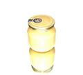
| 02/17/2003 03:23:20 AM | Honey from swedenby aspireComment: My honey is in Uppsala and I'm going to visit him next week :) The yellow is very understated, but works. I think the lighting is a bit bright - but maybe you just wanted it high key. I like the reflection but I'm not sure about centering it horizontally. |
| 02/17/2003 03:13:35 AM | Breakfastby JakComment: Oh the cholesterol! Your poor heart is gonna hate you. I don't like that the fork and knife lead the eye off the frame. The plate as a whole woulda been more pleasing if you shot it before u ate. |
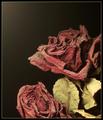
| 02/17/2003 01:36:40 AM | Preserved but Forgottenby RefractedComment: OK. I gave this a 5 in voting. My idea of this topic was to take the best picture you can of a cliche topic - in order to appreciate all those pretty, cliche shots you see all the time. Roses are cliche, but this is not how you usually see them. The dust and decay of these flowers just turned me off. It's interesting, but not very appealing to me.
Technically, it's very good. I like the colors and tones and focus. Lighting is even. Composition seems a little weird b/c of all the negative space on top but the bottom rose is cut in half, and the right side is cropped too close.
I am a tough voter. To get a good score from me, it has to be good technically and have be an appealing picture that took time and effort. You have the time and effort and technique down. Upon reflection, this might deserve a 6, but that gut reaction works against you in challenges where there are so many photos to go through. | | Photographer found comment helpful. |
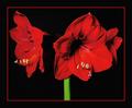
| 02/16/2003 11:46:59 PM | Ladies in Redby TerryGeeComment: HEY! Someone knows how to use a border! :)
I like this. It's a high quality shot - very sophisticated and professional looking. May need a tad more exposure as the shadows on the flower seem too dark. Focus also seems a little off - oversharpening maybe? Nice score. Very dramatic shot. Deserving of a good score. I like the composition, but I don't like that dark area between the left and center flower - either get more detail in it or take the shot from the right more so that we can see more of the flower on the right and less of the black hole.
(please excuse the brevity but lots of shots arent getting critiques at all this week) | | Photographer found comment helpful. |
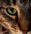
| 02/16/2003 11:42:50 PM | Cats Eyeby AnachroniteComment: HEY! (please excuse the brevity but lots of shots arent getting critiques at all this week)
This looks a lot like another cat shot I critiqued earlier. Very similar composition. I actually like this one because of the color. That green eye is perfectly placed. Here are my complaints. Focus - parts of it (esp the nose) seem soft which is probably due to the aperture. Was this on purpose? If you're showing such a small area of the face then I want it all in focus. It also looks like you might have sharpened. Sharpening fur (or anything with so much texture) is always really hard b/c it doesn't take much to look like too much. There are a couple of whiskers in particular that have diagonal jaggies (look like stair steps), and that bothers me. Quality is always a big issue with me enjoying a shot. Lighting is another one. I think this seems a little dark. Love the composition tho. Nice shot. Decent score - esp with such tough competition. | | Photographer found comment helpful. |
|
Showing 241 - 250 of ~991 |
Home -
Challenges -
Community -
League -
Photos -
Cameras -
Lenses -
Learn -
Help -
Terms of Use -
Privacy -
Top ^
DPChallenge, and website content and design, Copyright © 2001-2026 Challenging Technologies, LLC.
All digital photo copyrights belong to the photographers and may not be used without permission.
Current Server Time: 07/17/2026 11:11:39 AM EDT.
|