|
|
|
Showing 231 - 240 of ~991 |
| Image |
Comment |
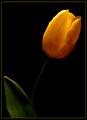
| 03/02/2003 06:05:07 PM | Speeding To The Sunby paully2k1Comment: I love when people ask.. is this supposed to be art?
*lol* This is pretty cool. I think the score just reflects the idea around dpc that this is a straight photography site. Traditional sorts of shots do the best even when they say that you should be creative. The red and yellow is really nice here. I don't like the green in the shadow so much though. Maybe you can desaturate a channel to fix that. Getting rid of the shadow alltogether is another option. Good placement of the head within the frame. I think this is a fun picture, but if you're concerned with the score then you should probably go a little more mainstream next time. |  Photographer found comment helpful. Photographer found comment helpful. |
| 03/02/2003 06:00:19 PM | The Line Between Usby togtogComment: Well. It IS yellow. Technically there just isn't much to critique here. It just seems a little too simple IMO. Maybe getting closer to the ground and shooting the line traveling out into infinity with a shallow dof would be better than shooting straight on... it just needs something. The line is splitting the photo directly in half, but I feel like there should be something on one or both sides if you're going to center it and title it like this. You might try desaturating everything but the yellow so that the pavement is more grey than blue. Having a black and white image with one shot of yellow would be cool, but I still think it needs a little more to it. | | Photographer found comment helpful. |
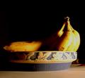
| 03/02/2003 04:46:18 PM | Yellow?by Cjorgy2oo4Comment: You got quite a bit of feedback during the challenge so I'll make this short. This shot fits the challenge, but didn't stand out as a strong image. I'm not sure what is behind the bowl on the right but it is distracting. Focus is too soft on the bananas, and the lighting is too harsh. I do like the black background. Did you try putting some white cloth or paper in front of the light to diffuse it some? See how the brightest areas are "hot" and almost look white? You need to adjust the lighting and/or exposure to avoid that. I'd also like to see more of the bananas. Maybe just shooting them against all black would be nicer. The table top is just distracting anyway.
Good luck and keep shooting! |
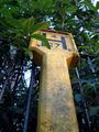
| 03/02/2003 04:36:36 PM | Tall Yellowby paynekjComment: Yes it is yellow. Fits the challenge. However, I don't think the subject is interesting enough to stand out in 250 entries. I do like the angle that you chose to shoot from, and the colors are nice. Exposure/lighting is good. The post is dirty though and just a little too... mundane to be a strong image. Good practice shot probably but not the best choice to enter in a popularity contest (which is basically what dpc is). You need to find subjects that will appeal to a wide audience. Whether we like it or not, pretty shots and those that make you say "wow" will usually do well. Good luck! | | Photographer found comment helpful. |
| 03/02/2003 04:31:16 PM | Making Waves by kosmikkreeperComment: The composition is nice. I like the diagonals. Lighting is good. Any more exposure, and you'd lose some detail in the highlight areas. As is, there's a good range betwen light and dark. I really like the decision to make this blue. It's a little more understated than yellow and puts the focus more on the repetition and lines while still adding interest.
Biggest gripe would be the soft focus in the upper left corner. If you had used a different angle so that it was obvious that some threads are closer to the camera then a shallow dof could be useful. As is, it looks like they are on the same plane so it doesn't work to have a section out of focus. The little hairs don't really bother me. You have such great focus in the center, and it IS a macro. The whole point is to show things as they aren't usually seen - beauty in the details - and I think you achieved that.
For this challenge, it's a great shot. However, for a portfolio... I think that you should do some sort of series. I can imagine this hanging in a grouping of 3 or 4 on a well. Each shot being a different color and showing a similar sort of close-up that focuses on texture and lines. Maybe you can keep that in mind and make it a work in progress.
Congratulations on the high score. It's a very simple, clean, and effective photo.
| | Photographer found comment helpful. |
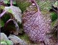
| 02/27/2003 08:45:52 AM | Nature's Rhythmsby kandyjComment: Hmmm. a cabin on the river, huh? Niiiiiiiice.
First off, yes this fits the challenge though I think of it more as a texture shot than a repeating theme. If the leaves were all in a line or going the same direction then it would be more repetitive IMO.
I do like the color, but something about the lighting is bothersome. The leaves are rather shiny to begin with and the little hairs are white so the colors aren't as prominent as they could be. Focus is good, but because of how close you are to the subject - some areas are soft and the lines aren't as distinct as they could be. Those little hairs are a bit like animal fur close-up... very hard to focus on and nearly impossible to sharpen in post processing.
I just think this is a difficult subject to shoot b/c of those hairs. You did a decent job though. There just isn't enough interest to hold someone's attention for long. The colors are a bit of a blur b/c of the glare off the leaves and there aren't strong lines or an obvious focal point.
I don't really like the frame. Unless it can really add to the shot, it's best to just let the picture stand on its own probably.
Overall, decent shot of what may not have been the best subject. I can see what drew you to it but I'm just not sure it makes a strong photograph. Good luck! | | Photographer found comment helpful. |
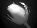
| 02/27/2003 08:29:26 AM | This one for you!by rj324Comment: Well... That's a different take on love.
Red roses might say love, but this is a bit of a stretch for me.
I like the angle of the flower, and the close-up. It might work as a square crop. Something about the horizontal orientation just doesn't seem right to me. I don't really think you needed water drops in this one. They don't add much IMO, and the light reflections on them look a little like hot pixels. The focus is good except for that one leaf - maybe it you turned the flower some so that it isn't coming forward so much. It wouldn't really bother me if there were other parts that were out of focus but having just that one area blurred sort of makes it pop out too much. I like the lighting on top and the shadow on the petals from the leaf. I'd like a little more light on the bottom and stem though because there just isn't enough detail/contrast there. The area in the middle of the petals - between the bright spot and the darker areas - is the best because you can see all of the detail.
It's really a cool shot though maybe not the best for this challenge. High quality with just a few nit-picky technical quirks. It's probably can't appreciate a lack of color at all. |
| 02/25/2003 07:30:57 AM | Alone in the Lightby indigo997Comment: Hey! Cool. I didn't expect to place, but I won't complain. Low scoring challenges can be nice ;)
I've seen a lot of really nice flower shots on photosig, and then magnetic's cliche shot inspired me to try one myself. The shot has actually been rotated 90 degrees cc, so the light was to my right instead of above. I used a small halogen work light from home depot with a homemade diffuser in front (frame covered with white cloth from walmart).
I adjusted levels some in photoshop - especially the black - until I got what I wanted, and sharpened just a bit. I had an alternate version with more light on the stem, but I prefer this one. I think it's more dramatic to have the stem disappearing into the black. However, I didn't take into account that some people don't have their monitors calibrated correctly and wouldn't be able to see it at all. Live and learn. Thanks for the comments! |
| 02/25/2003 06:45:19 AM | somebody loves meby shutterflyComment: HELLO!
This is such a happy picture. The comments are kind of funny though. People are always complaining about backgrounds being distracting, and now they're complaining about it being too plain. I do think that a solid in a different color would work better though. The lighting is a bit harsh, and the white bg only makes it more so.
I also have to agree about the cellophane wrap. It's really reflective and somehow cheapens the bouquet.
Technically: Focus is good. Cropping is good. Lighting could be more even and diffused. Colors are nice. This reminds me of 99% of the christmas morning shots where the kids are holding up their presents to show off. Because of that, it doesn't bother me that she is looking at the camera.
It's a good shot for the challenge. The lighting, plastic wrap, and bg are the only improvements I can think of. Maybe she could hold the flowers a little lower in the frame or wear something a little dressier. Honestly, I think this is a tough age b/c they're really too old for the "cute kid" factor and too young for the "glamour" or fashion shots. For the most part, people just don't have a lot of interest in looking at pictures of other people unless they fit into those categories. Outside of the proud parent album, this sort of shot would probably work best in a flower ad campaign. It still got a very decent score, and IS a nice photo. | | Photographer found comment helpful. |
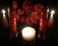
| 02/25/2003 06:22:17 AM | Candlelight Romanceby BigSmilesComment: Hey!
You know what I think is the coolest about this shot? The candle reflections in the glass. That's just too cool. My least favorite thing is the fake flowers. They're too dark to really make out well, and who gives fake flowers for Valentines Day? ;P
I think that still lifes are really hard to do well. You have to have great color or lines or texture to pull it off, because you're dealing with inanimate, cold objects for the most part. It is a good chance to work on lighting, exposure, focus etc, but the biggest challenge is keeping it from getting boring. Technically, this is pretty good. Focus is good. The exposure might've been a bit too long. A shorter shutter speed would have prevented the starburst effect on the flames in the back and it would've helped with the front candle - where I'd rather see a flame than just a bright white area.
I'm really not sure how to help the composition. Somehow this just isn't saying "love" like it should. If it were something set up for someone then I would expect a real rose, a card, a jewelry box or some body oil... maybe chocolate covered strawberries even. This is just too symmetric and not personal enough to draw the viewer in or make them care about it.
Overall, it is a quality shot that obviously took some thought and skill. The subject matter just isn't emotionally involving enough. I think that technically poor shots usually get shot down on dpc so at least you've conquered that demon. Now it's just a matter of finding the right subjects. |
|
Showing 231 - 240 of ~991 |
Home -
Challenges -
Community -
League -
Photos -
Cameras -
Lenses -
Learn -
Help -
Terms of Use -
Privacy -
Top ^
DPChallenge, and website content and design, Copyright © 2001-2026 Challenging Technologies, LLC.
All digital photo copyrights belong to the photographers and may not be used without permission.
Current Server Time: 07/17/2026 12:33:34 PM EDT.
|