| Image |
Comment |
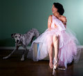
| 04/20/2011 02:25:01 PM |
Pas de Deuxby tangueraComment: What makes this image great is the pose of the dog :) Gave this an 8. The lighting is a tad harsh on her left leg all the way down to her shoe which may have been one of the reasons it didn't do better. Also, her dress is pink which is not a perfect fit in a cool challenge which is perhaps another big reason that you got some low votes. |
 Photographer found comment helpful. Photographer found comment helpful. |
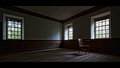
| 04/20/2011 02:18:43 PM |
The Old Primary School by vawendyComment: Like this a lot except for the way the outdoor light was blended in with the indoor mood. I absolutely love everything about the indoors part of the image. The outdoors has that harsh light feel with some pinkish chromatic aberration when I look closely. An exposure with a faster shutter speed just for the outdoors would have made the blending a lot smoother. Still a great image and should do extremely well ... perhaps a ribbon. |
| Photographer found comment helpful. |
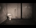
| 04/20/2011 02:15:09 PM |
Thrown Away Throneby jim29028Comment: Oh yes! This is awesome! Minor nit ... I wish you had cloned out the reflections on the wall in the upper right to eliminate the distraction there. The borders work so well here, btw. 10! |
| Photographer found comment helpful. |
| 04/20/2011 02:10:18 PM |
Always Picked Lastby sjhulsComment: Cute image, but unfortunately it was taken too close up to give the viewer the sense of an empty room. It seems like you were trying to decide to enter in this challenge or in the Sadness challenge? Because this could pass for the other one better IMO. Of course it is a major hassle to move furniture around to create the feel of an empty room for just a challenge, so I understand :) |
| Photographer found comment helpful. |
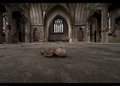
| 04/20/2011 01:58:35 PM |
Aloneby BastaComment: Love the Gothic feel in this one. Is it me or is the horizon not quite straight? Great image and should do very well. 9! |
| Photographer found comment helpful. |
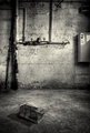
| 04/20/2011 01:54:40 PM |
Patienceby tomeComment: Love the tones a lot. The mouse trap needs to be a little brighter to draw the eye to it more since it is a key element in this photograph. Currently I am drawn to the pipes in the background. Still very good image and it should do well. 8! |
| Photographer found comment helpful. |
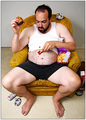
| 04/20/2011 01:01:54 PM |
Plates? Never heard of 'em.by timfythetooComment: Hi Tim,
I know it's been awhile since this challenge has ended but I wasn't around back then when this masterpiece was created! Since the version 4 of this challenge just got announced, I figured this would be the perfect time for me to make a comment on this image by saying how much I love your attitude, your outlook on life, and the kind of photos you take. I also wanted to ask you to please enter in the 4th version of this challenge that just got announced and totally disregard how it would finish. Can't wait to see what you'll come up with next. Don't worry where it will rank because some people will hate it no matter what, but one thing they cannot deny is the fact that whether they love it or hate it, they WILL remember it and that is what it's all about! Good luck! |
| Photographer found comment helpful. |
| 04/20/2011 12:44:55 PM |
|
| Photographer found comment helpful. |
| 04/20/2011 12:43:43 PM |
cordoneby posthumousComment: Brighter eyes would have made a huge difference here. Since this is a fairly closeup shot, the only way a viewer can get the impression of sadness from this image is if his eyes were more visible. I wish you had brightened his eyes more in photoshop. |
| Photographer found comment helpful. |
| 04/20/2011 12:25:42 AM |
|
| Photographer found comment helpful. |
Home -
Challenges -
Community -
League -
Photos -
Cameras -
Lenses -
Learn -
Help -
Terms of Use -
Privacy -
Top ^
DPChallenge, and website content and design, Copyright © 2001-2026 Challenging Technologies, LLC.
All digital photo copyrights belong to the photographers and may not be used without permission.
Current Server Time: 06/21/2026 11:57:46 AM EDT.