DPChallenge: A Digital Photography Contest You are not logged in. (log in or register
 
Browse Settings
Currently viewing:
Registered Usertrain

Show comments:

Per page:

Order:

Comments:


Comments Made by train
Pages:   ... [265] [266] [267] [268] [269] [270] [271] ... [384]
Showing 2671 - 2680 of ~3833
Image Comment
Zen
08/01/2004 04:17:50 AM
Zen
by Jesuispeure

Comment:
Hello Amanda from the Critique Club

This is a very well 'Balanced' and thought out image, and beautifully presented.

The focus, detail,colour and tone are all excellent.

Your score is very good also
I cannot add anymore to it really or make any improvements
The D P C voters are a hard lot to please. LOL!
There were a lot of good images in the Balance Challenge, yours being one of them. I guess the problem is there can be only 3 winners

Enjoy your photography
Good luck with your future challenges
If you have any questions please feel free to P M me
Regards
Sally

Photographer found comment helpful.
Balance Required
08/01/2004 04:06:25 AM
Balance Required
by Stagolee

Comment:
Hello Tim From the Critique Club

This is a great action shot with lots going on and a good capture
and definately fits the challenge
It may be improved if it was a little bit sharper but the amount of surf seems to almost overtake the image
Maybe the mid tonal levels reduced would make it darker and bring the subject out more I am not very technical though
But overall a really good subject which gave you a really decent score and its so frustrating when a shot like this is overlooked because of some great 'set up' images. I can imagine your image would be quite hard to achieve and you would feel really great about putting up for the challenge only to be out voted.
But it is a natural image with good detail so just enjoy your photography and keep up the good work.

D P C voters are a hard to please lot. LOL!
Good luck in future Challenges and if you have any questions plese feel free to P M me
Regards
Sally
Photographer found comment helpful.
Balancing the ball for a living
08/01/2004 03:51:53 AM
Balancing the ball for a living
by RUEDISCHMUTZ

Comment:
Hello Ruedi from the Critique Club

This is a good image in itself and a good choice for Balance
with the Silver and red ball and the man with the crutches both showing balance
The image is a little dark but the man has nice skin tone. Good sharp focus.

I really don't know what to say about why it didnt do any better in the Challenge. I guess its the sort of image that either appeals or doesn't and I don't think that's any reflection on you as a photographer
D P C has very hard to please voters in my opinion LOL! I am still trying hard to please them but getting nowhere lately!

Enjoy your photography and I hope you do well in future challenges
I hope my comments are helpful to you and if you have any questions please feel free to P M me
Regards
Sally
Photographer found comment helpful.
Birds in Balance
08/01/2004 02:45:47 AM
Birds in Balance
by coolhar

Comment:
Hello Harvey from the Critique Club

This is an unusual image. A great find. I really like the movment of the birds against the blue sky. Image is sharp and well composed although if you could have included the bottom of the birds in the shot I think it would look better than cropped off.

I am not sure about the Plane but it does add to the balance theme I guess.I think I would have cloned the plane out but then that's just a matter of preference I dont suppose you will appreciate my comment if you had been waiting a long time for that jet LOL!

You had a good score and nothing to be ashamed of here. A worthy image and I really cannot add much more I hope that you continue to enjoy your photography and Good luck in the future challenges
If you have any questions please feel free to PM me
Regards
Sally
Photographer found comment helpful.
Natural Harmony
08/01/2004 02:33:02 AM
Natural Harmony
by cmangis

Comment:
Hello Carol From the Critique Club

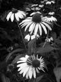
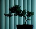
I really like your image and your choice for B/W
very good detail, focus is sharp and I think this says 'balance' you could try and tone down the middle tones to make it a bit darker as suggested in one of your comments but I like the way it is.

In the critiques Iv'e done so far I am finding that the 'nature' images didn't do so well in this 'Balance' challenge if you look at the top 10 images they are all objects balancing with the exception of one.

So in my opinion there is nothing I can see that is obviously wrong with your image it's just a matter of the voters went for the objects

In my own nature Balance entry I did very badly but I thought the Weta was in harmonious surroundings creating a balance but the voters didnt see that.

So we live and learn, I guess.

I liked the winners image very sharp and cleverly done but I'd rather look at an image like yours anyday so I find it very hard to say anything objective ( if I am real picky maybe the white on the stem on the top left flower is a bit harsh near the top and could be cloned out)

You had an average score for an image that will be liked by a whole lot of people myself included.
But for D P C ribbon winners, I think, they just have an edge somehow
I'd like to know how they do it!

I hope that you enjoy your photography. Good luck in the future challenges. I hope my comments help and if you have any questions please feel free to P M me
Regards
Sally
Photographer found comment helpful.
Balanced...........on the fence!
07/31/2004 05:06:38 AM
Balanced...........on the fence!
by suemack

Comment:
Hello Sue from the Critique Club :

First of all I know just how difficult these little birds are to photograph I have been trying for ages and have three resonable images but I have yet to get it with its tail spread out.
They are beautiful but very fidgety birds and they always follow us when we take our dog for a walk.
I like the inclusion of the spiders web but I think your image would look better if it was cropped closer and not so central Photographers seem to have a 'thing' about being off centre but I think it looks alright the way you have it, although the post is a bit heavy looking behind such a fragile bird
Colour tones are nice, the focus on the fantail could be a little sharper and your score in the challenge did far better than my own
But to make this more of a 'Wow' image I think it needs a sharper focus and maybe the little fantail could look less ruffled. LOL!

I have critiqued quite a few of the Nature images in the Balance challenge and they did not do as well as the objects balancing just look at the top 10 images although for my own interest I like the nature ones the best thats not to take anything away from the top 10 they are all brilliant
Sorry I cant be more of a help
Enjoy your photography and good luck in the future Challenges
If you have any questions please feel free to P M me
Regards
Sally Incidentially I live in Hamilton New Zealand
Photographer found comment helpful.
Balancing sound
07/30/2004 06:40:39 AM
Balancing sound
by MAK

Comment:
Hello Marac from the Critique Club

A very clever and sharp image
colour and tone are excellent
Great idea and I like the shallow D O F
Your score is a decent one so the voters liked it, so nothing to be ashamed of.

I dont see how you could improve it really
The voters are a fickle lot
I think this sort of image does not appeal to everyone and I feel it would appeal mainly to younger men,( I may be wrong) some may not even know what it is at first glance.
This challenge has some really good images yours included
So I cannot improve on what you have already done
I hope my comments are helpful to you
Good luck in your future challenges. Enjoy your photography.
If you have any question feel free to P M me
Regards
Sally
Photographer found comment helpful.
On Golden Rocks
07/30/2004 06:27:24 AM
On Golden Rocks
by digistoune

Comment:
Hello Ellen from the Critique Club

A very clever idea and you certainly have the voters fooled, myself included. Just how did you get that ice so clear?
I like the title and the background but there are a few soft spots maybe it is the cloning or one of the tools you used especially visable on the second row down on the left

I think a darker background may have given it more of a lift, I think that would make the ice stand out more, maybe a dark or navy blue. but then the title would have to change.
There are many clever images in this challenge and yours did very well.
So I am not sure what else to say because yours is very clever
( MY own image really bombed)
But keep those ideas coming and enjoy your photography
Good luck in your future challenges
if you have any questions you can P M me
Regards
Sally
Photographer found comment helpful.
Flight of the Bumble Bee
07/30/2004 06:11:26 AM
Flight of the Bumble Bee
by Homunculus

Comment:
Hello Milos from the Critique Club

I have found as I am going through the critique for this challenge that the 'Nature'theme in Balance has not done very well (My own included really bombed)

The top 10 images are mostly set up images involving objects and although they are very cleverly done they are just that, set up.
With some really sharp images and great equipment I would imagine

Your image is not sharply in focus and appears soft but I can see where you are going with the balance theme
The shadows take my eye off the main subject which I assume is the Bumble bee
The Black and white is good but has a blue tinge to it

I think the main thing with your image in the theme you have chosen (Nature)and your focus, although that can be very hard when taking a photograph of a buzzy bee. It really does need to be sharp Did you have your camera set to Macro?
Enjoy your photography and I hope my comments have helped.
For myself I can get very frustrated with this site when my image gets voted down so low but I put it down to a learning experience
If you have any questions please feel free to P M me
Good luck in the challenges
Regards
Sally
ps I really like your yellow ribbon image very clever thinking
Balanced Imbalance
07/30/2004 04:30:44 AM
Balanced Imbalance
by adine

Comment:
Hello Adine from the Critque Club

First of all Congratulations on your placing with this image
I just love the blue bottle and it is very nicely done but for my own preference I do not like the brown bottle it has little interest maybe a green one would look better but thats just being very picky
The blue bottle almost looks like its been painted onto a canvas and could almost give the same impact without the smaller bottle
I am not very technical but I can see this is good and very nicely done
Maybe the white background is a little stark or harsh Dark blue maybe would look nice
But other than that I dont really feel I can add a lot more Nice idea well taken
Just keep on enjoying your photography and enjoy D P C I find it very addictive!
I hope my comments although very limited help
If you have any questions feel free to P M me
Regards
Sally
Photographer found comment helpful.
Pages:   ... [265] [266] [267] [268] [269] [270] [271] ... [384]
Showing 2671 - 2680 of ~3833


Home - Challenges - Community - League - Photos - Cameras - Lenses - Learn - Help - Terms of Use - Privacy - Top ^
DPChallenge, and website content and design, Copyright © 2001-2025 Challenging Technologies, LLC.
All digital photo copyrights belong to the photographers and may not be used without permission.
Current Server Time: 09/29/2025 02:58:59 PM EDT.