| Image |
Comment |
| 07/26/2004 12:27:38 PM |
|
| 07/26/2004 12:25:56 PM |
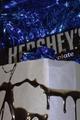
gadiveby fstopopenComment: What's this and what does this have to do with chocolate? (1 - for not meeting the challenge) |
 Photographer found comment helpful. Photographer found comment helpful. |
| 07/26/2004 12:24:33 PM |
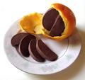
Simple Pleasuresby md8speedComment: Simple and great, though, looks like cards. Maybe a bit more wow factor is what I miss here. I like the colours and the lighting, smart one. :-) (8) |
| 07/26/2004 12:20:05 PM |
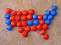
Red State, Blue Stateby KraahkanComment: Nice idea. :-) It could be a bit sharper, I think so. The environment looks a bit too unnatural for a tasty chocolate composition, too and the angle you choose is not very interesting. I would have lowered the camera for it a bit. Alltogether it's nice. (5) |
| 07/26/2004 12:18:01 PM |
|
| 07/26/2004 12:16:46 PM |
Unnaturally Deliciousby mocabelaComment: Unnatural, indeed, but sooooo CREATIVE! :-) I love the vivid colours with the pastel plate, lighting is fine, wonderful sharp... definitely ribbon winner! I keep my fingers crossed for you! (10) |
| Photographer found comment helpful. |
| 07/26/2004 12:14:03 PM |
Willy Wonka has nothing on...by jmleliiComment: Well... I don't think I would eat any chocolate if it was the first photo I saw about it in my life. Composition is too busy and untidy, lighting is too harsch, I don't get it, really sorry... (2) |
| 07/26/2004 12:10:11 PM |
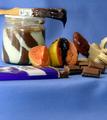
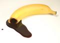
Chocolate Junkie!by ConcreteDonkeyComment: Nice idea, and creative. :-) I also like the reflection on the chocolate. I would add more contrast and a bigger split of chocolate, to gain more reflection and fill the photo a bit more. (6) |
| 07/26/2004 12:04:47 PM |
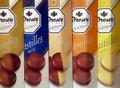
Droste anyone ?by AndrewTOComment: I am not a fan of capturing the wrapping, rather the chocolate inside. The idea of making a rainbow is great. :-) In this case I would have pahed more attention on showing exactly the same amount of the box on each part, and lighting is strange on the right, seems like the wrapping was bended and lighting made some shadows. (4) |
| Photographer found comment helpful. |
| 07/26/2004 12:01:54 PM |
Pure Goldby vaguiloComment: Nice composition, but lighting needs improvement. It's good on the wrapping, but the edge of the box with the Chocolate text is too dark. I also think WB was improper here, colours look quite unnatural. I like the graduate colours of your background. (3) |
| Photographer found comment helpful. |
Home -
Challenges -
Community -
League -
Photos -
Cameras -
Lenses -
Learn -
Help -
Terms of Use -
Privacy -
Top ^
DPChallenge, and website content and design, Copyright © 2001-2026 Challenging Technologies, LLC.
All digital photo copyrights belong to the photographers and may not be used without permission.
Current Server Time: 07/18/2026 02:19:49 PM EDT.