|
|
|
Showing 431 - 440 of ~995 |
| Image |
Comment |
| 08/23/2004 07:19:00 AM | Elizabethby LegatoMuzicComment: It looks more like a snapshot. You have cut her boots, background is too busy for me, and she is quite out of focus. I also find colours flat, lights are very harsh on his right leg (on the left of the photo) and she wears too many clothes to be nude... If she hadn't been willing to take off her clothes, it would have helped to take a shot of a part of her body that's absolutely nude, dunno. Just my opinion. |
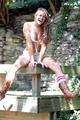
| 08/23/2004 07:15:46 AM | Lukeby biggood53Comment: Okay, he is nude, diagonal composition with the surf desk would be fine, but there are a few issues I would like to mention: You have cut off his feet, and the lighting isn't that well either. Due to the flash you lost colour shades and the red-eye effect in his eyes is harsh (as it's a member's challenge, you could have got rid of them using separate RGB layers and delete the red area on the red layer). It rather looks like a snapshot, than a conscious work, sorry. Next time, try to use diffused lights, and check that everything important is on the photo. |  Photographer found comment helpful. Photographer found comment helpful. |
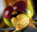
| 08/10/2004 07:12:51 AM | Dragon Eyes by JackoComment: What a face! :-) I love the eye details. Congrats on the double win, Jacko! :-) | | Photographer found comment helpful. |
| 08/02/2004 12:42:48 PM | | | Photographer found comment helpful. |
| 07/28/2004 03:37:10 PM | | | Photographer found comment helpful. |
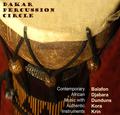
| 07/28/2004 02:18:44 PM | Dakar Percussion Circleby DiamondPeteComment: I love the colours, composition, really moody shot! :-) Though, I am not familiar with the tipography in the left bottom corner. It's so different from the one above (I like that), and the whites are adding too much Contrast IMHO. I would use a smaller font type for the text in the bottom and align it absolutely to the right, I would also use the beige shades instead of the white. Just an idea. (7) | | Photographer found comment helpful. |
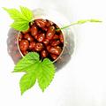
| 07/26/2004 01:08:46 PM | Chocolate Covered Raisinsby artvetComment: Is this a high key shot? I love the composition, the crop, the lighting a much! Few, but effective colours, I love this. :-) I also love the grape leaves, they add a nice colour and shape element to the composition. 10 from me, and good luck! (10) | | Photographer found comment helpful. |
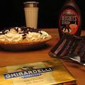
| 07/26/2004 01:03:57 PM | Got Milk!by awpollardComment: I think the composition would be better without the gold bar of chocolate. The background is a bit tilting to the left (the edge of the table), and there are too many thinkgs on this photo. Fewer would be more effective, like the syroup, the cakes, without the glass and the bar on the bottom, or something like that. (4) | | Photographer found comment helpful. |
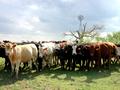
| 07/26/2004 12:41:42 PM | White Chocolate, Dark Chocolate, Light Chocolate!by Frank BeckmanComment: The photo is nice, but the association is too complicated. Okay, we need milk for Chocolate and the sign of Milka is a cow, but I'd rather use real chocolate for the challenge. For me it seems like you have submitted something, not taking the shot precisely for the challenge.For me, this doesn't fit it well. Sorry if I am mistaken. The cows are anyway sweet and colours are great, except a few shadows and blow outs on the animals. (3) |
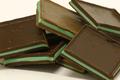
| 07/26/2004 12:34:48 PM | Stephanny's Chocolates - The Denver Mint.by jimsappComment: The mint in the front could be sharper, it's a bit out of focus on the edge. Nice couple of chocolate, though, there is nothing special. I mean the composition or lighting could have more wow factor. (4) |
|
Showing 431 - 440 of ~995 |
Home -
Challenges -
Community -
League -
Photos -
Cameras -
Lenses -
Learn -
Help -
Terms of Use -
Privacy -
Top ^
DPChallenge, and website content and design, Copyright © 2001-2026 Challenging Technologies, LLC.
All digital photo copyrights belong to the photographers and may not be used without permission.
Current Server Time: 07/18/2026 04:21:39 PM EDT.
|