| Image |
Comment |
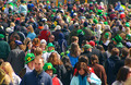
| 03/25/2007 04:49:29 PM |
Can You Hear Me Now?by flip89Comment: This is a quite bad quality photo (complression, cromatic aberration)... You filled the frame well with crowd, but hardly any cell phone to be seen here. The girl looking here with black hair could be put to a rule-of-thirds point. She should hold the mobile and you could crop a bit tighter as well. |
| 03/25/2007 04:49:23 PM |
Fun with the new Cherry?by kje83Comment: Harsh lights on the face, busy background and lack of conscious composition. Shame, because her blond hair, turquoise clothes and cherry colour phone would work well if lighting and composition was set up properly. |
 Photographer found comment helpful. Photographer found comment helpful. |
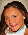
| 03/24/2007 08:44:50 PM |
Brooke!by 777STANComment: This is a snapshot... Needs more contrast, composition and a proper background. Try diffusing some light into her eyes (a golden diffusor would work well here) and avoid the blow out on the top of her hair. She has beautiful eyes and skin, keep trying with her. |
| Photographer found comment helpful. |
| 03/24/2007 08:41:49 PM |
Just a Small Smileby bobdaveantComment: Landscape cropped portraits work better with eyes following the rule of thirds or more negative space. Also the background is too busy here. Great idea to use the blue jewel with her blue eyes, but the cropping on the bottom does not seem ideal... would be better if there was a blue bubble on the left side of the necklace as well. |
| Photographer found comment helpful. |
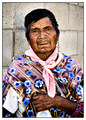
| 03/24/2007 08:38:47 PM |
Huichol Indianby ValdoComment: Great combination of textures, patterns and colours. Also the hand adds an interesting "plus" to the photo, I like this one. |
| Photographer found comment helpful. |
| 03/24/2007 08:37:36 PM |
Lakotaby rayz1Comment: Nice girl. This would work better if you cropped it tighter on the top. Also the harsh shadows caused by the flash are distracting. |
| Photographer found comment helpful. |
| 03/24/2007 08:32:45 PM |
Maggieby svt_gEEkComment: Lights and shadows are harsh and it would work better if the eye was composed following the rule of thirds. Her hand is overexposed which is a little distracting and also her skin looks as it was over-neatimaged. Also a few artifacts of improper blurring can be realised on her face and hair (on the left size for example, the background texture totally disappears behind her hair). |
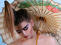
| 03/24/2007 08:27:58 PM |
Stareby TransitComment: This extreme style and make-up looks very-very familiar to me. ;-) Great capture of emotions and extraordinarity! |
| Photographer found comment helpful. |
| 03/24/2007 08:25:13 PM |
Just Myselfby gemjloComment: White balance should be set up to avoid yellowish-redish tones next time. Needs more contrast as well, it is underexposed (needs more light) and composition is flat for me. Well, good view for a passport photo, but you could make it more interesting with a different angle. I think this will not do well in this challenge... |
| 03/24/2007 08:21:39 PM |
Razzamatazzby scalvertComment: Wonderful backlighting, would do well in multiple light sources as well! Adorable the expression on her face. |
| Photographer found comment helpful. |
Home -
Challenges -
Community -
League -
Photos -
Cameras -
Lenses -
Learn -
Help -
Terms of Use -
Privacy -
Top ^
DPChallenge, and website content and design, Copyright © 2001-2026 Challenging Technologies, LLC.
All digital photo copyrights belong to the photographers and may not be used without permission.
Current Server Time: 07/16/2026 06:24:51 PM EDT.