| Image |
Comment |
| 02/03/2006 10:41:09 AM |
Glass Heartby TwylaComment: Isn't really a clear shot, and I can't see the matter of the subject. The almost diagonal composition is conscious, but the subject is nothing that could take the viewer with. Maybe you should choose a more different viewpoint here. |
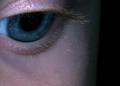
| 02/03/2006 10:39:43 AM |
Baby Blueby lindesComment: It would be better to show more of the baby's beautiful blue eye, and less skin and background. It's difficult to photograph babies, they never do what you say. But, IMO, lighting could be improved in order to gain better skin tones, and the eye could be even sharper. |
 Photographer found comment helpful. Photographer found comment helpful. |
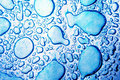
| 02/03/2006 10:38:20 AM |
Blue Dropby alexvoloComment: Seems overexposed and quite unnatural. I can't really see the point of composition here, the subject of your photo. Indeed it's blue, but blue should be a likely feature of your subject or tell us some more about the subject you choose. I think the purpose of the colour is important in this challenge. |
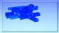
| 02/03/2006 10:36:23 AM |
Blue Ivyby LeejpComment: Composition needs more concept and the use of flash did some blow outs and unnatural colours on the leaves. If I were you, I would not insist on making blue of things which don't really look good blue. Or, if you like this subject, a dark environment and some blue lighting sources would help you. My submission was done with a white subject, I think white is the most likely colour to be able manipulated by white balance or colourful light sources. |
| 02/03/2006 10:33:32 AM |
washing dayby corrieComment: You loose some details during this shot, which may come both from the lighting or expoure. The composition is nice, though it looks unnatural blue. WB is a nice tool to help you in this race, but I think it was overused here. |
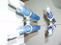
| 02/03/2006 10:32:08 AM |
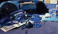
Blue brushesby senojComment: Meets the challenge, though it's very much out of focus and overexposed, which makes in unenjoyable. Don't push the camera into the subject if it does not support macro mode, because you will loose focus. |
| Photographer found comment helpful. |
| 02/03/2006 10:32:01 AM |
not really blueby CamManComment: I feel like being a bit out of focus here, and also there is some irregular distortion of white balance. It's funny and meets the challenge, but still, the subject and the implementation both miss something... |
| 02/03/2006 10:31:57 AM |
Those Blue Passtimes....by lucienawComment: Blue Chaos? It's difficult to make a good chaos composition. I can't find the concept here, neither the purpose of cropping. Lighting could be improved, too. One of my favourite sayings is: "Less may be more." I feel this is true for this one: choose a single subject but make it perfect. |
| 02/03/2006 10:31:52 AM |
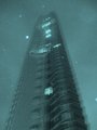
A Look Aboveby yasminComment: I think this could have been better if it was shot with a tripod. Your hand must have been shaken durong the exposure, which mades it unclear, and the spots are a bit distracting. Is it snow falling? |
| 02/03/2006 10:30:12 AM |
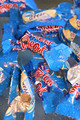
Out of the Blueby NigelComment: Another chaos shot... Not sure about the empty wrappings would work well. It also seems overexposed, and not an interesting subject either, sorry. |
| Photographer found comment helpful. |
Home -
Challenges -
Community -
League -
Photos -
Cameras -
Lenses -
Learn -
Help -
Terms of Use -
Privacy -
Top ^
DPChallenge, and website content and design, Copyright © 2001-2026 Challenging Technologies, LLC.
All digital photo copyrights belong to the photographers and may not be used without permission.
Current Server Time: 07/17/2026 02:47:07 PM EDT.