| Image |
Comment |
| 07/01/2011 11:40:13 AM |
Dunceby banmornComment: It's a funny take. It gives off that modern message on manhood... Women rule, men drool. I think it needs a more centered composition and the rotation looks off a hair, but it could be an illusion. |
 Photographer found comment helpful. Photographer found comment helpful. |
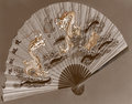
| 06/29/2011 11:30:03 AM |
Dance of the Dragonsby BrianRComment: It's rather a flat image due to the lack of range in tones. Also I think a hand holding the fan would have added a lot to the image! |
| Photographer found comment helpful. |
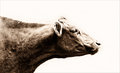
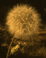
| 06/29/2011 11:25:59 AM |
#600519by rooumComment: High key and Sepia too! I thought you may be referring to an older image by your title, but apparently not...
 |
| Photographer found comment helpful. |
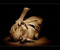
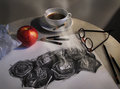
| 06/29/2011 11:24:39 AM |
Garlicby IreneMComment: Great lighting and wonderful use of form and shape to create something visually "appealing" if I can use a pun. The smaller garlic looks like a snail! Great sepia tones too. Lovely browns! |
| Photographer found comment helpful. |
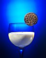
| 06/29/2011 11:17:13 AM |
O-R-E-O againby jbirkmanComment: Well I looked and saw a few oreo shots similar to this one so I don't know what the original was therefore I can't really comment on your improvement like I would like to for this challenge. However I can comment on this image. I am no lighting expert but the first thing that sticks out to me is the background highlighted area. I think it should be bigger. Also the choice of color lighting and the dark shade of it makes the picture look a little murky. I am kind of seeing some orange glow on the edges of the glass where the should be highlights from backlighting or side lighting. Other than those lighting issues, which I could not even come close to replicating, you have a clean, crisp image that makes me want to eat an oreo! |
| Photographer found comment helpful. |
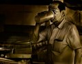
| 06/29/2011 05:56:55 AM |
Summers Workby BaldurTComment: I think you really lost the whites in the toning process which makes the image look flat. There is less depth. |
| Photographer found comment helpful. |
| 06/29/2011 05:52:18 AM |
A Day's Workby mariucaComment: A good re-shoot of your work and an improvement at that. I like the angle better and the light is softer which looks good. The artwork looks like it is steaming!! |
| Photographer found comment helpful. |
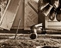
| 06/28/2011 04:18:07 PM |
Nailedby hernan43Comment: There's nothing really wrong with the picture's technicals... good light, good focus, nice range of tones. I think the subject matter is kind of bringing it down for me |
| Photographer found comment helpful. |
| 06/28/2011 04:14:55 PM |
|
| Photographer found comment helpful. |
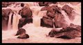
| 06/28/2011 04:14:05 PM |
Falls with heronby rhoadesurfComment: Good capture of the Heron in a somewhat hostile environment sitting there peacefully. I think the reds are a bit too red in your tones. It has bled into the water. |
Home -
Challenges -
Community -
League -
Photos -
Cameras -
Lenses -
Learn -
Help -
Terms of Use -
Privacy -
Top ^
DPChallenge, and website content and design, Copyright © 2001-2026 Challenging Technologies, LLC.
All digital photo copyrights belong to the photographers and may not be used without permission.
Current Server Time: 07/17/2026 03:02:01 AM EDT.