| Image |
Comment |
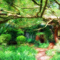
| 07/01/2011 11:45:46 AM |
Secret Gardenby james_soComment: It's like the entrance to a hobbit hole or something. Very dreamy and good soft focus. I like how you exposed the light to make the entire scene nice and bright without really blowing anything out. |
 Photographer found comment helpful. Photographer found comment helpful. |
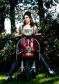
| 07/01/2011 11:44:47 AM |
Scooter Divaby matt_d_ukComment: I think the photo is very good with a hard edged contrast and deep saturated colors. One thing that could be changed is the background. It is dark and busy with lots of textures that overpower and hide the subject somewhat. I would prefer a more grey urban background or something plain and simple. |
| 07/01/2011 11:40:51 AM |
A true Patriotby ASTONishingComment: This man ought to be proud of this picture! Nice job. Love the muted feel of the colors and the composition with the flag. One thing... the eyes are very unnatural. No one has Ice blue eyes like that. I think you just worked them too much in PP. |
| Photographer found comment helpful. |
| 07/01/2011 11:40:48 AM |
|
| Photographer found comment helpful. |
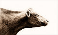
| 07/01/2011 11:40:13 AM |
Dunceby banmornComment: It's a funny take. It gives off that modern message on manhood... Women rule, men drool. I think it needs a more centered composition and the rotation looks off a hair, but it could be an illusion. |
| Photographer found comment helpful. |
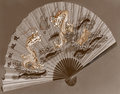
| 06/29/2011 11:30:03 AM |
Dance of the Dragonsby BrianRComment: It's rather a flat image due to the lack of range in tones. Also I think a hand holding the fan would have added a lot to the image! |
| Photographer found comment helpful. |
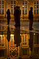
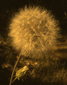
| 06/29/2011 11:25:59 AM |
#600519by rooumComment: High key and Sepia too! I thought you may be referring to an older image by your title, but apparently not...
 |
| Photographer found comment helpful. |
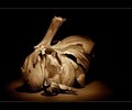
| 06/29/2011 11:24:39 AM |
Garlicby IreneMComment: Great lighting and wonderful use of form and shape to create something visually "appealing" if I can use a pun. The smaller garlic looks like a snail! Great sepia tones too. Lovely browns! |
| Photographer found comment helpful. |
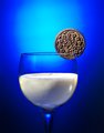
| 06/29/2011 11:17:13 AM |
O-R-E-O againby jbirkmanComment: Well I looked and saw a few oreo shots similar to this one so I don't know what the original was therefore I can't really comment on your improvement like I would like to for this challenge. However I can comment on this image. I am no lighting expert but the first thing that sticks out to me is the background highlighted area. I think it should be bigger. Also the choice of color lighting and the dark shade of it makes the picture look a little murky. I am kind of seeing some orange glow on the edges of the glass where the should be highlights from backlighting or side lighting. Other than those lighting issues, which I could not even come close to replicating, you have a clean, crisp image that makes me want to eat an oreo! |
| Photographer found comment helpful. |
| 06/29/2011 05:56:55 AM |
Summers Workby BaldurTComment: I think you really lost the whites in the toning process which makes the image look flat. There is less depth. |
| Photographer found comment helpful. |
Home -
Challenges -
Community -
League -
Photos -
Cameras -
Lenses -
Learn -
Help -
Terms of Use -
Privacy -
Top ^
DPChallenge, and website content and design, Copyright © 2001-2026 Challenging Technologies, LLC.
All digital photo copyrights belong to the photographers and may not be used without permission.
Current Server Time: 06/26/2026 11:40:52 AM EDT.