| Image |
Comment |
| 09/03/2011 07:27:59 PM |
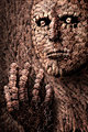
The Artisan by gyabanComment: Amazing! I assume you took some pictures of the hands and made some brushes. It is really cool and all the hands added to the pose and the look on the face give it an interesting emotion. |
 Photographer found comment helpful. Photographer found comment helpful. |
| 09/03/2011 07:27:54 PM |
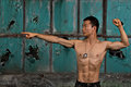
NEXT !!by BastaComment: Very even lighting. High quality image fit for a movie poster, etc... |
| Photographer found comment helpful. |
| 09/02/2011 03:18:08 PM |
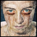
Sicknessby Jon_HComment: I think the processing is very well done. You have a great point of view and the eyes are incredible. One thing that I struggled with while working on my unsubmitted photo for this challenge was the blending of the texture with the skin. I think I am seeing the same thing here... I struggled with getting a good look around the transition of the jaw line to the neck and areas like that on the face including the lips and nose. I think there should be a very thin shadow under the jaw line that acts to separate the jaw from the neck. There should not be any texture going through the shadow line and the pattern at the neckline should not match with the pattern on the jaw. You have done a nice job on your texture at that point. (Sorry for being long winded...) |
| Photographer found comment helpful. |
| 09/02/2011 03:00:47 PM |
Eyes Wide Open...by Beni RodriguezComment: What great big eyes! I like the dark, gritty tones to this. I think I would prefer the composition of the subject to be in the top third of the photo, but that is more personal taste than something that is technically wrong. |
| Photographer found comment helpful. |
| 09/02/2011 02:58:44 PM |
Young Ladyby dtremainComment: Very good color, good contrast and DoF. Great pose! It looks to me like the focus is on her front shoulder so I am not interpreting this to be out of focus intentionally. Besides the obvious missed focus I feel the post processing was done very well. |
| Photographer found comment helpful. |
| 09/02/2011 12:08:19 PM |
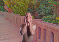
the scream redux or fear of public nudityby smardazComment: Straight from a dream! LI like what you did here. The only thing I can think of to critique would be the edge of the man cutout on the background. The back lighting on the man doesn't fit with the lighting in the background scene. |
| Photographer found comment helpful. |
| 09/02/2011 12:02:23 PM |
|
| Photographer found comment helpful. |
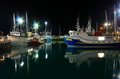
| 08/30/2011 08:21:26 AM |
East Coast Ruralby KarenNfldComment: Nice job getting the glassy water and keeping the boats from having motion blur! And hey, a little pop of lens flare in honor of next weeks challenge!! |
| Photographer found comment helpful. |
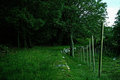
| 08/30/2011 08:20:25 AM |
Green Pathby mrbig65Comment: The bright blue sky doesn't quite say nightscape. I think you over exposed to get more light in your foreground and brightened up the twilight sky too much. Other than that, you have a nice leading line through the shot using the rock wall. Nice eye with that. |
| Photographer found comment helpful. |
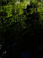
| 08/30/2011 08:17:49 AM |
Lake Stinsonby jjbeguinComment: Nice reflection. A little dark but I like the darker in the foreground but I like the darker green tones. The middle part of the photo has a great abstract look. |
| Photographer found comment helpful. |
Home -
Challenges -
Community -
League -
Photos -
Cameras -
Lenses -
Learn -
Help -
Terms of Use -
Privacy -
Top ^
DPChallenge, and website content and design, Copyright © 2001-2026 Challenging Technologies, LLC.
All digital photo copyrights belong to the photographers and may not be used without permission.
Current Server Time: 06/24/2026 12:46:44 PM EDT.