| Image |
Comment |
| 07/22/2002 01:02:00 PM |
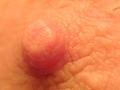
Chikubiby risu81Comment: the left side and the top of the nipple are too blurry, you should try and get everything in focus. and yes, i know that's tough with macros, but necessary for these kind of shots. the hairs are very distracting, and so are the dark specs below and to the right of the nipple that look like dirt. -- gr8photos (2) |
 Photographer found comment helpful. Photographer found comment helpful. |
| 07/24/2002 11:05:00 AM |
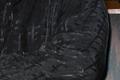
Slide Sleeveby IsaacComment: good idea for texture. i think i would've tried to crop this one a little more on the right to get rid of the background nd make this look a little more abstract. maybe also add a little more space to the left (if poss) to include the buttons more, they make a nice focal point. -- gr8photos (4) |
| 07/24/2002 12:13:00 PM |
Morning Rainby RipiComment: how do i know it's really morning? j/k. i'm sorry to say that this photo is not appealing to me at all, despite the fact that it is in focus, and the colors are ok (for the subject), too. there's just nothing to hold my interest, sorry. -- gr8photos (3) |
| 07/29/2002 12:26:00 AM |
Saggy Baggy by PatellaComment: awesome shot. congratulations on a very well deserved ribbon! |
| 07/23/2002 04:51:00 PM |
Saggy Baggyby PatellaComment: WOW! what great texture and colors, too. then there's the composition and crispness, i really have nothing to suggest to do differently here. definitely in my top 5 this week, well done! :) -- gr8photos (10) |
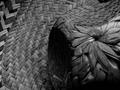
| 07/25/2002 03:35:00 PM |
interweaveby JenguinComment: nice texture. i wonder why you made this b&w? was it colored straw? otherwise color would've been nice. of course, i'm getting the same comments on my b&w entry this week and there was no way i could've submitted the color version ... so that may be the case here, too. the only other thing is that there's a lot of too dark areas right in the middle of your photo. would it have been possible to take the photo from a different angle, for example the area that is at the top where the lighting was more even? nice composition btw. -- gr8photos (5) |
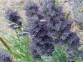
| 07/23/2002 05:54:00 PM |
soft textureby jimsappComment: your title implies that you may have chosen this soft focus deliberately. did you? for me, personally, it doesn't work. i would like to see more of the plants in focus. maybe (depending on what is to the right) to even take a shot further to the right so the plants in the left don't poke into the shot in the LL corner) and more of the leachen (sp?) texture in the UR corner to contrast the softness. just my 2cents. -- gr8photos (3) |
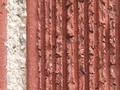
| 07/23/2002 04:50:00 PM |
Touch Me!by CowgirlComment: this is a great texture idea, and i like the title, even though i wouldn't want to touch, looks like i would hurt myself. the white strip down the side is good, too, what would've really improved your shot in my opinion is to use the unsharpen mask before posting. i just did this in an editing program and then the texture really popped out at me. -- gr8photos (4) |
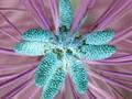
| 07/26/2002 04:33:00 PM |
Flourishby CheetahComment: i'm trying to figure out why you inverted the colors. i went and 'uninverted' them to look at your original picture and i liked those colors better. but then - that's just my personal taste. i did think you could see the texture there a little better. -- gr8photos (4) |
| 07/24/2002 11:10:00 AM |
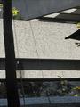
Trees shadowed like smokeby steelburComment: hm. i can see why you took this for shadow, and the lines make it a little more abstract. still, unfortunately, this shot doesn't look so interesting to me (subject wise) and i'm not sure what i would suggest as a change. sorry. -- gr8photos (3) |
Home -
Challenges -
Community -
League -
Photos -
Cameras -
Lenses -
Learn -
Help -
Terms of Use -
Privacy -
Top ^
DPChallenge, and website content and design, Copyright © 2001-2026 Challenging Technologies, LLC.
All digital photo copyrights belong to the photographers and may not be used without permission.
Current Server Time: 07/23/2026 02:54:16 AM EDT.