|
|
|
Showing 611 - 620 of ~1569 |
| Image |
Comment |
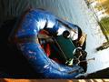
| 12/03/2002 04:53:00 PM | Collapsing Blueby bobgaitherComment: challenge ~ met
composition (content) ~ i'm sure you get asked this a lot, but did you deliberately submit this photo on its side? i'm assuming you did, but i have to admit that i don't quite 'get' why. i guess it's interesting that, even when rotated, the water level is not straight, and significantly not, so i'm sure that wasn't an oversight either.
background ~ like the reflections in the water, as well as the different tonalities of it. would like it to be just a little more exposed in the bottom left, but i suspect that wasn't possible w/out blowing it out in other places.
camera work (technical) ~ good focus and colors.
digital processing (technical) ~ no digital artifacts or anything like that, so you did a good job.
my opinion ~ i'm puzzled (i think that already came through in my comments ;) will check out your comments on monday.
~~ gr8photos Message edited by author 2002-12-13 16:34:50. |
| 12/02/2002 12:45:00 PM | abstract blueby shutterflyComment: challenge -- met technical -- totally nice white background (i love those) and colors are great overall composition -- high-key, neg. space & abstract all in one ... and it works! i like it. what am i looking at? a drink with a squirly straw? nicely done :) -- gr8photos |  Photographer found comment helpful. Photographer found comment helpful. |
| 11/11/2002 11:20:00 AM | What's the point?by goodtempoComment: wow, what a great idea ... the thumbnail immediately caught my eye! challenge -- met technical -- very well done. maybe just a tad too dark. the cropped off tips at the left are not quite straight, that give the whole shot a slightly tilted look. i also feel that the background color is a little too close to the silver tones of many of the tips. maybe just a little lighter, but not quite white? composition -- great idea. the arrangement works really well. -- gr8photos | | Photographer found comment helpful. |
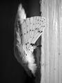
| 11/13/2002 11:52:00 AM | Laying in Waitby mjcecilComment: hm. you got me puzzled here. why rotated? challenge -- met technical -- good focus on wing, overall nice tonal variety, even though i'd like to see some real white. composition -- why on its side? i'm assuming this is a bug/moth/kind of thing. is it artificial? the head can't really be made out, and that would make a difference, i think, to see it. -- gr8photos. |
| 11/14/2002 12:32:00 PM | Go! Kings!by Wheeler1992Comment: challenge -- met technical -- the blurry orange part (ball?) in the background is a little too distracting for my personal taste. i like the clear focus o nthe texture on the kings. composition -- same comment as under technical about the ball. -- gr8photos. |
| 11/11/2002 12:05:00 PM | Vertigoby rdesaiComment: challenge -- met technical -- i wish this was just a tad crisper on my monitor, but good nevertheless. wish the lighting was a little more even (instead of dark on the right). composition -- classic use of ROT, and it works, too. good shot :) -- gr8photos |
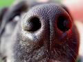
| 11/14/2002 01:44:00 PM | Noseyby MarshaComment: challenge -- now that's what i call a close-up & macro shot! :) technical -- totally wonderful. excellent detail on the nose, and the reflections really make it look like the damp cold nose it is. the focus is great, too, the nose almost pops out of the image. composition -- also very good. -- gr8photos. |
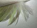
| 11/13/2002 02:59:00 PM | lovebird featherby amandolinComment: heh. i was going to enter a feather shot on white paper, too. :) challenge -- met technical -- i would like to see the background being more white and less structured so that the user is more focused on the feather's details. good focus overall. i think it's ok that some of the feather tips are out of focus, but i suspect you will get comments that don't like it. just different opinions. composition -- maybe cutting a little more off the bottom and adding a little more to the top would've balanced the picture a bit better, at the moment it seems a bit top-heavy to me. i like the overall concept of your crop though. -- gr8photos |
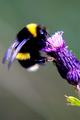
| 11/11/2002 12:24:00 PM | Bee on Flowerby arnitComment: i love bug shots! (i bet you are not hearing this very often here ;) challenge -- met technical -- the focus seems to be a little stronger on the flower than on the bee. a difficult thing to get right with the shallow DOF that digital cameras have in macro mode. i like the plain but not totally uniform background. overall colors are great, the purple tinge of the wings is nicely complemented by the flower. composition -- great. outside of this challenge, i would clone out those green bits at the bottom of the flower. good shot -- gr8photos |
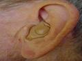
| 11/12/2002 06:19:00 PM | "The Better to Hear You With, my Dear"by kposeyComment: challenge -- met. definitely a close-up macro (you were covering both bases here, weren't you? ;) technical -- great clarity and focus. how did this look in b&w? the colors here don't do much for me (appears a bit yellow in places), which is why i'm wondering about b&w. composition -- good, even though i'd like to see the top of the ear, too. that's minor. the angle feels a bit funny, i think because the ear is diagonal in the shot. did you try portrait format? -- gr8photos. |
|
Showing 611 - 620 of ~1569 |
Home -
Challenges -
Community -
League -
Photos -
Cameras -
Lenses -
Learn -
Help -
Terms of Use -
Privacy -
Top ^
DPChallenge, and website content and design, Copyright © 2001-2026 Challenging Technologies, LLC.
All digital photo copyrights belong to the photographers and may not be used without permission.
Current Server Time: 07/21/2026 07:40:38 PM EDT.
|