| Image |
Comment |
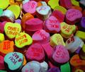
| 02/20/2003 12:49:36 PM |
Sweet Heartsby AnachroniteComment: Challenge met. Nice colorfult shot. I like how you've filled the whole frame with the little candy hearts as if they are going on forever. Nice DOF, too. |
 Photographer found comment helpful. Photographer found comment helpful. |
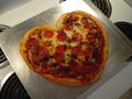
| 02/19/2003 03:42:30 PM |
Mama Miaby MajorChaosComment: What a cute idea. Definitely meets the challenge. Nice that you arranged this diagonally. I can't make up my mind whether I like the stove rings or not. The longer I look at this, the more I think I do. :) The only thing is the lighting, it's much lighter toward the back and there's a hotspot reflection on the baking sheet. But the pizza looks soooo yummy :) |
| Photographer found comment helpful. |
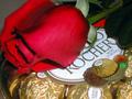
| 02/19/2003 01:17:28 PM |
Be Mineby Frank BeckmanComment: MMMMMMMM... my favorite chocolates. That alone should give you extra points. ;) I like the composition, the chocolates and the rose are cropped, the rose has a beautiful tone of red. I am wondering whether you took this photo too close up though, because it doesn't seem quite focused, and focus gets better towards the back. |
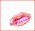
| 02/19/2003 01:15:20 PM |
A Kiss ...by nathaliedooComment: Challenge met. I bet you are getting comments about this not being a digital art website ... but I like your entry. The lips are placed well in the frame, and I like the different shades of reds and pinks. The white background is so difficult to achieve and you did it well. The red border just rounds things of nicely. I don't know what I would've done differently :) |
| Photographer found comment helpful. |
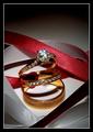
| 02/19/2003 01:13:55 PM |
Trinity by DavenitComment: Challenge met. I would've never thought of arranging the three rings with those ribbons, but that turned out very well. Need to add that to my list of things to remember for future photo ideas! You've got nice focus and controlled the reflections on the jewellery pretty well. While I admire the gradiant background you've achieved, I don't think it adds anything to the photo. Have you considered cropping down to the red ribbon (maybe just crop a bit off its highest point on the left). The borders work well here, overall a very good entry for this challenge. |
| Photographer found comment helpful. |
| 02/19/2003 01:11:33 PM |
His First Grade Sweetheartby OneSweetSinComment: I have to admit that "Love" does not come to mind when looking at this photo w/out the title, but I can see where you are going. Overall, the photo has some potential, but also some flaws that give it a "snapshot" kind of feel. I like how the girls are lined up in a row that flows diagonally through the photo. I like that most of them are wearing read which emphasizes the diagonal. Overall, the photo isn't quite as sharp as it needs to be and seems al ittle washed out. The first girl has a table behind her head that's distracting. A slightly different angle could've taken care of that. |
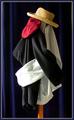
| 02/19/2003 01:09:04 PM |
Love on a Hat Rackby Pep VentosaComment: You made me smile with this one, what a funny idea, and perfect title to match :) Nicely arranged, just a little hot on the gray sleeve, and I would've used a flat background (or even just pulled the curtain in the background straight) to separate the object from the background further. Border works well, too. |
| Photographer found comment helpful. |
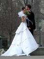
| 02/19/2003 01:07:35 PM |
A New Beginning by YomiComment: What a perfect entry for love ... wonderful dress, wonderful pose ... but she's got the flowers in front of her head and they are not looking at each other! Those two things probably would've made this the winning image for me, but they do hurt the photo some by not being there, sorry. I hope you took more photos that day. :) |
| Photographer found comment helpful. |
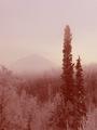
| 02/19/2003 12:59:15 PM |
Side By Side - Forever Togetherby jerrftComment: To me, this is a bit of a stretch for the challenge, love wouldn't necessarily have come to my mind w/out the title. But I can see where you were going, so I'll accept that. Composition-wise this is a good shot, the two trees are definitely the focus, and the mountain in the background gives the photo balance. I'm not sure about your choice of coloring. What did the original look like? How would it worked in simple b&w? I'd be curious to see those, maybe you'll post links after the voting is over. |
| Photographer found comment helpful. |
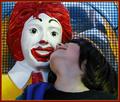
| 02/19/2003 12:57:06 PM |
Kids Love McDonaldsby GeneralEComment: Challenge met. Not the kind of love I had in mind when considering photos, but definitely a valid interpretation. Nice composition. The grid in the background actually makes it less distracting and the way the kid has it's head turned back to Ronald is just too funny. You can still see the grin on his face, too. Nice and colorful overall. |
| Photographer found comment helpful. |
Home -
Challenges -
Community -
League -
Photos -
Cameras -
Lenses -
Learn -
Help -
Terms of Use -
Privacy -
Top ^
DPChallenge, and website content and design, Copyright © 2001-2026 Challenging Technologies, LLC.
All digital photo copyrights belong to the photographers and may not be used without permission.
Current Server Time: 07/18/2026 06:01:42 PM EDT.