|
|
|
Showing 401 - 410 of ~1569 |
| Image |
Comment |
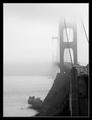
| 03/18/2003 11:43:05 AM | Golden Gate Bridge by byetkoComment: A Comment From The Critique Club
Hi Brian!
First of all, congratulations on your ribbon, it is well deserved, you submitted a spectaculare photo to the challenge. It'll be a pleasure to write a review, but I'm not sure how much I can suggest for improvements ... but I know that I'm tempted to go out and buy a ticket to San Francisco and finally see this bridge with my own eyes!
Your photo has a very dreamy/mystical feel to it because of the fog. This is enhanced by your choice of b&w and the nice use of negative space in the left of the picture. I like how the top of the bridge and the far end of the bridge simply melt into the fog, but the front is very clearly visible, and you can see all those 'little' cars.
Your photo is nice and crisp where the bridge isn't obscured by the fog, and you achieved a nice tonal range. The frame very nicely complements the picture.
The photo obviously meets the challenge. I hope it has a place on your wall somewhere because it deserves it. Keep up your wonderful work, I checked your portfolio and you have some incredible shots in there :)
Please let me know if you have any questions or comments about this review.
Franziska. |  Photographer found comment helpful. Photographer found comment helpful. |
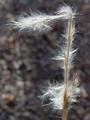
| 03/17/2003 04:14:06 PM | Decorative Numberby kandyjComment: A Comment From The Critique Club
I immediately loved those little backlit hairs on the plant, they are beautiful. The composition is nice, also, letting the eye wander nicely up and to the left of the plant and therefore leading the viewer through much of the photo. The plant is nicely complemented by the 'mottled' background. It is sufficiently out of focus to enhance, rather than distract, but it does add texture and interest to a photo that would've been plain without it.
The plant is nice and crisply in focus, however, the hairs are blown out in several places. It's nothing major that really detracts from the image, but bracketing your shot with higher and lower exposures could've gotten you one that was a little less overexposed without being too dark. I'd have to see it to be sure, backlit objects are hard to photograph and you did do a good job. There are no obvious signs of post-processing, so, whatever you did, you did well.
The photo easily meets the challenge, the 7 can be spotted immediately.
I really like simplistic nature images like this, and you should be proud to have spotted it ... to often we just walk past these things unseeing. Keep up the good work :)
Please let me know if you have any questions or comments about this review.
Franziska. | | Photographer found comment helpful. |
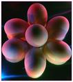
| 03/13/2003 04:46:06 PM | Technicolorby NatashaComment: A Comment From The Critique Club
Hi Natasha!
My first impression was that this is a very funky and creative idea and I was curious how you've achieved this photo. Then read your description and concluded that I would've never in a million years come up with that. Great idea :)
I like the composition a lot. The arrangement of the eggs combined with what seems to be multiple exposures makes the viewer wonder if this really is just one egg in different positions. I know it's not, but it is a thought that crossed my mind.
The background is mostly evenly black, which emphasizes the eggs and the different color lights on them further. There are a couple of colored streaks where the lights seem to have hit folds in your background material. I can't decide if I'd like it better with them or without, but I'm starting to think they add to the photo when I look at it longer.
Technically, this is also a good shot. Nice focus and DOF. Good coloring. Someone suggested shooting from straight above the eggs to eliminate the shadow under the eggs, I didn't initially notice them much, so it's not a big thing, but I think it's a good suggestion that makes for a slightly cleaner image.
I don't know if you did much for post-processing, so I don't have much to say about that one except I don't see anything wrong. I think I would've changed the crop a little bit to even out the distance of the eggs to the different edges, I think the crop on the right is a bit too close to the egg. The border works well, it compliments the shot without drawing the eye away from it.
Definitely meets the challenge.
In conclusion, I think you entered a really creative and effective photo in the challenge that I liked a lot, and so did a lot of the other voters judging by your final score. I really enjoy your submissions, keep up the good work :)
Please let me know if you have any questions or comments about this review.
Franziska. | | Photographer found comment helpful. |
| 03/13/2003 12:46:52 PM | | | Photographer found comment helpful. |
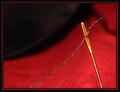
| 03/06/2003 01:06:55 PM | Oh No! And he'll be here in a minute!by Harz_JoergComment: A Comment From The Critique Club
First Impression
I hate sewing! :) I do like the black/red color combination though, and totally understand the feeling!
(1) Composition / Content
I like simple and effective photos like this one. The thread follows the line of the material which leads the user's eye through the photo nicely. The crease in the material on the right ensures that the eye is not just lead out of the photo, too.
(2) Background
Very plain and simple black. Often one of the most effective backgrounds to use for still life / set-up shots.
(3) Camera Work / Technical
My initial reaction looking at that photo was that I like the shallow DOF but would like just a tad more nonetheless, because the red material has such nice texture to add to the photo, and because the thread seems just a little bit soft, but I realize that you used the max aperture that your camera allows already. Would it have been possible to tilt the needle and thread to have it more parallel to the photographic plane and therefore in focus, too? It's not a biggie though, I was just wondering. There's a bit of glare on the needle that you could have toned down with a sheet or two of paper between your lightsource and the needle.
Continued below ... | | Photographer found comment helpful. |
| 03/06/2003 01:06:19 PM | Oh No! And he'll be here in a minute!by Harz_JoergComment: Continued from above ...
(4) Post-processing
The colors are really nice, and the border is just perfect for the picture. No signs of over-sharpening or compression, you did a good job.
(5) Meeting the Challenge
Yes, in your light-hearted way I can kind of see how it meets the challenge, although without the title I wouldn't have made the connection, and even then it is definitely more of a humorous approach and a bit of a stretch.
(6) My Opinion
A really nice macro shot, simple but effective with just minor details that could be enhanced a bit. I like it a lot. I suspect this would've scored much higher in a different challenge. Keep up the good work :)
Please let me know if you have any questions or comments about this review.
Franziska. | | Photographer found comment helpful. |
| 03/05/2003 05:40:06 PM | Strandedby RefocusedComment: A Comment From The Critique Club
First Impression
Wow, a wonderful abstract :) I wonder what it is? How large / small is it?
(1) Composition / Content
I really like letting my eyes wander through this photo to explore the curves and texture. You can see all sorts of things in there if you just look long enough. One type of flowers comes to mind (can't remember their name) or an eye. It is definitely recognizable that I'm looking at a snow drift here once I've looked at the photo closer. I still am not sure what's sticking out of the snow. Since I don't know what that is, I have no real sense of scale, either.
(2) Background
Perfect black background that wonderfully complements the snow.
(3) Camera Work / Technical
Taking photos of snow is very hard and you did very well. The snow is just a bit overexposed on the top, but you have a good tonal range throughout your photo. The lighting and shadows add a lot and enhance some of the texture nicely.
(4) Post-processing
Converted to b&w just fine, no processing artifacts visible, which is good. There are a couple of stray white spots (for example towards the bottom on the left). Not sure what they are, but worth cloning out now that the challenge is over.
Continued below ... | | Photographer found comment helpful. |
| 03/05/2003 05:39:14 PM | Strandedby RefocusedComment: Critique continued ...
(5) Meeting the Challenge
This is where I got stuck with this. To me, this photo does not say despair. That might be partially because I like snow, but I think mostly I associated despair with a human reaction. That might just be me though. ... Duh, I just read through the comments. Of course it is a car. Once you see that you wonder how you didn't realize before, but I was too much taking in by the details :) I think this is what hurt your score a bit, I bet it would've done much better in an abstract challenge.
(6) My Opinion
Doesn't quite meet the challenge in my mind, even though I now know what it is, but gets closer. But the photo is a fantastic abstract. Wonderfully done!
Please let me know if you have any questions or comments about this review.
Franziska. | | Photographer found comment helpful. |
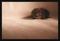
| 03/05/2003 03:37:36 PM | Huddled In The Cornerby inspzilComment: Critique Club Comment
First Impression
Such a cute kitten ... I adore cats. Not looking too happy though. Unusual color scheme for a cat photo, but I think it might just work.
(1) Composition / Content
Good placement of the kitten up against the back of the sofa, and also within the photo, using the rule of thirds. It works here, because it gives the kitten space to move into if it wanted to. This also emphasizes the feeling of isolation a bit.
(2) Background
The background is very unobtrusive and turns this photo almost into a monochromatic image, all shades of brown. The shadows break up the monotony which is nice.
(3) Camera Work / Technical
The picture is focused nicely, and not over- or underexposed. The backlighting throws a shadow on the cat which is ok for the purpose of this photo (to depict despair), but in other situations I would prefer to see the light from the left, this could also add some catchlights to the kitten's eyes, which I think would add to the photo.
(4) Post-processing
I think this picture could do with just a little increase in contrast to give it some more "umph". No signs of oversharpening or anything like that. The color of the border works well in keeping with the color scheme of the whole photo, but I feel it is a little too heavy for a photo of such a small kitten. | | Photographer found comment helpful. |
| 03/05/2003 03:36:14 PM | Huddled In The Cornerby inspzilComment: CC review continued ... for some reason I wasn't able to paste my whole review into one window ...
(5) Meeting the Challenge
The feelings (other than love for cats ;) that come to mind when I look at this photo are more of loneliness and being lost rather than despair. I don't think animal photos are easily used to show despair, it's more of a human feeling to me. But that might just be me.
(6) My Opinion
I have kind of mixed feelings about this photo. I don't think it fits the challenge, but it is a cute cat, and there are only minor things that I pointed out above that could be changed. I think the main reason for me to have mixed feelings is because I liked your entry into the stock challenge much better, the whole image was happier (more appropriate in that challenge) and reflects the playfulness of kittens better. Does that make sense?
Please let me know if you have any questions or comments about this review.
Franziska. Message edited by author 2003-03-05 15:38:04. | | Photographer found comment helpful. |
|
Showing 401 - 410 of ~1569 |
Home -
Challenges -
Community -
League -
Photos -
Cameras -
Lenses -
Learn -
Help -
Terms of Use -
Privacy -
Top ^
DPChallenge, and website content and design, Copyright © 2001-2026 Challenging Technologies, LLC.
All digital photo copyrights belong to the photographers and may not be used without permission.
Current Server Time: 07/18/2026 09:51:36 AM EDT.
|