|
|
|
Showing 391 - 400 of ~1569 |
| Image |
Comment |
| 03/21/2003 11:43:40 AM | |
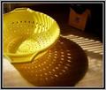
| 03/19/2003 06:12:05 PM | Strainer shadowsby nitro102Comment: Good idea, I like shadow plays. Removing the knife block in the background would make the background even less obtrusive. |
| 03/19/2003 06:10:38 PM | |  Photographer found comment helpful. Photographer found comment helpful. |
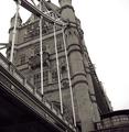
| 03/19/2003 04:55:02 PM | Under the Bridgeby SimmsComment: A Comment From The Critique Club
Hi Mark!
My immediate reaction was 'Home'! I lived in London for six years so it was exciting for me to see a photo of Tower Bridge :)
You've chosen a great subject, and you are doing it justice. Tower Bridge is very impressive and the angle that you have chosen is nice. I wonder what your original looked like, if it allows it I would suggest a slightly different crop: Leave a little more room at the top so that the tip of the tower at the front is visible. Crop the right side a bit more to remove the beginnings of the entrance sign. This would achieve a couple of things in my mind: balance the shape of your photo a bit more (at the moment it is squarish but not quite square, and that just feels a bit off when I look at it). It would also remove more white sky (which doesn't add anything to your photo) and the half-legible word (the viewer's eyes are always drawn to writing which in your photo is not the main subject). I do like the angle that you've chosen (not having the tower straight), and I noticed that the voters are divided on it. I think you did well choosing this angle because that avoids the converging lines issue by making non-vertical lines a feature rather than a problem. :)
Was it the sky that made you choose to go b&w (or slightly toned, I think, at least on my monitor here)? Whatever it was, I think the choice is an excellent one. Color photos of Tower Bridge are much more common and your choice of b&w sets your photo apart from the rest.
The tonal range and detail you have achieved in your photo is exemplary, you have everything from pure black to pure white and all the details in the bridge itself are nicely visible, and there are no blown-out or underexposed areas. The white sky is nice and simple and works well, but I still think it wouldn't hurt to see less of it (see my earlier comment above). Everything's nice and sharp, too. Good work.
The photo definitely meets the challenge, the bridge is the obvious (and only) focus of your entry. I like it very much, and overall, the voters did, too. This was a tough challenge with lots of good competition and I think you held up really well with your entry.
I just checked out your portfolio, b&w is obviously a favorite of yours and you do it well. I'm looking forward to seeing more of that from you :)
Please let me know if you have any questions or comments about this review.
Franziska. | | Photographer found comment helpful. |
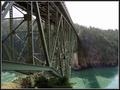
| 03/19/2003 02:05:47 PM | Deception Passby nitro102Comment: A Comment From The Critique Club
Hi Steve!
My very first impression on your photo was how the color of the bridge matches the water and just how high the bridge seems to be. Very cool :)
Your composition is good, I think under the bridge shots often work well, and it does here, too. The metal 'parts' make for interesting patterns without obscuring the landscape on the other side of the bridge. Your eye is lead all the way through the picture by following the bridge, and actually finds a 'resting place' on the other side, but doesn't wander out of the photo, because there's still space to the right. Well done.
The thing that lets your photo down a bit is the bland white sky. I know you can't exactly control the weather, and I don't know if you could've come back at a different time of day (that might also eliminate the shadow on the water), but a polarizing filter helps sometimes unless the sky is just a gray mass of clouds to begin with. If it is just a washed-out blue, the polarizer could be used to enhance the color. Another suggestion I've been given on bland skies is to simply exclude the sky from the photo altogether, but I feel that wasn't an option here for you.
The photo seems just a tiny bit soft, did you use unsharpen mask? If you didn't or usually don't (I know I didn't even know what that wasuntil after I started at DPC), it is best used after you crop and resize your photo, resizing it down makes it inherently a little softer, and unsharpen mask counters that. I believe there is a tutorial on this site, too. Your border nicely enhances the photo without being distracting.
Your entry definitely met the challenge, and has a lot of potential. There are some things that you could improve on further, if you live close enough to the bridge you might want to go back when the weather is better for photography and take another set of shots and see what a difference it can make.
Please let me know if you have any questions or comments about this review.
Franziska |
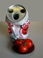
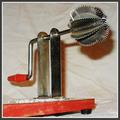
| 03/19/2003 01:25:59 PM | Grate Expectations (last hint)by GeneralEComment: Hi Paul :) Is this really a cheese-grater? Certainly different from others I have seen. Live and learn. Well, I like the angle in your photo a lot, but the two things I find pretty distracting are the shadow on your background (moving the grater further away or using alternate lighting could help) and the wrinkles and stains (above the part that fixes the grater to the base) are distracting. I like the border you've added to the photo. | | Photographer found comment helpful. |
| 03/19/2003 01:11:43 PM | Asiaby lionelmComment: So simple and so effective. Wonderful shot. My top 3 this week. :) | | Photographer found comment helpful. |
| 03/19/2003 01:11:22 PM | With Flavourby Pep VentosaComment: I love the soft colors on this one and the selective lighting. The plain background and simple border just add to it. One of my favorites this week :) | | Photographer found comment helpful. |
| 03/19/2003 12:54:10 PM | Perfect Dinnerby arnitComment: This shot is just phenomenal :) I love all the textures and colors and I'm drooling heavily while typing this, and that despite the fact that I've only just finished lunch! I could easily see this on the cover of a cooking magazine. The only minor nitpick I have right now, and it's not even a nitpick, but a suggestion, I guess, is to move the peppermill further to the right so that the fish doesn't melt into it. |
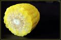
| 03/19/2003 12:44:23 PM | Yellow Zeroby karmatComment: A Comment From The Critique Club
Hi Karma!
My first impression was 'cool'. I liked the simplicity of the photo and the strong colors. Plus, I like corn, yummy. :)
Intuitively, I would've probably moved the corn to the right of the frame so, but I actually like your composition better. This way, you look immediately at the front of the corn, which was obviously the focal point for this challenge. I like that the corn is just a little bit at an angle.
The background is nice and black, except for right in front of the corn, you can see the texture of your background there. Maybe a less reflective surface, like a sheet of black cardboard could have avoided that. I do like it being so uncluttered and your use of negative space works well here.
You were obviously playing around with shallow DOF (a phase that I seem to be going through right now, too). I like the idea, but to be honest, I don't think it quite works for this photo. The right side of the corn is focused wonderfully, but not all of the cut is in focus, and that's a little distracting to me. I understand though that this is a trade off. Either increase DOF, have some of the cut OOF or move the corn so that the cut is parallel to the plane of the camera, and that would've destroyed your composition. I think a tad more DOF would be the answer, you would still have the soft blurring on the end of the corn, which, by the way, I like a lot.
As for your post-processing, I can't see anything obvious, so whatever you did, you did well. The borders that you have added also enhance the photo nicely.
Your photo meets the challenge ... the number zero. It could be argued that this one was man-made (or woman-made as the case may be) because you cut the corn that way, but none of the commenters mentioned that, so it's probably just me being picky.
Overall, I liked the shot, I think there are a couple of things that you could improve on (focus and the background), focus being the more important one of them. I think that's reflected in both the comments you got and your score. Regardless, this is a great shot that's also possible to recreate with different background and greater DOF would you feel so inclined. I think I might have to do more vegetable shots, there are wonderful things to be done with them ... thanks for the inspiration and keep up the good work :)
Please let me know if you have any questions or comments about this review.
Franziska. |
|
Showing 391 - 400 of ~1569 |
Home -
Challenges -
Community -
League -
Photos -
Cameras -
Lenses -
Learn -
Help -
Terms of Use -
Privacy -
Top ^
DPChallenge, and website content and design, Copyright © 2001-2026 Challenging Technologies, LLC.
All digital photo copyrights belong to the photographers and may not be used without permission.
Current Server Time: 07/18/2026 09:51:49 AM EDT.
|