|
|
|
Showing 371 - 380 of ~1569 |
| Image |
Comment |
| 04/28/2003 12:10:19 PM | |
| 04/28/2003 10:58:00 AM | |  Photographer found comment helpful. Photographer found comment helpful. |
| 04/25/2003 10:23:24 PM | KitKatby severinComment: Andrew, thanks for adding the description. I guess I just assumed that a cat would freak out or something (mine would) ... | | Photographer found comment helpful. |
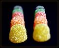
| 04/25/2003 03:00:37 PM | KitKatby severinComment: A Comment From The Critique Club
Hi Andrew,
what a colorful and clever idea. You didn't put any comments, but I'm assuming that you have the smarties on a glass table or similar and your cat is sitting underneath.
I wish I could take any kind of photos with one of my cats in it . . . they just never sit still when I want them to ;)
I really like how your kitty seems to be looking right at the smarties, I also like that the smarties are cropped around the edges so they seem to be going on forever. The yellow ones look a bit bright, almost blown out, but the other ones are fine, and I think this is a tough one because you have the really light colored and really dark colord in your photo, giving quite some contrast. Maybe taking the brown ones out (since they seem to be melting in the background more and don't have as much of an impact on a black background) and then adjusting your exposure a bit ... this might also make the blackground even darker.
I would also like to see a bit more of the cat, but see my previous comments about cat photography ...
Congrats on a very creative and good photo with a great title to match, I'm looking forward to seeing more from you in the upcoming challenges :)
Please let me know if you have any questions or comments about this review.
Franziska. | | Photographer found comment helpful. |
| 04/23/2003 12:41:35 PM | Pick Your Colorby RefocusedComment: A Comment From The Critique Club
Hi Lawrence,
it's been a while, I finally get to critique one of your photos again :) I really like your idea for this photo and it is perfect for the candy challenge. You have bright colors and a great pattern that seems to be going on forever. I also like how the lines break up towards the foreground and there are just a couple of smarties lying there. Much more effective than just filling the whole photo with M&Ms.
It's the technical side of things that let you down a bit . . . the comments were pretty consistent on that one and you already posted something about it, too. Focusing is hard for mirrors (I've done a couple of mirror shots myself), but I don't think that was really your problem. Your focus was either not quite right or you overprocessed the image afterwards (maybe a little of both?). Have you tried taking the original and just going through post-processing again to see if the photo looked better with less sharpening?
Regardless, DPCers don't often give high scores for photos where there are obvious technical imperfections, the score you got speaks volumes for the creative idea and setup and that the impact of the photo can to a point override the technical concerns. I certainly like your colorful creative approach to M&Ms a lot, I might just have to go out and buy a pack or so and see what I can come up with :)
Keep coming up with those great ideas for the challenges!
Please let me know if you have any questions or comments about this review.
Franziska.
Edited to change "smarties" to "M&Ms" :) Message edited by author 2003-05-12 09:54:34. | | Photographer found comment helpful. |
| 04/22/2003 04:47:59 PM | Simply Sinfulby GekkerComment: A Comment From The Critique Club
Hi Carey,
I'm not a big fan of Hershey's kisses, but you did manage to pick the one that I like best for your photo :) I really like the negative space and the reflection you used here. The background is flawless (nothing to distract), and so is the focus on the photo overall. The reflection from your lightsource on the kiss is a little stronger than I would like (you could fix that with some tissue paper between the light source and your subject and extended exposure time). I wonder what this would like with the little almond tag to the right (or alternatively with the negative space to the left of the kiss). At the moment, my eye wanders up that flag and follows its direction straight out of the picture.
All of these are smaller things though, overall, I like the very simple, almost elegant approach you took for the photo, which is underscored by you picking a golden-brown kiss rather than one of the more brightly colored ones. Definitely meets the challenge, and, based on the score, was well received. And deservedly so.
Just read through the comments, I think DennisF nailed it with the negative space. Since your background is so nice and evenly black, try cropping the right side and then extending your canvas (set it to black) to the left. See if you like it :)
Please let me know if you have any questions or comments about this review.
Franziska | | Photographer found comment helpful. |
| 04/21/2003 12:46:39 PM | |
| 04/21/2003 12:25:15 PM | Double Visionby crabappl3Comment: A Comment From The Critique Club
Hi Danny,
Me again . . . my second critique this week and both times on of your photos.
Well, this is another creative one. I had already read through the comments you got and your description of how you took this photo before receiving this for critique, and I'd be completely stumped as to how you did this if I hadn't read your description.
My favorite type of photos have a very simple blackground, you've done well with yours here, very nice and even black, also the perfect backdrop to really bring out the colors in the candy. I love how your focus for each of the candy lines is spot-on and how you can see the texture and everything. Because there are no visible shadows, your candy seems to almost be floating in space :)
I bet getting the candy in the two exposures to line up properly was hard and you did a good job. I would like to see the photo rotated CW just a tad so that the two yellow pieces are more level, but that's really the only area for improvement I can see (and even that one is somewhat nitpicky).
As in your other submission this week, your post-processing is great, the frame works well here.
A great submission that I enjoyed a lot for this challenge. You are truly on a roll, I look forward to seeing more fabulous photos from you in the coming challenges :)
Please let me know if you have any questions or comments about this review.
Franziska. | | Photographer found comment helpful. |
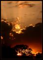
| 04/21/2003 10:32:08 AM | Burning Bush by crabappl3Comment: A Comment From The Critique Club
Hi Danny :)
Well, if I'm supposed to suggest areas for improvement then this is going to be a very very short critique. :)
First of, congratulations on your ribbon, it's very well deserved, this is a spectacular image. The title very aptly describes the image, I love how the sun is shining through the tree and almost gives it a halo that is then surrounded by black clouds and then above that you have yet another burst of color and rays, shooting straight up into the air.
I think that, other than the obvious dramatic quality of the photo, it is the somewhat atypical approach to a sunset that makes this shot. The vertical format is more unusual and the really dark clouds and lack of obvious horizon aren't part of the more standard sunset image, either.
The frame very nicely enhances the image. I'm always at awe when people manage to take photos that don't need a lot of tweaking, you certainly did that, too.
Again, congratulations on a very well deserved ribbon :)
Please let me know if you have any questions or comments about this review.
Franziska. | | Photographer found comment helpful. |
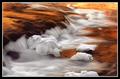
| 04/18/2003 01:08:17 PM | Red on the waterby terrentiusComment: A Comment From The Critique Club
Hi!
I'm always happy to get to write a review for a fellow D100 user, especially if it's for such a stunningly beautiful photo as yours. It has a really calming influence and the light dappling the water reminds me of happy summer days, and carefree living, playing by the water as a kid.
You managed to capture a wonderful combination of dappled light reflection on the water, the still water that lets you see clearly to the bottom, and the floating leaf that breaks the water surface in just a couple of places.
The whole photo (except for the floating leaf) consists mainly of muted shades of brown, these enhance and complement the orange/red of the leaf very well and really let it stand out, but also connect the background with it because the background consists mainly of leaves, too.
Using the ROT for the position of the leaf in the photo works well here. The sticks in the water, especially the one towards the bottom of the photo lead the eye to the leaf, then along the spine of the leaf towards the corner of the photo. This way, everything is looked at.
The sharpness and lack of reflections is amazing, especially looking at the long exposure. The water must have been really really still.
There's really nothing I would change about this photo, I love it just as it is. Congrats on your wonderful entry, and I'm looking forward to seeing more of your work on DPC :)
I just read through the comments you got after finishing this review and noticed that many people didn't like the light reflections, or thought that they were too much. I personally really like them and think they add to the photo. Other than that, the commenters all very much liked your entry and that shows in your final score, too. A good choice for the color challenge.
Please let me know if you have any questions or comments about this review.
Franziska. Message edited by author 2003-04-18 13:09:05. | | Photographer found comment helpful. |
|
Showing 371 - 380 of ~1569 |
Home -
Challenges -
Community -
League -
Photos -
Cameras -
Lenses -
Learn -
Help -
Terms of Use -
Privacy -
Top ^
DPChallenge, and website content and design, Copyright © 2001-2026 Challenging Technologies, LLC.
All digital photo copyrights belong to the photographers and may not be used without permission.
Current Server Time: 07/18/2026 05:49:11 AM EDT.
|