|
|
|
Showing 351 - 360 of ~1569 |
| Image |
Comment |
| 06/06/2003 05:08:17 PM | Loud!by jodiecostonComment: I don't have time to vote this week, but I just wanted to leave you a quick comment that I really like your photo. I can definitely see you getting a ribbon. It meets the challenge, and is technically very well executed. The high-key photo is nicely balanced by the black rim of the hat. Composition is unusual and works well. Congratulations on a wonderful photo :) |  Photographer found comment helpful. Photographer found comment helpful. |
| 06/06/2003 12:22:46 PM | Oldtimer by kiwinessComment: A Comment From The Critique Club
Hi Gary,
so I finally have time to do a few CC critiques again and I get started off with a winner, what a pleasure :) First impression: I'm stunned. What a wonderful photo full of character and details. I'll have a hard time suggesting anything for improvement ...
COMPOSITION - Very well composed. You filled the frame, got the background blurry but the main subject in perfect focus and still managed to have the guy just a bit off-center to give more room to the direction he is facing. Nicely done. Two tiny little nitpicks on the overall framing are that the collar is cropped off a bit on the left and, since the beard plays such a big role in this photo (at least to me), I'd love to see all of it in the frame, and not the last few straggling bits cropped out. But those are small, the essence of the photo is totally there, the expression on the guy's face, all the details ... great capture at just the right moment.
TECHNICAL - Wonderful. Great focus, and nice blurry background. Good tonal range. Plus, you chose a photo that really lends itself to the Duotone challenge. I bet this photo was good in color, too, but didn't have half as much impact.
POST-PROCESSING - It's well done if you can't see it :) The frame is nice and simple and complements the photo rather than distracting from it.
Overall ... congrats on your new camera and the well-deserved ribbon. I have the sneaky suspicion you'll be getting even more of them soon ... you have a good eye, talent and great equipment :)
Please let me know if you have any questions or comments about this review.
Franziska. | | Photographer found comment helpful. |
| 06/04/2003 09:43:09 AM | | | Photographer found comment helpful. |
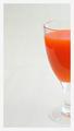
| 05/24/2003 03:05:40 PM | Carrot Juiceby agwrightComment: A Comment From The Critique Club
Hi Tony,
first of, let me congratulate you on your ribbon in the primary color challenge - your entry was beautiful and well spotted ... no setup ... a well deserved win!
And here, another beautiful image of yours, but totally different. I was instantly captured by the beautiful simplicity of the image, and how I could simply focus on what's there, no distractions, I really like it! Plus, it clearly contains orange, so it meets the challenge as well :)
COMPOSITION / CONTENT - The composition with the negative space and showing just half the glass works really well here, especially because the negative space has a very unobtrusive off-white color but has some texture that gradually disappears to the top of the photo but is clearly visible in the bottom half. The nice strong orange color of the carrot juice (yucky taste, but it does look good!) is emphasized further by the muted color of its surroundings.
CAMERA WORK / TECHNICAL - Nice focus, nice colors in your photo. Photographing glass is really hard, there are always reflections and such going on. You didn't do a bad job, but there is definitely room for improvement in your photo, especially because it's so simple and clean that reflections are drawing the viewer's attention even more. If you could have avoided the reflection just in the juice (which makes one half look lighter than the other), I'm sure the photo would look even better. I backlit my entry for the secondary color challenge (which I don't think would be suitable for your setup because the juice would be totally too dark), but the other thing I did was stand behind the camera (I used the tripod and timer to take the photo) with a black sheet of cardboard to eliminate some of the reflections in the background. I think that would've helped here, too.
POST-PROCESSING - No obvious flaws are always a sign of good post-processing, so you did well here, too. :) I agree with your choice of a very simple border, but I am not convinced that pure white was the best choice for it as it emphasizes that your background is more beige than white. I honestly don't have a suggestion as to what would've worked better. A one-pixel inner border in a different color sometimes just helps with the separation and then the white might work better. Maybe something for you to play around with further ...
Personally, I think your image should've scored higher. The reason it didn't might be the lack of a "wow" factor for people (based on the comments) and the strong competition that it was up against. I was just looking at the image some more (I often think of how can I copy the idea but still make it my own) and what strikes me is that the tip of a carrot peeking in from the bottom left of the image might have added a little bit of tension to the shot. Clearly, it wouldn't be the shot you had in mind, but an interesting variation to consider nonetheless, and you never know, something like that might just increase the wow-factor people felt was lacking a bit. I wouldn't change the composition because I really like it, but it might be fun to play around with some of the suggestions, too.
Please let me know if you have any questions or comments about this review.
Franziska. | | Photographer found comment helpful. |
| 05/24/2003 12:47:23 PM | Orange beautiesby kebbieComment: A Comment From The Critique Club
Hi Debra,
I really love tulips (I have orange ones in a vase at home right now) and I think they are a perfect subject for the secondary color challenge. My first impression (that I share with each of your commenters during the challenge) is that this seems to be a very pretty image but is too small to really appreciate or critique.
COMPOSITION / CONTENT - I like that you have focused in on several of the tulips as the main subject of your photo, and have cropped some of the ones around the edge, it gives the impression that I am seeing just a small part of a large field of tulips. The colors are vibrant and there seems to be a good tonal range.
CAMERA WORK / TECHNICAL - This is very hard to determine because of the size of the photo. I'll be happy to send you a separate critique if you post a larger version of the photo somewhere where I can leave comments or email me a copy at franziska.lang@lycos.com
POST-PROCESSING - The size is the ultimate thing to address. I looked at some of your other submissions that were sized just fine so I'm assuming this was just one of those oversights where you typed in the wrong number when resizing or uploaded the wrong version. Bad luck, it happens to the best of them, in future just double-check your submission :)
Good luck in your future challenges and have fun at DPC :)
Please let me know if you have any questions or comments about this review.
Franziska. | | Photographer found comment helpful. |
| 05/23/2003 04:37:34 PM | Intrigue_21702-pdm-whtype.jpgby GeneralEComment: I like the diagonals with the text here much better than your other entry with the orange and blue "corners" because here, they serve a purpose other than just blocking out some of the distracting background stuff.
Plus, I really like this photo anyhow, the little girl is so beautifully entranced by the music and the colorful musicians balance the girl's bright clothes perfectly.
Wonderful capture! :) | | Photographer found comment helpful. |
| 05/21/2003 12:53:43 PM | primary curvesby shutterflyComment: A Comment From The Critique Club
Hi Wendy,
I instantly liked your image when I saw it ... the very simplistic colorful curves are beautiful. Abstract, but not too abstract to recognize what I'm looking at.
CHALLENGE - Well, you used all the primary colors, so it most definitely meets the challenge.
COMPOSITION / CONTENT - The composition is very well thought out. On the right, each of the bowl meets the edge of the photo right about at a third, which makes the image very pleasing to the eye. It's the lighting though that makes this image special because other than the rim of each of the bowls, the rest seems to disappear into darkness, almost the same color as the background, but not quite.
CAMERA WORK / TECHNICAL - The focus seems to be just a little tad off in places to me, mostly on the blue bowl. Other than that, I can really just repeat that I like your lighting setup here.
POST-PROCESSING - A little more unsharpen mask would probably help my perception of parts being out of focus, and, even though I suspect you went with the more subdued colors to match the curves, a little more "pop" to the colors would look nice IMHO.
MY OPINION - Well, I just read the comments that you got, and I think I'm all in line with the voters that commented. You have a beautiful simple image here that met the challenge very well and deservedly scored well, too. Just a couple of post-processing steps would make this image even more outstanding. Great work!
Please let me know if you have any questions or comments about this review.
Franziska. Message edited by author 2003-05-23 17:54:10. | | Photographer found comment helpful. |
| 05/21/2003 12:40:39 PM | Mr. Swineys life in a bowlby boyte1Comment: A Comment From The Critique Club
Hi Anona,
a little late, but I finally finished the CC comment on your photo. Sorry about that. Sometimes, work just gets in the way when I've just requested an image ;-P
Anyhow. Let me start by telling you that I'm impressed as to how many challenges you've participated in, more than twice as much as me and you joined later. Wow.
CHALLENGE - This entry fits the challenge - there's a glass bowl in the photo - but it's really the fish that grabs the attention, not the bowl.
COMPOSITION / CONTENT - I like how you positioned the goldfish in the upper right corner so that he has room to "swim into the picture". The background/water/bowl also create some interesting patterns which I like.
CAMERA WORK / TECHNICAL - The biggest challenge about glass photography are reflections, I know I struggled with them for hours for my entry for the secondary color challenge. You did well here, because there are very few light reflections, nothing that's distracting. The goldfish seems overall a little dark to me, I think you used backlighting to illuminate this photo? Plus, I know this is normal for an aquarium, but the "stuff" in the water is a little distracting, too. Replacing the water before taking the photo probably would've done the trick.
POST-PROCESSING - I just opened your photo in MS Photo Editor and played around with the brightness, contrast and gamma a bit, and it's possible to make the whole image a bit brighter and the color of the fish pop a bit more without really blowing out the light background. I think that's the biggest change that would've increased your score a bit.
Overall, this picture definitely has several things going for it (the abstract background, the lack of reflections), and with a bit more care before and after taking the photo (clean water, post-processing) would've done better in the challenge. I personally don't think it's one of your best, but you have some great stuff in your portfolio and your submissions to the challenges. I especially like "Red One" from your recent portfolio additions. Good luck in the future challenges :)
Please let me know if you have any questions or comments about this review.
Franziska. | | Photographer found comment helpful. |
| 05/16/2003 04:47:37 PM | | | Photographer found comment helpful. |
| 05/16/2003 01:05:10 PM | welcome to georgiaby giseleComment: A Comment From The Critique Club
Hi Gisele, welcome to DPChallenge :)
My first reaction upon seeing your photo was a surprise of seeing peanuts. . . I'd heard of the Georgia peach but not that Georgia is also famous for its peanuts. You learn something new every day! But your photo does meet the challenge, having something typical from the state in it and a typical postcard slogan, too.
COMPOSITION / CONTENT - I like how you have arranged the peanuts in the basket with the cloth or napkin and how you cropped it. That part of your photo has a nice dynamic feeling because of it. The napkin goes perfectly with the background. I don't quite understand why the clock is there (but then, I also didn't know the reason for the peanuts), so I can't really comment on the fact that it is included in the photo. For me, it seems a bit out of place, not connected with the peanuts, but that might just be the missing context. I don't like the angle and crop on the clock so much. The tip is missing, and because it is such a little bit that's missing it looks a little accidental. Due to the angle you took the photograph from (from higher up), the clock also doesn't seem quite straight, which is very apparent when it is right at the edge of the photo.
CAMERA WORK / TECHNICAL - The image is nicely focused and the DOF is good, too. There are no heavy shadows (barely any shadows at all), which works well for a setup postcard. Overall, I seem to detect a little yellow tinge to the photo, that might be due to the light you used. Playing around with your whitebalance on your camera before you take the picture or desaturating yellow a bit in post-processing might alleviate this.
POST-PROCESSING - The font and size of text that you added is nice, personally, I would've considered splitting it up into two lines and moving it to the right so it doesn't overlay the clock. Also play around a bit with the levels and hues to make the image "pop" a little more, right now the colors look just a tad flat (that's always a drawback of that nice even lighting).
Overall, I agree with the comments you got ... a nice change from all the landscape postcards. Playing around with the post-processing a little more would probably improve the photo further.
Please let me know if you have any questions or comments about this review.
Franziska. | | Photographer found comment helpful. |
|
Showing 351 - 360 of ~1569 |
Home -
Challenges -
Community -
League -
Photos -
Cameras -
Lenses -
Learn -
Help -
Terms of Use -
Privacy -
Top ^
DPChallenge, and website content and design, Copyright © 2001-2026 Challenging Technologies, LLC.
All digital photo copyrights belong to the photographers and may not be used without permission.
Current Server Time: 07/18/2026 04:38:59 AM EDT.
|