| Image |
Comment |
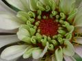
| 09/07/2003 10:55:36 PM |
My Wedding Bear Favorsby chunsumComment: Well, congrats on the upcoming event and also on a superb photo. One of my favorites this week. I like how they are all arranged a little differently and not neatly lined up, plus, you truly did fill the frame with all of them. Hope you get a ribbon as a wedding present :) |
 Photographer found comment helpful. Photographer found comment helpful. |
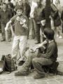
| 09/06/2003 09:00:17 AM |
Covent Garden Buskersby floydComment: Spectuacular image. And such a typical Covent Garden scene as well. You already got some very good comments, so there's not much I can add to them, other than I think in color this would've been too busy because I'm sure there's lots of different color in the clothing. On one hand, I wish the guitar-player would be turned more toward the camera so we can see his face, but I also love the way they are looking at each other to coordinate their playing, and since I can't have both, I think you have the made the right choice here, it's just not the typical choice. Fantastic image, very worthy pick for POTD, congrats :) |
| Photographer found comment helpful. |
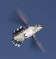
| 09/05/2003 11:43:39 PM |
80 Beats Per Secondby RefocusedComment: Wow. You have two totally different types of repetition going (the tail feathers in the traditional sense plus the beating wings) plus you have a wonderful photos of a hummingbird, which I know are extremely difficult to photograph. Awesome. A little more room to the right would be perfect (but even just getting the whole bird in the photo is an achievement, so I'm just nitpicking) Great job, even down to the catchlight in the eye. |
| Photographer found comment helpful. |
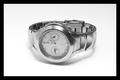
| 09/05/2003 11:39:19 PM |
Time repeats itselfby CheerzComment: Very nice watch / stock photo. You controlled the reflective surfaces extremely well. Nice focus, and centering the watch works here. I personally find the big black border too overbearing, maybe just a gray one? Most of all, w/out the title, I don't think repetition would've come to mind for me. In a stock photo challenge, this would've been one of my high scores. |
| Photographer found comment helpful. |
| 09/05/2003 11:37:38 PM |
Striking a Poseby RiderGalComment: Very cool. Definitely repetition. Caught at the right moment. I wish the focus wa on the first lady, not the second one. Plus, the bright yellow light on the right draws the eye away from the actual subject a bit. Would you have been able to change your location to be further right? Less direct light and the ladies wouldn't be quite so overlayed. But I understand that chances are that you weren't able to do that because of stuff outside the pic that we dont' see. |
| Photographer found comment helpful. |
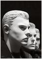
| 09/05/2003 11:32:21 PM |
Fashion line upby AnastasiaComment: Very cool, and meets the challenge. I love how the heads are all turned a little differently, and the strong directional lighting and resulting shadows add interest. Nice tonal range, b&w is a good choice. I'd like to see a little less black space at the top and maybe just a little more at the bottom (assuming there's nothing in the way). Gotta see it to be sure though. |
| Photographer found comment helpful. |
| 09/05/2003 11:30:00 PM |
Naturallyby katlynComment: Great idea for the challenge, lots of different repetitions going on. Unfortunately, I feel you are being let down by the technical aspect of your image. The lighting is nice and even (no shadows), the colors are quite good, but overall, there's no specific point that's really sharp, crisp and in focus. Don't know if it's beyond the limitations of the camera (are you too close) or somehow due to OOF and post-processing. |
| Photographer found comment helpful. |
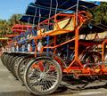
| 09/05/2003 11:28:26 PM |
Surrey, Surreyby JeileenComment: Great subject for this challenge. I like that the "bikes" are lined up pretty exactly and the colors. The somewhat OOF or fuzzy look of the image lets you down though. Not sure whether it's compression but I don't think so because the sky looks nice. |
| Photographer found comment helpful. |
| 09/05/2003 11:25:25 PM |
Archesby DigitalGravyComment: Definitely fulfills the challenge. Not the most attention-grabbing picture otherwise, though. I do like the perspective and all the different lines running through the image, not too thrilled by all the leaves on the pavement but it's not like you are going to sweep those up for a photo ... |
| 09/05/2003 08:37:34 PM |
Click Click Clickby SonifoComment: Interesting with the black background and the TV barely visible in the corner. Would've been a really good entry for the negative space challenge. Gotta admit that - w/out the title - this does not say repetition to me. Love the great range of tonality and b&w was definitely the right choice. |
| Photographer found comment helpful. |
Home -
Challenges -
Community -
League -
Photos -
Cameras -
Lenses -
Learn -
Help -
Terms of Use -
Privacy -
Top ^
DPChallenge, and website content and design, Copyright © 2001-2026 Challenging Technologies, LLC.
All digital photo copyrights belong to the photographers and may not be used without permission.
Current Server Time: 07/17/2026 11:20:34 AM EDT.