| Image |
Comment |
| 05/28/2002 08:53:00 AM |
The scholarby amnonComment: Great catch. I like how you got a little further down to his level. IMO, this photo would've had a lot more impact though if it had been cropped much tighter, to exclude the shutters in the back and have just teh walls and pinkish doors as the background. That would've also moved the scholar out of the center of the shot and made it follow the ROT. |
| 05/29/2002 01:16:00 PM |
Young Cowboyby nbortonComment: Now, I generally prefer to see faces in the "people" shots because they say so much about people, but this one's an exception. I really like the shot. Two things that would've made this one perfect (and that may not have been possible, since I can't see outside of the photo) is if the kid to the left wasn't in the shot (could you have the boy standing up on the left of your shot and then include more of what's to the right?). For some reason I imagine he should be on tip-toes to try to look over the bar in the fence. |
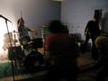
| 05/29/2002 01:17:00 PM |
kite flying societyby heartsdivideComment: I'm assuming the title is the name of the band? IMO, this photo is too dark (especially with the blurry person in the foreground blocking much of the center) and blurry. Maybe more light, a higher ISO setting (if your camera allows that)? My eye keep on trying to move around the center (front figure) to find something to focus on. |
| 05/29/2002 09:30:00 AM |
the wisdom of morpheusby jonathansComment: Hmm. Not quite what I expected for a people challenge. I expected to see at least a face somewhere in the shot. I probably just don't get it. Technically a good shot. |
| 05/21/2002 02:43:00 PM |
The Pitchby AnAUTigerComment: Nice. There weren't too many sport shots (and I'm guilty of not submitting one, too), so this makes a nice change. I like the framing, too. A couple of things to consider next time are that the photo doesn't seem to be quite level, and (if that was possible) to move a little further to the right so that the whole background is the screen, and not the stopsign and trees poking through on the right. That would've also given you a slightly more sideways view of the player in the front of the photo. |
| 05/23/2002 12:08:00 PM |
Game On...by AleciaComment: I think this is one of the shots where color would worked better than b&w, at least IMO. The lighting is a little bit too harsh, too light in the middle, too dark on the edges. I do like the angle and composition of the shot. |
| 05/21/2002 07:36:00 AM |
|
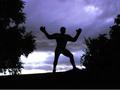
| 05/20/2002 02:07:00 PM |
Let the Games Begin!by cameoComment: I have to admit that I prefer some of the other sport-silhouette shots that were entered this week. You have a great sky there, but overall the picture is a little blurry and grainy (camera?) for my liking. |
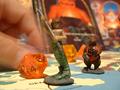
| 05/20/2002 01:53:00 PM |
Dungeons and Dragonsby eddyComment: IMO, this would've worked better if the middle figure was also in focus (maybe just move back to be on same level as die) and if the background was a little less busy so it's less distracting. |
| 05/21/2002 02:40:00 PM |
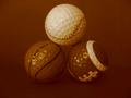
Everything Comes Back to Golfby BdaleBlueDemonComment: Nice subject for the challenge. One thing that IMO would've worked a little better is a different color background that gives you more contrast compared to the bottom two golf balls. How would placing these on the lawn have worked? That would've also given you natural light, and maybe reduced the light reflections a little. Just a thought. |
Home -
Challenges -
Community -
League -
Photos -
Cameras -
Lenses -
Learn -
Help -
Terms of Use -
Privacy -
Top ^
DPChallenge, and website content and design, Copyright © 2001-2026 Challenging Technologies, LLC.
All digital photo copyrights belong to the photographers and may not be used without permission.
Current Server Time: 07/17/2026 12:30:24 PM EDT.