| Image |
Comment |
| 06/14/2002 12:12:00 PM |
(Soon to be) On the roadby sheyingshi88Comment: Great action shot. Caught in just the right moment. Would've done well for stop action, too. I see how you are tying this to the road, but in my mind that's a very loose connection. Some post-process sharpening would've done this picture good. |
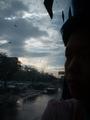
| 06/12/2002 12:54:00 PM |
sadness on the roadby karutuneComment: This image is entirely too dark on my monitor. I looked at it in some photo editing software and there was so much more detail than is visible here. I also don't quite get what's so sad about what's going on on the road (other than the rain maybe, but I like rain sometimes). Colors of the sky are great. |
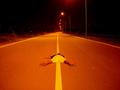
| 06/14/2002 01:25:00 PM |
Waitingby eesserComment: Did you consider having the car face the road closed sign, rather than face away from it? I think that would've made more of an impact to me. Also, a driver in the car would've been a nice addition. Still, like how the car is positioned in the shot. |
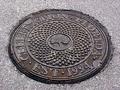
| 06/14/2002 03:08:00 PM |
8 Years Youngby CreativeFlyPhotoComment: Nice textures in this one. I think it would've been a little more abstract and interesting if you hadn't included all of the manhole cover, but just parts of it. Btw, I have a thing about manhole covers (my Dad does charcoal rubbings of them) so I was glad to see one in the competition. |
| 06/14/2002 11:14:00 AM |
roadkillby eadwineComment: I KNEW there'd be a roadkill shot in here somewhere! Very funny. |
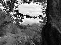
| 06/04/2002 01:07:00 PM |
Mountain Through Treesby janfriesComment: Nicely framed by the tree. Good contrast between sky and tree, mountains are great, however, the foreground lacks contrast. This may be a candidate for "color is better" (outside of this challenge of course...) |
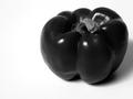
| 06/04/2002 08:25:00 AM |
red pepper on whiteby dmwardComment: Now this is a shot that I would like to have taken. Usually done (and done well) in color, it is very intriguing in b&w. Well executed! :) I would probably have cropped just a tad more off the top (outside of this challenge of course) to emphasize the ROT. |
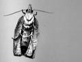
| 06/03/2002 02:52:00 PM |
Mothraby mciComment: I like using the ROT rule, too, however, IMO it works better (in most cases) if there's something in the background. Also would like to see just little more DOF. Interesting angle though. Could've used that for upside down as well! |
| 06/07/2002 11:33:00 AM |
Grevy on a Sundayby PatellaComment: I'm not sure . . . I think this one would look better in color! J/k. To be honest, I can't make up my mind about this one. It's a great b&w subject, an interesting composition, technically ok, but for some reason I can't pinpoint why I'm not excited about it. I think it's just a tad too busy for me. No points deducted for my indecision though. |
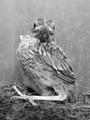
| 06/04/2002 10:10:00 AM |
Mommy!!by timj351Comment: Wow, those legs look HUGE from this angle. I like this shot. How did it work in color? If it hadn't been for the challenge, what would you have gone with? My one nitpick (and I don't know whether color would've corrected that or not) is that the feathers on the head almost disappear in the background. They would've made a nice addition if they were a little more pronounced. |
Home -
Challenges -
Community -
League -
Photos -
Cameras -
Lenses -
Learn -
Help -
Terms of Use -
Privacy -
Top ^
DPChallenge, and website content and design, Copyright © 2001-2026 Challenging Technologies, LLC.
All digital photo copyrights belong to the photographers and may not be used without permission.
Current Server Time: 07/17/2026 10:16:31 PM EDT.