|
|
|
Showing 1101 - 1110 of ~1569 |
| Image |
Comment |
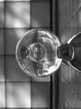
| 07/08/2002 10:00:00 AM | knobs by snsComment: steven, this was my favorite this week, very well done :) |
| 07/02/2002 12:08:00 PM | knobsby snsComment: this is just simply totally awesome. i have nothing to suggest by ways of improvement. my top photo this week. -- gr8photos (10) |
| 07/01/2002 04:43:00 PM | Earth Stemby darylbrownComment: nice composition, i like the symmetry of it. fulfills the challenge for sure. did you deliberately make this so grainy? if not, check out the tutorial on tips on how to best save your file for max. quality and using the whole allowable file size. picture also seems a little soft. -- gr8photos (3) |
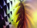
| 07/07/2002 11:42:00 PM | Sun-Flowerby GangreenComment: wow, what more can you ask for transparency, color, and distortion. very cool. no suggestions for change. my top 10 this week -- gr8photos (9) |
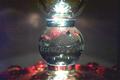
| 07/02/2002 11:59:00 AM | Crystal Lightby samwiseComment: that crystal is great. you may be getting comments that it needs to be cleaned, but i think the texture adds a lot. what i find rather distracting in this photo is that wavy diagonal thing going across the photo. i just can't quite figure out what it is. i'm sure it's important (it's too obvious to be missed while taking the photo), i just don't get it, and therefore to me it's distracting. -- gr8photos (5) |
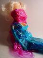
| 07/01/2002 02:53:00 PM | Transparent Personalityby kvocklerComment: hm. i guess technically this is a good photo. composition is ok, it's in focus, not too dark or too light. i also see your point of humor, but somehow the picture doesn't grab me and i'm trying to figure out why. maybe it's because the wrap (can't remember the brand name) is kind of used as clothing, but not really. one arm is wrapped in, the other almost tied up in the air. i guess it looks a little haphazardous to me. but then, that's just my opinion, other's may be thrilled and may get it more. (gr8photos - 3). |
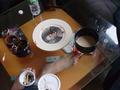
| 07/02/2002 09:46:00 AM | naturmortby leshiyComment: geez, you are even more messy than me! ;) your table is great for this challenge, the feet under the glass add a nice touch. not a shot i would hang on my wall though. -- gr8photos (5) |
| 07/01/2002 04:09:00 PM | |
| 07/01/2002 11:04:00 AM | THEN and NOWby RedRuthannComment: I just tried to check out your new version of the photo but couldn't find it in your gallery. Hm. Which of your galleries did you put the photo in? |
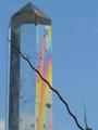
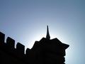
| 06/17/2002 04:18:00 PM | haloby mnewmanComment: I don't know how the shadow vs. sillhouette discussion ended in the forum, but I'm firmly in the 'they are not the same' camp, so in my mind, you didn't really meet the challenge. For a sillhouette shot though, I really like this one. Interesting shapes, nice contrast, like the white just behind the tower that slowly turns to blue as you get further away. |
|
Showing 1101 - 1110 of ~1569 |
Home -
Challenges -
Community -
League -
Photos -
Cameras -
Lenses -
Learn -
Help -
Terms of Use -
Privacy -
Top ^
DPChallenge, and website content and design, Copyright © 2001-2026 Challenging Technologies, LLC.
All digital photo copyrights belong to the photographers and may not be used without permission.
Current Server Time: 07/19/2026 10:46:32 PM EDT.
|