| Image |
Comment |
| 09/24/2003 10:30:13 PM |
|
| 09/24/2003 10:22:42 PM |
|
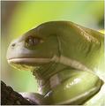
| 09/24/2003 08:53:52 PM |
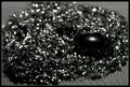
Taking the rough with the smoothby NatatorComment: There is enough detail on the smooth object to see that it is perfectly focused, in contrast to the rough material. This parallels the contrast between rough and smooth that is the subject of the photo, adding depth to the meaning of the image. Well done. |
 Photographer found comment helpful. Photographer found comment helpful. |
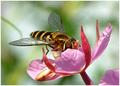
| 09/24/2003 08:48:00 PM |
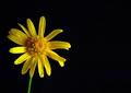
Macroby tattoorlgComment: The soft focus of the flower doesn't match the striking contrast with the black background. |
| 09/24/2003 08:44:17 PM |
|
| Photographer found comment helpful. |
| 09/24/2003 08:42:24 PM |
|
| Photographer found comment helpful. |
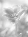
| 09/24/2003 08:40:20 PM |
Flowerby KoriyamaComment: I don't care for the high key approach here; it makes it look too washed out. |
| Photographer found comment helpful. |
| 09/24/2003 08:33:54 PM |
|
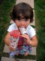
| 09/23/2003 08:32:53 PM |
The Good Lifeby ashadisComment: Great photo! Her pose is perfect; with those wide eyes and offering to share you can't be mad at her! All the colors work well together. Shooting from above distorts the model's shape a bit, but gives the photo an adult vantage point and adds to the effect. I love it. |
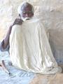
| 09/23/2003 07:54:02 PM |
Who Am I ?by gotomarksComment: Intriguing photo. Good color, OK composition. The dark tones need to be darker to show his skin better and increase the contrast a bit (but use Levels or Curves, which will keep the nice high key approach, not Contrast which would reduce details in the light areas). |
Home -
Challenges -
Community -
League -
Photos -
Cameras -
Lenses -
Learn -
Help -
Terms of Use -
Privacy -
Top ^
DPChallenge, and website content and design, Copyright © 2001-2026 Challenging Technologies, LLC.
All digital photo copyrights belong to the photographers and may not be used without permission.
Current Server Time: 07/17/2026 07:14:20 PM EDT.