| Image |
Comment |
| 10/22/2003 10:06:36 PM |
|
 Photographer found comment helpful. Photographer found comment helpful. |
| 10/22/2003 10:03:19 PM |
|
| Photographer found comment helpful. |
| 10/12/2003 08:41:59 PM |
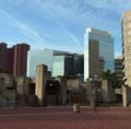
Blue Skies over Red Bricksby coolharComment: Nice array of shapes, colors, and textures. Hard to tell what the center of interest is; maybe it doesn't need one, but I'm having a hard time deciding what this image is about. The blue and red of the title are at the top and bottom of the image, separated by several layers of structure, so that doesn't seem to be it. |
| Photographer found comment helpful. |
| 10/12/2003 08:31:24 PM |
Al-Khobarby KhalidComment: Great composition. I like the variety of textures captured in this photo. It's a bit soft, which combines with the warm colors to convey a peaceful feeling. But I'd prefer a little sharpening to enhance the textures. |
| Photographer found comment helpful. |
| 10/12/2003 08:20:48 PM |
Oklahoma Urban Landscapeby IanPComment: The interesting shape of this oil rig makes an interesting silhouette. I don't really call it a "building", though. |
| Photographer found comment helpful. |
| 10/12/2003 08:14:19 PM |
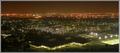
Gothenburg By Nightby MikaelComment: Although the clouds are nice, the city lights (the real subject of this image) are burned out and blend into each other. |
| Photographer found comment helpful. |
| 10/12/2003 08:08:44 PM |
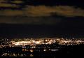
Indigo City Morningby DebN2003Comment: A unique high key, high contrast approach. You've executed it well; the elements are easily recognizable, yet the image has a nice abstract quality to it. |
| Photographer found comment helpful. |
| 10/12/2003 07:48:18 PM |
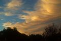
Urban SKycapeby yamahondamomComment: Beautiful patterns and colors. Good composition. Some noise, but it doesn't detract from the image. Nice photo. Doesn't meet the challenge, despite the clever title. |
| 10/12/2003 10:09:25 AM |
Eyes to the Skyby dsidwellComment: The mutual reflections create an interesting texture that contrasts well with the other textures in the image. The circles add yet another interesting element and are well placed at the bottom of the image. |
| Photographer found comment helpful. |
| 10/12/2003 10:03:59 AM |
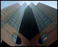
Andie's at Emerald....by undieyatchComment: The lighting is a bit harsh, but the symmetrical composition works well. The Andie\'s banner provides a needed contrast to the rectangles so prevalent in the image. |
Home -
Challenges -
Community -
League -
Photos -
Cameras -
Lenses -
Learn -
Help -
Terms of Use -
Privacy -
Top ^
DPChallenge, and website content and design, Copyright © 2001-2026 Challenging Technologies, LLC.
All digital photo copyrights belong to the photographers and may not be used without permission.
Current Server Time: 07/19/2026 02:28:10 AM EDT.