| Image |
Comment |
| 11/25/2003 11:33:05 PM |
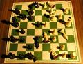
All the King's Men...by kashyapaComment: Greetings from the Critique Club!
I don't get a clear message from this photo. Including all the men, some of them on their sides, gives the impression of a chaotic battle in progress. The paper board gives a feeling of superficiality. Yet the pieces are arranged nearly symmetrically, which suggests planning and deep purpose. The overall yellowish hue could represent optimism, cowardice, or several other things; or maybe the white balance was just set wrong.
Technically this is well done. The lighting is very dramatic, as pointed out by many previous comments. I find it interesting how the shadows of the light pieces seem lighter than the shadows of the dark pieces. The focus and exposure are fine. I think a little sharpening would improve the image overall, but again don't know the message so can't say for sure. |
| 11/24/2003 11:27:11 PM |
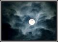
The Witching Hourby WildflowerJoyComment: Greetings from the Critique Club!
This is a very dramatic image. The backlit clouds have a wonderful shadowy texture that shows very well here. The bright, featureless moon adds the final touch that gives the intended occult feeling suggested by the title. The softness and noise add mystery. The composition works well; the dark cloud at the left is balanced by the moon being just to the right of center. A "rule of thirds" composition would have made a lovely photo, but the nearly centered moon gives this image more drama.
The photo does have some minor weaknesses. The dark cloud at bottom left is blotchy; it might be improved with a slight contrast adjustment (or Curves could give even more control). The border is a bit too much; just the black outside border would have enough, but the white distracts from the moon's brightness. |
 Photographer found comment helpful. Photographer found comment helpful. |
| 11/23/2003 08:02:37 PM |
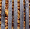
Corn will be free one dayby ajacoubComment: It's nice to see a humorous entry! Good composition, especially including the cob trying to escape. Interesting textures in the corn and wood; a little sharpening would help bring them out more. |
| Photographer found comment helpful. |
| 11/23/2003 07:52:32 PM |
Magnificenceby Euke_of_EarlComment: The soft focus gives this image an impressionistic feeling that I like. But it lacks contrast and seems to have a color cast. |
| 11/23/2003 07:45:37 PM |
|
| Photographer found comment helpful. |
| 11/23/2003 07:38:47 PM |
Fallenby mediamstComment: Good composition, and the overall blurriness gives a reflective mood. |
| 11/23/2003 07:35:00 PM |
|
| Photographer found comment helpful. |
| 11/23/2003 07:31:44 PM |
"money doesn't talk it swears...propaganda all is phony."by ColeyComment: I don't really understand how it relates to the title, but I like the photo. A simple, effective composition with nice dramatic lighting. But it is ruined by low quality compression. You should use the highest quality setting in your camera, and the highest quality that keeps the file size under 150K for the final submitted image. |
| Photographer found comment helpful. |
| 11/23/2003 07:18:26 PM |
Buy MY Cigarettes!by fishstix_666Comment: The digital noise enhances the message of this photo, but the Noise Filter is acceptable by DPC rules and gives a more uniform (and less distracting) result than the compression artifacts it looks like were used here. |
| 11/23/2003 07:04:20 PM |
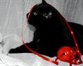
The Cat Who Saw Red by Lilian Jackson Braunby ladpupmoeComment: Greetings from the Critique Club!
The red ribbon and bell adds a nice splash of color that adds impact to the image. The white background is a great contrast with the black cat, but produces such a wide tonal range that it is difficult to photograph well. And indeed, all detail is lost in most of the cat; it is just solid black, with no texture. Exposing the cat properly would have overexposed the background, but I think this would have been preferable.
The cat's pose is great and the image is well focused, although some sharpening would bring out the textures (where they exist). The composition is lacking in two ways. First, the picture needs more space at the top, both to get the entire ears and to provide vertical balance. Most importantly, the bell is large, bright, and red; it is the first thing the viewer sees in the photo and it holds his or her attention, stealing the center of interest from the cat. There is plenty of red in the ribbon alone to provide the needed impact; the image would have been better without the bell. |
| Photographer found comment helpful. |
Home -
Challenges -
Community -
League -
Photos -
Cameras -
Lenses -
Learn -
Help -
Terms of Use -
Privacy -
Top ^
DPChallenge, and website content and design, Copyright © 2001-2026 Challenging Technologies, LLC.
All digital photo copyrights belong to the photographers and may not be used without permission.
Current Server Time: 07/19/2026 10:47:13 PM EDT.