| Image |
Comment |
| 12/13/2003 11:31:24 PM |
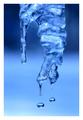
Winters Tear Drops by scab-labComment: Great timing! The contour of the icicle leads the eye to the drops, which are beautifully shaped. Nice color too. |
 Photographer found comment helpful. Photographer found comment helpful. |
| 12/13/2003 11:10:36 PM |
|
| Photographer found comment helpful. |
| 12/13/2003 11:06:30 PM |
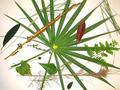
Shape of Leaves to Comeby kayceeComment: The assortment of small leaves is nicely arranged to complement the large leaf. They don't detract from it, but keep it from being too stark. |
| Photographer found comment helpful. |
| 12/13/2003 10:48:40 PM |
|
| Photographer found comment helpful. |
| 12/13/2003 10:34:36 PM |
Just a Dropby TerryGeeComment: The shape of the negative space is as interesting as the shape of the subject. Very nice! |
| 12/13/2003 01:26:28 PM |
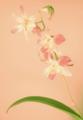
Fading Beautyby TerryGeeComment: Greetings from the Critique Club!
Soft focus combine with high key and low contrast to make this image convey a transcendent, tranquil beauty. The background color is perfect for this message. The composition is just right. The leaf is close enough to the bottom of the frame that it doesn't draw undue attention, but provides support and context for the flowers. The bud going to the right at the top nicely balances the left-facing flowers.
Overall, a wonderfully sublime image. I like it very much. My only suggestion is to ignore those who would prefer a more conventional photo, which may indeed be beautiful but would lack the ethereal, spiritual effect you have succeeded in capturing here. |
| Photographer found comment helpful. |
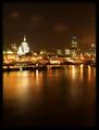
| 12/13/2003 10:39:07 AM |
Soft Watersby jonpinkComment: Greetings from the Critique Club!
The first thing that I notice when viewing this image are the beautiful warm colors. They draw me right in and work, along with the soft focus and predominantly horizontal lines, to give the photo a very peaceful feeling. The exposure and focus are great, and the sharpness (actually the lack thereof) is well controlled. The composition is lacking; putting the horizon right in the middle of the frame makes the photo seem split in half. The subtle clouds are very nice, but I think the overall photo would be more effective if most of the sky was cropped out. This would raise the horizon and make the buildings a more integral part of the photo. I also think it would have been better in a horizontal format (not cropped--the reflections are an essential part of the composition--but more expansive, including more buildings to the right and/or left). |
| 12/07/2003 11:39:36 PM |
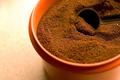
Fuel of the Dayby KINGComment: Greetings from the Critique Club!
Like several others, to me this looks more like dirt in a flower pot than coffee. The "rule of thirds" composition works well here, putting the center of interest at the coffee in the scoop. The shadows in that area are entirely black, with no details; this helps to frame the coffee in the scoop, making it stand out from the rest of the coffee, even though it looks much the same. The different textures of the focused and unfocused coffee adds interest. But not that much; in the end I agree with your own assessment: the photo lacks excitement. It needs some variety to create some impact; something as simple as a metal scoop would be beneficial. |
| Photographer found comment helpful. |
| 12/06/2003 12:14:08 PM |
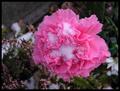
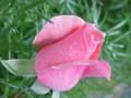
Pinky Roseby HariCoelhoComment: Greetings from the Critique Club:
This rose is nicely presented. The pink color and mottled texture are captured very well. The narrow depth of field blurs the background, making it less obtrusive. Unfortunately, the background has some very light shapes, so it is still a bit distracting. There is a lot of noise throughout the image. I'm guessing it's due to high jpeg compression; you might check to see if your camera has a high quality setting. Fortunately the noise on the rose is prevalent only in the shadows and edges, giving the overall photo a pleasing effect. |
| Photographer found comment helpful. |
| 12/05/2003 06:10:43 PM |
Subtle Nuances Surprise Me Most ! Indians?by MonaComment: Greetings from the Critique Club!
I think I see the Indian head: the long vine that crosses the window is the top of his head, the vines to the left are feathers, and the shorter vine below is the top of his ear. Right? It's fun that you saw it and made it into an image, and I confess that it was fun when I solved your puzzle (although I wasn't particularly surprised, probably because unlike you, I knew something must be there). If that's what you wanted to accomplish with this photo, you succeeded!
This image is loaded with lots of interesting colors and textures: leaves, smoke, grass, and several textures of wood to name a few. And the technical things like focus, exposure, contrast, and sharpness are great. But there is no center of interest; nothing grabs the viewer's attention and entices him to stay and look around except the hope of finding a hidden Indian. And he is very subtly hidden indeed. |
| Photographer found comment helpful. |
Home -
Challenges -
Community -
League -
Photos -
Cameras -
Lenses -
Learn -
Help -
Terms of Use -
Privacy -
Top ^
DPChallenge, and website content and design, Copyright © 2001-2026 Challenging Technologies, LLC.
All digital photo copyrights belong to the photographers and may not be used without permission.
Current Server Time: 07/19/2026 10:47:17 PM EDT.