| Image |
Comment |
| 01/04/2004 10:54:53 PM |
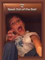
Break Outby GraciousComment: Creative idea. The model is nicely posed and has a great expression. The photo is very soft and noisy viewed up close (like I usually do when voting), but when viewed from a distance (as a poster should be!), the effect is great! |
 Photographer found comment helpful. Photographer found comment helpful. |
| 01/04/2004 10:42:48 PM |
From Chaos into Calmby KonadorComment: Greetings from the Critique Club!
The message
The creative input (blurriness, brightness, etc.) de-emphasizes the water used to create this image and allows the viewer to project his own thoughts and imaginations aroused by it. The differences above and below the definite edge are dramatic and obvious, and provide much fodder for the imagination. The title (chaos to calm) is but one possibility. For me, it reflects the creative process with a lot of jumbled possibilities finally emerging to a coherent stream. Others who make the effort to try will see different things. To me, that makes this a very successful image.
Creative choices
As mentioned, it is the creative choices that make this image work so well, and they are great. The lighting puts emphasis right where it is needed. The background with unfocused spots works well (certainly better than a solid or gradient color would). The colors match the shapes of the corresponding areas well. The relative amounts of space in the two areas is pleasing. The slanted edge adds energy as does the vertical format; this isn't an image for one to just sit back and enjoy. Viewer involvement is needed and invited.
Technical aspects
Focus, exposure, color rendition, and sharpness were all carefully controlled to achieve the final result. |
| Photographer found comment helpful. |
| 01/04/2004 10:10:09 AM |
Round And Round We Go!by hughletherenComment: Greetings from the Critique Club!
The message
This photo is a nice interpretation of the shape of a common object. The shadows are what make it work; they are as interesting as the whisk itself. But while certainly interesting, I personally don't find the photo compelling. It's initially fun to look at, but it doesn't hold my attention.
Creative choices
The lights used here are great, casting nice sharp shadows. But there are too many of them. Two are needed to get the two main shadows, but the other lights cast less distinct shadows that clutter the picture and, more importantly, make the main shadows too light.
The most interesting places in multi-shadow images are often where multiple shadows intersect. The point of view used here pretty much blocks that part. Other than that, the composition works well.
The color you have achieved fits the subject well.
Technical aspects
Focus and exposure are great. Sharpening is fine; there are some slight halos if you look carefully, but they aren't bothersome. The light shadow to the right of the whisk inside the main shadow seems a bit muddled; is this where you did spotting? It may just be interactions of shadows from the other lights, so if your spotting was elsewhere it was unobtrusive. |
| Photographer found comment helpful. |
| 01/03/2004 06:42:34 PM |
Snow Glowby ahazeComment: Greetings from the Critique Club!
The message
This charming image conveys a clear message to me: Let your light shine! Even a small light can do much good. Of course, this is just my interpretation with my Christian background. It may convey something different to other people, whether telling a story about a light melting the snow or just the beauty of the light surrounded by snow. That's a hallmark of a good picture.
Creative choices
The lighting is perfect here: mostly the subject but the red-lit background adds nice color, and very importantly, the ambient light shows the surrounding snow and sets the white level for the photo to a nice cool white; the white of the subject would not be nearly so warm without it.
The shallow depth of field is appropriate, preventing the background visible through the hole from being too apparent. The sharpness of the focused areas is great, showing the interesting textures of snow, ice, and glass.
The composition isn't bad. The left-to-right centering is formal and appropriate, but I think some extra space at the top would work better. Maybe even a vertical format. I'm glad the red light is hidden, but its socket, even though out of focus, is still a bit distracting (although there isn't much you could do about that).
Technical aspects
Exposure, focus, and color balance are all great. Just the right amount of USM. |
| Photographer found comment helpful. |
| 01/03/2004 01:17:29 PM |
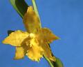
Small Yellowby BeagleboyComment: Greetings from the Critique Club!
This photo really shows off the beauty of this orchid. The subtle variegations of the petals and sepals and intricate shape of the lip are nicely captured. The lighting is perhaps a bit harsh, but not too bad. The blue background works great. Focus is great and sharpness is about right (sharp enough to show some texture but not so sharp to detract from the delicate nature of the subject). The composition works well; it seems balanced to me. I don't know what it looked like with the leaf behind the right petal, but it looks fine without it. Your cloning didn't soften the petal so much as leave a light blue halo around it. It isn't really distracting at web resolution, but would probably be obvious in a print. I like the fuzzy leaves; I think having them in focus would distract from the flower.
It may be just a flower, but I like flowers! And I think this one is well done. |
| Photographer found comment helpful. |
| 01/03/2004 11:46:55 AM |
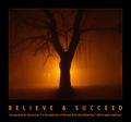
Have courage by tp-fcpComment: Great detail and color. Gives a nice peaceful feeling that matches the quotation well. |
| Photographer found comment helpful. |
| 01/03/2004 11:44:13 AM |
Keep your feet on the ground, and your thoughts at lofty heights.by CamComment: Great pose! The text helps balance the composition; without them the bird would be too far to the right. (Even with them, a bit more space on the right would be helpful, but not as critical.) Some sharpening might be helpful, and I think a black border would work better than a white one; it would help bring out the text and the black feathers better. |
| Photographer found comment helpful. |
| 01/03/2004 11:33:39 AM |
|
| Photographer found comment helpful. |
| 01/03/2004 11:25:43 AM |
The key to lifeby trainComment: I like how you've used words as part of the image, rather than relegating them to the margin like most of the posters. |
| Photographer found comment helpful. |
| 01/03/2004 11:16:59 AM |
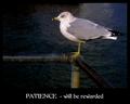
Patienceby pitsamanComment: Good bird shot. The bright subject stands out nicely against the dark background. Good focus and DOF. Needs a little more space at the top. The poster layout is OK, but the font choice is poor; the breaks in the letters are too wide for white-on-black use. The connection between the photo and the text is tenuous; birds aren't generally known for their extreme patience. |
| Photographer found comment helpful. |
Home -
Challenges -
Community -
League -
Photos -
Cameras -
Lenses -
Learn -
Help -
Terms of Use -
Privacy -
Top ^
DPChallenge, and website content and design, Copyright © 2001-2026 Challenging Technologies, LLC.
All digital photo copyrights belong to the photographers and may not be used without permission.
Current Server Time: 07/18/2026 05:37:13 AM EDT.