| Author | Thread |
|
|
01/07/2004 04:00:01 PM |
From the Critique Club
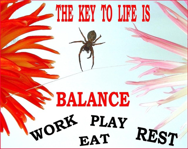
This is a good concept for the motivational poster challenge. You have a good message and managed to convey it.
Your choice of putting the wording in the image I think is a good one. However, your fonts and colors are a little overbearing and seem to crowd the frame. The red lettering to me is too close to the red flower on the right. This may have worked if you had some offsetting pinkish letters from the other flowers colors.
The photo itself looks IMHO to be a little too post edited. I don't know if it really is, but with all the elements put together it LOOKS that way. The white background contrasts too much with the spider and the lettering. The spiderweb is going the wrong direction to be a balancing act. The colors and definition of the flowers is not all it could be. In this format these photographic flaws do not mean a whole lot though as the challenge was to make a poster, not a photograph.
Very creative entry for this challenge.
TC |
|
Comments Made During the Challenge  |
|
|
01/04/2004 05:36:15 PM |
|
very nice...I really like the presentation! The colors are nice too....very creative idea |
|
 Photographer found comment helpful. Photographer found comment helpful. |
|
|
01/04/2004 02:48:16 PM |
|
the text makes it too busy. |
|
|
|
01/03/2004 11:25:43 AM |
|
I like how you've used words as part of the image, rather than relegating them to the margin like most of the posters. |
|
| Photographer found comment helpful. |
|
|
01/03/2004 03:22:22 AM |
|
Too simple. a spider that is walking on a tight rope represents you can layout the photo a little more realistically. |
|
|
|
01/02/2004 11:13:29 AM |
|
I like the way the flowers come in from the sides; but for me, that leaves too much white in the middle. Also, for my taste, there are too many different fonts being used ( though that may have been intentional to indicate 'balance' ). |
|
|
|
01/02/2004 05:22:09 AM |
|
I don't like how you put the text in there. The photo is great but the rest is terrible. -4 |
|
|
|
12/30/2003 10:00:48 PM |
|
Reminds me of "birth school work death" but very nice balancing spider shot. |
|
|
|
12/30/2003 05:46:14 PM |
|
If only the line were bowed down instead of up! Also, would have left off the four items in black. My personal feeling is that the shot and message is effective with just the red message. Let the observer add the rest. Nicely done. Good luck |
|
|
|
12/30/2003 07:48:12 AM |
|
Interesting use of subjects. It's nice and vibrant! I really would have put the text straight. Also the text seems very smoothly anti-aliased with the background, which looks a little harsh. Good effort. |
|
|
|
12/29/2003 09:34:33 PM |
|
I like the idea, but typograhically it is all over the place and distracts. It also seems as if it is a lot of photoshop putting together, instead of a single photo. |
|
|
|
12/29/2003 03:11:58 PM |
|
I like the way the flowers frame this photo, maybe the pink one was cropped a bit tight. Words could be a bit more in order, because this disorder doesn't really give the balanced feeling for me. Otherwise the idea is very good, I like it. |
|
|
|
12/29/2003 08:52:30 AM |
|
The text is too busy and overpowers the photography. |
|
|
|
12/29/2003 07:02:58 AM |
|
Interesting idea. I'm afraid the colors don't work too well for me. |
|
|
|
12/29/2003 04:59:13 AM |
|
Interesting idea about the balancing act. But the text is so very ugly. If this was a joke, then sorry. But if you are serious about this motivating someone, I think you've just succeeded to scare them away. |
|
|
|
12/29/2003 02:41:57 AM |
|
this would be a superb shot if it didn't have those words so big. |
|
Home -
Challenges -
Community -
League -
Photos -
Cameras -
Lenses -
Learn -
Help -
Terms of Use -
Privacy -
Top ^
DPChallenge, and website content and design, Copyright © 2001-2026 Challenging Technologies, LLC.
All digital photo copyrights belong to the photographers and may not be used without permission.
Current Server Time: 06/30/2026 01:06:57 PM EDT.