| Image |
Comment |
| 02/12/2004 08:12:16 PM |
|
 Photographer found comment helpful. Photographer found comment helpful. |
| 02/11/2004 11:06:39 PM |
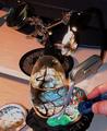
Props 'N Photosby RasaiComment: Greetings from the Critique Club!
The message
This image defies intellectual analysis, but the warm colors and overall darkness with some spots of light does evoke an emotional response. The feeling it gives me is mostly pleasant but there is an edge of fear; the same feeling I get when I'm about to give a presentation on a subject I'm comfortable with but don't know how it will be accepted.
Creative choices
The lighting is what gives this image it's magic, and is mostly done well. The bright spots are perhaps too bright, especially in contrast with the overall low key tone. The composition is definitely cluttered; I think the photo would be just as effective without the flashlight and possibly some other objects. The juxtaposition of sharply and softly focused items is one of the reasons it is difficult to analyze this intellectually, thus a key feature of the image.
Technical aspects
With the exception of the burned-out areas, the exposure is good and the tones and colors have been handled well. Focus and overall quality are great. |
| Photographer found comment helpful. |
| 02/11/2004 09:29:38 PM |
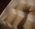
Wet Paintby ColeyComment: Greetings from the Critique Club!
The message
I get the impression from the title that this photo is intended to tell some story, like a hand touching wet paint. But to me it is more of a study in how shadows are affected by the form of the surface on which they appear.
Creative choices
The composition is great. Just enough of the stairway is shown to let the viewer know what it is, and other shadows parallel the arm shadow which adds interest. Including the elbow in the arm shadow is effective. The square format works well for this image. The stairway itself isn't really very interesting, and its shape is distorted by the wide angle focal length used here.
Technical aspects
Focus is great. Exposure is a bit dark--not dark enough to be a low key photo (an approach that might have worked here to sinister effect), just enough to make me wonder why. Some Levels adjustment would make it look more natural as well as boosting the contrast of the shadow with the background. The shadow of the arm is too blurry, caused I think by a combination of motion blur and a large light source. |
| Photographer found comment helpful. |
| 02/11/2004 08:40:29 PM |
Nut and Boltby orussellComment: Greetings from the Critique Club!
The message
To me, this image nicely shows both the similarities and differences between these two items that obviously go together. The common color and functionality tie them together, while the separation between them emphasizes the differing textures and very different shapes. Overall a fairly interesting image, although not really compelling.
Creative choices
The lighting here is so-so; it shows the textures OK but there is too much glare and the shadows aren't very interesting. Using a smaller key light positioned a bit lower and reducing the fill or ambient light would have created shadows that were sharper, longer, and darker, thus more exciting. The composition works well; the diagonal orientation of the bolt makes it dynamic, and having it point toward the nut helps tie the elements together. The elements are positioned well in the frame. The DOF is pretty shallow--the front of the nut and back of the bolt are blurry--and I'm not sure what this adds; I'd rather see everything in focus.
Technical aspects
The exposure is great. So is the focus, although it is somewhat soft; sharpening would show off the textures better. There is a nice tonal range, and the color is nicely subtle. The noise in the shadows is mildly distracting. |
| Photographer found comment helpful. |
| 02/10/2004 11:29:53 PM |
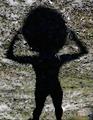
Put on a Happy Face . . . :-)by kayceeComment: Greetings from the Critique Club!
The message
This image has a rather surrealistic feel with the too-large head and high contrast, mostly monochromatic background. There is a hint of texture inside the shadow that adds to this effect. It won't appeal to everyone, but it is very creative. Probably a bit too "artsy" to get a high score on DPChallenge.
Creative choices
The lighting is perfect for the effect you've created; the shadow is not too sharp, not too fuzzy, and just the right size. The background works well, as does your pose. I think the composition is a bit off; the "head" crowds the top of the frame too much.
Technical aspects
The exposure, focus, and processing are great. The sharpness of the background gives it a nice texture. The shape of the body is very realistic, especially the muscles in the legs and arms; this makes the huge head all the more surrealistic. |
| 01/25/2004 08:51:51 PM |
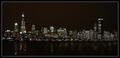
The City that Never Sleepsby RoosterComment: Greetings from the Critique Club!
The message
This is a nice view of a large city after dark. The shapes of the buildings show well here, and the thousands of lights create interesting textures throughout the image.
Creative choices
The panaroma format is a good choice for photos of this genre, and mostly works well here. The wide angle is perhaps too extreme for the small pixel dimensions allowed for DPChallenge entries (and especially the even smaller ones used here); it makes the image a bit muddy. The composition is a bit unbalanced, a lot brighter on the left, which makes the perfectly straight photo seem to slant slightly. The blacks are probably recorded accurately, but they aren't very black. Using levels to make them a bit darker would improve the image.
Technical aspects
The major technical problem is that a high jpeg compression created lots of artifacts that reduce the detail. The wind didn't help the sharpness either, although there wasn't much you could do about that. |
| Photographer found comment helpful. |
| 01/25/2004 02:14:27 PM |
Forgotten Peopleby browntComment: An image only a camera could capture; most people would focus on the crowd and look higher to see their heads. The time exposure makes the crowd translucent and denying visibility of the heads makes the viewer focus on the "forgotten person". This needs to be in black and white to emphasize its starkness, and I hope that even the National Geographic editors would agree with that choice even though they normally favor color. |
| Photographer found comment helpful. |
| 01/25/2004 02:04:27 PM |
|
| 01/25/2004 01:58:43 PM |
Weighing In the Futureby librodoComment: The boy has a great pose and the produce gives a sense of place, which is important for National Geographic images. |
| Photographer found comment helpful. |
| 01/25/2004 01:43:54 PM |
I am a Snake.by labudsComment: Pretty good editing job, but I'm afraid it ruined this photo's integrity. |
Home -
Challenges -
Community -
League -
Photos -
Cameras -
Lenses -
Learn -
Help -
Terms of Use -
Privacy -
Top ^
DPChallenge, and website content and design, Copyright © 2001-2026 Challenging Technologies, LLC.
All digital photo copyrights belong to the photographers and may not be used without permission.
Current Server Time: 07/18/2026 07:49:58 AM EDT.