|
|
|
Showing 181 - 190 of ~1171 |
| Image |
Comment |
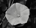
| 03/19/2005 01:26:10 PM | Morning Gloryby zagmanComment: Greetings from the Critique Club!
This is an attractive photo, but lacks impact. The main problem is that the focus isn't perfect. A tripod would probably help, but may be difficult to take into a botanical garden. Focus is critical for close-ups and slight movement of the camera toward or away from the flower after focus lock and before the shutter release will throw off the focus. Trying to correct for the poor focus by sharpening has resulted in distracting halos around the stamen and edges of the flower.
The other problem with this photo is lack of tonal range and contrast. This is best fixed with Curves; I'm not an expert at that tool myself, but I personally like the effect of a curve with four points: (0,0), (60,45), (170,190), and (202,255).
On the positive side, the lighting works well here. Although on the verge of being too harsh, it's not, and the shadow of the stamen is interesting and attractive. The not-quite-head-on point of view is also effective, fully revealing one of the spots at the center and parts of others, while maintaining the overall shape and symmetry of the flower. And I certainly think you achieved your goal of focusing on the beauty of a single flower while showing its context. |
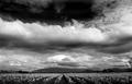
| 03/19/2005 12:45:11 PM | Daffodils, Washington Stateby jbsmithanaComment: Greetings from the Critique Club!
A great photo, as evidenced by the top 10 finish. But I must admit that it isn't one of my favorites. I don't like the way the photo is split in half by the clouds in the middle, and think it would be a lot stronger if the top third or so was cropped off, leaving a 3:1 panorama. I also find the white line in the clouds just above the mountain to left of center somewhat distracting, although that's minor.
I do like this in black and white; it makes the viewer focus on the wonderful lines and textures rather than the expanse of yellow. |  Photographer found comment helpful. Photographer found comment helpful. |
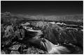
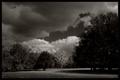
| 03/19/2005 11:47:50 AM | Day Break on the Cheyenneby DJLubaComment: Greetings from the Critique Club!
It needs to be a little brighter and a lot sharper, but this is a great photo. I wouldn't have guessed this was an IR photo, but it darkens the water and lightens the foliage; the effect is subtle and works very well here. The bottom of the photo seems cut off, but otherwise the composition is good. The landscape format contributes to the dreamy feeling evoked by the blurred waterfalls. The many diagonal lines lend excitement and make me want to visually explore the nooks and crannies, which unfortunately lack definition here. The focus point for IR light is slightly closer than for visible light which autofocus systems are tuned for; that may be part of the problem here. (It's one of the challenges of IR photography!) | | Photographer found comment helpful. |
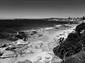
| 03/18/2005 12:17:28 PM | It's a beautiful dayby pgattComment: Greetings from the Critique Club!
This is a beautiful photo, and a great subject for a black and white depiction. I think color would have overpowered the wonderful tones present throughout the picture. The composition is great. The major elements fit together nicely (I especially like the way the shape of the foreground bush fits with the shape of the shoreline). And there are plenty of minor elements (like people and boats) to make the photo well worth exploring in detail.
The major problem with this photo is the lack of depth of field. I long to see the same sharp detail in the village as in the foreground rocks. A smaller aperture (perhaps f/16) might have captured this. There also seems to be some moiré in the sky, although it certainly isn't serious. | | Photographer found comment helpful. |
| 03/18/2005 11:47:33 AM | Chapel Oaks Ranchby rblantonComment: Greetings from the Critique Club!
A pleasant pastoral scene, with plenty of different elements to make it interesting, but not so many that they become overwhelming. Composition is fine, although the large tree on the right is on the verge of being overbearing. Overall a great subject that evokes a peaceful feeling, but with a nice undercurrent of excitement from the clouds. I'd call your "light hunt" successful!
There are some technical problems that prevent the photo from being really successful. It is underexposed. The shadow areas are pure black, with no detail, and the white areas are gray, making the photo seem a bit dingy. The focus isn't precise, prevent details from being resolved. And the photo lacks sharpness, an important part of Ansel Adams' style. There is unwanted texture in the foreground clouds and sky, which I'm guessing is caused by a dirty sensor (although I'm not positive of the source). Last (and least) there is some lens glare at the lower left although it is only mildly distracting.
| | Photographer found comment helpful. |
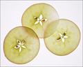
| 03/09/2005 09:08:33 AM | Apple starsby dr rickComment: Originally posted by SimonBergink:
great use of the starfruit! nice white and good on you for using a different fruit. |
These are apple slices. But starfruit slices would make an interesting photo; I'll have to try it sometime... |
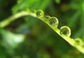
| 03/08/2005 09:02:28 PM | Ferncliffby LesleyNelsonComment: I like the scene, although it really makes me want to see what's on either side. Assuming it's as attractive, I think a landscape (or perhaps square) format would work better.
And although I usually prefer silky-smooth long exposure waterfalls, I think the stop motion works well here. It gives the overall photo a more dynamic feeling. | | Photographer found comment helpful. |
| 03/08/2005 08:53:30 PM | | | Photographer found comment helpful. |
| 01/22/2005 12:43:48 PM | hekobokehby LevTComment: Greetings from the Critique Club!
A very interesting photo. I like it! It has a beautiful abstract feel, but with an element of reality that I think makes it accessible to a wider audience. Great focus and color. But let me add my vote for cropping off the left side. Yes, the curve is graceful, but really isn't essential. The "just a diagonal line" isn't boring since it isn't really the subject; it's role is just to tie the drops together and provide a context for the rest of the image. By all means, leave in the top of the curve, making a square format that I think fits the subject better than a horizontal one. | | Photographer found comment helpful. |
| 01/22/2005 12:24:15 PM | You've got stars in your eyes...by tyrkinnComment: Greetings from the Critique Club!
I'm sorry to say I don't particularly care for this photo. Interesting idea, but I think the stars need to be much smaller and more artfully arranged for it to work. And they need to either be sharp or very soft. The paper burrs from your filter show up plainly here, and are distracting.
(A variation might be to photograph the eyes from the front, with some star-shaped lights reflected in them.)
You've probably already figured out from the other comments that your method (and thus the fact that this was real bokeh) wasn't apparent from viewing the photo. I don't think there is much that can be done about that... | | Photographer found comment helpful. |
|
Showing 181 - 190 of ~1171 |
Home -
Challenges -
Community -
League -
Photos -
Cameras -
Lenses -
Learn -
Help -
Terms of Use -
Privacy -
Top ^
DPChallenge, and website content and design, Copyright © 2001-2026 Challenging Technologies, LLC.
All digital photo copyrights belong to the photographers and may not be used without permission.
Current Server Time: 07/17/2026 12:32:49 PM EDT.
|