| Image |
Comment |
| 01/04/2006 11:08:02 PM |
Adobe Shapesby fivebalesComment: Good composition, and the angle of the light is very effective here. It could use a little sharpening. |
 Photographer found comment helpful. Photographer found comment helpful. |
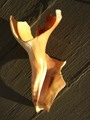
| 01/04/2006 11:00:19 PM |
Venus de Shell...ohby Joy MooreComment: Great idea! Good composition. The lighting works well except for the glare. Having the shell out of focus helps make the subject more abstract, I suppose. But I keep wishing it was focused... |
| Photographer found comment helpful. |
| 12/18/2005 11:01:00 AM |
Pyromancyby elsapoComment: I don't really like this photo. It's rather disturbing. I think that's the point, so it's very well done! |
| Photographer found comment helpful. |
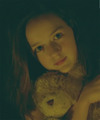
| 12/18/2005 10:45:26 AM |
Innocent Teddyby hutch699Comment: The low contrast approach works great here, but it's just a bit too low. At least the blacks should be black. |
| Photographer found comment helpful. |
| 12/18/2005 10:31:43 AM |
Candlelightby GaupiComment: This is a real gem. It conveys an intimate feeling of warmth and is very pleasing to look at. It would not have the same impact if it was larger or in focus. |
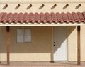
| 12/17/2005 01:16:03 PM |
sing me a song...by shotComment: Greetings from the Critique Club.
This is a creative idea. The model's expression is good, and using a single light source was, I think, the right choice for this. But the light background ruins the low key effect. The knife lacks detail; it's just a bright shape with no form or texture. I also think a vertical format would have been more appropriate for the subject. The face is somewhat blurry, and that's an interesting choice. I suspect having a sharply focused face with a little more contrast would have worked better, but it's really hard to say; it would make the photo more attractive, but that's not the goal here. |
| Photographer found comment helpful. |
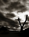
| 12/17/2005 12:46:23 PM |
Fence post forked like a Snake tongueby KivetComment: Greetings from the Critique Club.
This is a really good photo. The composition is brilliant. The main focal point is off in the distance where the perspective leads, and it's positioned perfectly for proper balance. The bright spot in the sky is a secondary focal point, attracting attention because of its lightness, but not so light that it is overpowering. The silhouetted fence post is an essential element, both adding interest and helping to connect the two focal points, but doesn't really draw attention to itself. The effect works very well.
This isn't a photo that shouts "look at me" to everyone who glances at it (which explains the mediocre score in the challenge), but it doesn't have to be. It certainly richly rewards anyone who takes the time to get to really look at it. |
| Photographer found comment helpful. |
| 12/16/2005 11:55:01 PM |
ABSTRACTby mia67Comment: Greetings from the Critique Club.
A very pleasing photo. Nice forms and lines, a splash of color, interesting contrasts. Technically well done. But lacking somewhat in emotion; it doesn't really engage me or hold my interest for very long. |
| Photographer found comment helpful. |
| 12/15/2005 09:57:23 PM |
Knife Fork Spoonby messerschmittComment: Greetings from the Critique Club.
This is an interesting photo. It takes mundane utensils and makes them extraordinary. Great composition, and I like the black background and general low key approach. But the reflections are large, devoid of detail, and so bright they are distracting. A smaller light source might have been more complimentary. |
| Photographer found comment helpful. |
| 12/07/2005 07:58:43 PM |
I'm watching youby dexter51Comment: Ignore everyone who says this is too small. It is just the right size! After all, that owl is really small, and the smallness of the photo emphasizes that. I do wish the focus was better. |
| Photographer found comment helpful. |
Home -
Challenges -
Community -
League -
Photos -
Cameras -
Lenses -
Learn -
Help -
Terms of Use -
Privacy -
Top ^
DPChallenge, and website content and design, Copyright © 2001-2026 Challenging Technologies, LLC.
All digital photo copyrights belong to the photographers and may not be used without permission.
Current Server Time: 07/17/2026 11:41:19 AM EDT.