| Image |
Comment |
| 08/17/2003 02:02:12 PM |
Earth warmingby rhipsterComment: The high key approach you have taken works well here. Any one of the elements would work well in isolation (being sure to leave lots of negative space). Especially the skull. Putting all three so close together seems staged and somewhat reduces the impact. Your exposure and processing are very well done. I like the lighting also; starker lighting would create darker shadows which might be effective, but might also weaken the high key effect you have so successfully achieved here. |
 Photographer found comment helpful. Photographer found comment helpful. |
| 08/16/2003 01:05:57 AM |
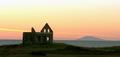
Desolation Boulevardby rickhd13Comment: I like how this photo shows how nature is always opportunistic and willing to take over when man abandons a site. It shows that desolation is a human oriented term. |
| 08/16/2003 01:00:26 AM |
|
| Photographer found comment helpful. |
| 08/16/2003 12:55:44 AM |
Lonelyby ceovishyComment: This is a very different approach to the topic. Desolation is usually thought of as a long-term thing, like a building falling apart over many years. The term isn't normally applied to petals falling from a flower over a few days. And flower petals don't get lonely, so that sense of desolation doesn't really apply here either. Yet this photo combines both senses to symbolically represent desolation in a way not achieved by the other entries I've seen. The image is beautiful in its own way, and technically well done. Centering the subject works well here, and you've left plenty of space around it to emphasize the sense of loneliness you want to convey. Great photo. |
| Photographer found comment helpful. |
| 08/15/2003 09:42:50 PM |
The endby mtreitComment: The dark tones and dramatic lighting work with the subject of a lone chess king on its side to form a vivid image of defeat. Not quite desolation, which to my mind is more permanent than a lost game, but I guess it works in a symbolic way. Great use of negative space. |
| Photographer found comment helpful. |
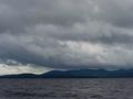
| 08/15/2003 09:34:09 PM |
ENTER THE DISMAL SKYby basia03Comment: That sky certainly is dismal. But it is also interesting, and you've managed to capture a lot of detail in the clouds. The land and water are blurry, but that's acceptable since your subject is the sky. I personally don't see this as a portrayal of desolation; indeed the rain in those clouds will help the forest grow. |
| Photographer found comment helpful. |
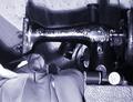
| 08/15/2003 07:12:55 PM |
Her hands lie idle nowby neenee1999Comment: I like your approach to the challenge. I like the choice of subject and the arrangement of the objects. The title is essential to properly interpret the photo which will bother some people, but I like it. The obvious pixelation adds a fuzziness to the image that adds to its character and enhances its message; this is a uniquely digital technique that I think should be used more often. But you need to watch for diagonal lines like the shadow on the left that gives a stair effect with large pixels. This photo would be a lot more effective if the overall tone was darker and the lighting was softer (the glare across the sewing machine, which should be dark, is especially distracting). A more interesting background would be helpful as well. |
| Photographer found comment helpful. |
| 08/15/2003 06:48:46 PM |
"Grandpa Is Babysitting"by autoolComment: Cute photo. And very resourceful of grandpa to install a jail for when he needs to babysit! The white foreground and background keep the overall tone of the photo light and helps the viewer realize that humor is the intent here. The red dress contrasts nicely with the girl's skin tones and the copper bars. The texture of the wall helps distinguish foreground from background and so adds depth to the image. Nicely done; very creative and my favorite entry to this challenge. |
| Photographer found comment helpful. |
| 08/15/2003 06:17:30 PM |
Inside Herselfby sagestudioComment: I send my daughter to visit her cousins for a few weeks, and she not only gets her picture on the Internet, but she gets addicted to DPChallenge! I'm going to have to start fighting her for camera time now!! This is a nice photo (I'm trying to be unbiased here). The lighting is intentionally harsh to create the mood you wanted, yet you succeeded in getting a wide tonal range, particularly on her face which was probably tricky without being able to use the dodge tool. I don't usually care for borders, but the thick one here works as part of the tightly cropped and nearly square composition to emphasize being "boxed in". |
| Photographer found comment helpful. |
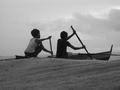
| 08/15/2003 01:33:48 PM |
We're off to the Pacific!by chalconeComment: This photo says it all: swells as high as the boat, giant raindrops, a menacing sky, and two boys off on an adventure. Well captured. |
| Photographer found comment helpful. |
Home -
Challenges -
Community -
League -
Photos -
Cameras -
Lenses -
Learn -
Help -
Terms of Use -
Privacy -
Top ^
DPChallenge, and website content and design, Copyright © 2001-2026 Challenging Technologies, LLC.
All digital photo copyrights belong to the photographers and may not be used without permission.
Current Server Time: 07/17/2026 02:12:04 AM EDT.