|
|
|
Showing 91 - 100 of ~1171 |
| Image |
Comment |
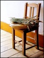
| 09/03/2006 08:28:34 PM | Lavenderby pacpintoComment: I like the subject and composition. Lighting is too harsh, causing distracting reflections and making the shadows too dark. |  Photographer found comment helpful. Photographer found comment helpful. |
| 09/03/2006 08:21:55 PM | | | Photographer found comment helpful. |
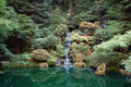
| 09/03/2006 08:18:07 PM | Waterfallby ben4345Comment: The setting is beautiful, but there's just too much. Cropping about a third off the top and maybe half that off the bottom gives a nice panorama that helps focus on the waterfall a bit more. And the photo is in dire need of contrast, preferably using curves to prevent washing out the waterfall more than it already is. |
| 09/03/2006 08:00:22 PM | | | Photographer found comment helpful. |
| 09/03/2006 07:58:27 PM | Lagoon-2by VanBergenComment: The colors are great. The silhouette has some nice features, but the overall shape isn't very interesting. I wish there were some details in the shadow. | | Photographer found comment helpful. |
| 04/30/2006 11:07:00 PM | Rest In Peaceby djtj1980Comment: Greetings from the Critique Club
I like the contrasts in this photo: water vs bridge vs foreground rocks, old vs new bridge, and warm sunset vs cool dusk. The pattern of the girders makes an interesting silhouette. The wide tonal range from bright sunset to dark rocks is captured very well, as is the range of colors. The long exposure makes the sea very, very soft, and gives a nice, rather nostalgic feel to the photo; perfect for the tribute this photo appears to be.
I don't particularly like the composition, which leads my eye out of the frame on the left. I think turning the camera a bit to the left to get the focal point in the frame would be more compelling; the pier on the right is interesting, but not essential to the message of this photo.
The photo would also benefit from a bit more contrast and a lot less sharpening. And of course it would be nice if the bridge was in focus.
Overall, not a great photo, but an interesting and beautiful one. | | Photographer found comment helpful. |
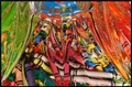
| 04/10/2006 11:59:17 PM | Waterfall of Colourby gotthoffnungComment: Greetings from the Critique Club
Overall, I find this photo very pleasing to look at. Nice colors, balanced composition, and a great assortment of textures and shapes. I like the way the top left and right frame the rest of the photo, kind of like a curtain. The small aperture gives a very wide depth of field; everything is in focus, and that is very effective.
It's almost too busy, but the sheer number of object combined with the distortion of the bowl help everything sort of blend together, creating the great abstract effect that I think you intended. Diagonal lines make a photo dynamic, and the large number of diagonal lines is almost overpowering except that the effect is tempered and balanced by the horizontal almost panoramic format. Nicely done.
Two or three things could use improvement. First is the lighting. It just isn't very interesting, and the bright spots in the top center are mildly distracting. Second, the photo lacks contrast, which makes it a bit bland. Bumping up the contrast a bit would add punch to it, making it a lot more compelling. Finally, I think a touch of Unsharp Mask would help. I waver a bit on this suggestion, because it also makes it less abstract, removing some of the blending of the various objects that I like so much. But it also draws the viewer in more, and I think that wins out in the end. Give it a try and see what you think!
You have a great idea here, and have carried it out fairly well. I encourage you to pursue it with other objects, experiment with different lighting setups, and perfect your technique. |
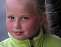
| 03/01/2006 08:30:57 PM | Anchored to the pastby patrinusComment: Greetings from the Critique Club
This photo brings out some of the personality of the model. Nice textures on the face, and the pose works well, giving the feeling of a glimpse into his real self, not the facade seen in standard portraits. The red headband is especially useful, adding a touch of color and generally complementing the subject. Lighting is a bit harsh, but probably unavoidable for a candid shot like this and certainly adequate; nothing important is burned out or in deep shadow. The balance is poor, with the cropped head but full chest. I think framing the photo a little higher, getting the whole head and less chest, would have been more effective, both improving the balance and minimizing the white area that tries to grab the viewer's attention. |
| 03/01/2006 07:57:27 PM | Music to MY ears, anywayby jorrComment: Greetings from the Critique Club
I don't have a lot of experience with this genre of music and am not familiar with its artists. And as an outsider, this photo doesn't mean much to me. There are some good points: the square format is perfect, suggesting the square containers that music comes in, and the CD's at the bottom suggest wheels, which I guess has something to do with AC/DC since there is a truck on the poster. And the technical aspects (focus, lighting, color, etc.) are fine except for the blotch where you cloned out the glare and some minor jpeg artifacts that could have probably been avoided by using a higher quality (DPC allows up to 150K files).
Overall, not a bad photo. Just a rather static and not very interesting one. | | Photographer found comment helpful. |
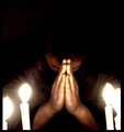
| 02/27/2006 11:25:36 PM | Praying for Faithby Green_PieceComment: Greetings from the Critique Club
I like the composition. Good pose. The negative space at the top works well. The noise adds to the mood. The color doesn't seem quite right, and the overexposed candles, although essential to the message, are somewhat distracting. I'm not sure what to think of the exaggerated hands. I can't really say I like it, but it does certainly emphasize the subject of the photo, so I guess I'll commend your innovative use of wide angle.
Overall, it's difficult to easily tell what the photo is about; you have to look closely. That isn't necessarily bad, but here it doesn't really work for me. |
|
Showing 91 - 100 of ~1171 |
Home -
Challenges -
Community -
League -
Photos -
Cameras -
Lenses -
Learn -
Help -
Terms of Use -
Privacy -
Top ^
DPChallenge, and website content and design, Copyright © 2001-2026 Challenging Technologies, LLC.
All digital photo copyrights belong to the photographers and may not be used without permission.
Current Server Time: 07/17/2026 03:00:16 AM EDT.
|