Greetings from the Critique Club
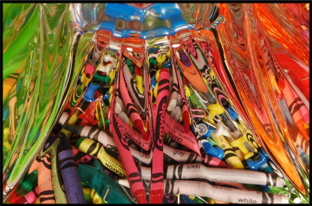
Overall, I find this photo very pleasing to look at. Nice colors, balanced composition, and a great assortment of textures and shapes. I like the way the top left and right frame the rest of the photo, kind of like a curtain. The small aperture gives a very wide depth of field; everything is in focus, and that is very effective.
It's almost too busy, but the sheer number of object combined with the distortion of the bowl help everything sort of blend together, creating the great abstract effect that I think you intended. Diagonal lines make a photo dynamic, and the large number of diagonal lines is almost overpowering except that the effect is tempered and balanced by the horizontal almost panoramic format. Nicely done.
Two or three things could use improvement. First is the lighting. It just isn't very interesting, and the bright spots in the top center are mildly distracting. Second, the photo lacks contrast, which makes it a bit bland. Bumping up the contrast a bit would add punch to it, making it a lot more compelling. Finally, I think a touch of Unsharp Mask would help. I waver a bit on this suggestion, because it also makes it less abstract, removing some of the blending of the various objects that I like so much. But it also draws the viewer in more, and I think that wins out in the end. Give it a try and see what you think!
You have a great idea here, and have carried it out fairly well. I encourage you to pursue it with other objects, experiment with different lighting setups, and perfect your technique. |