| Image |
Comment |
| 02/23/2009 09:25:27 PM |
~ m a r c h ~by gocComment: Nice idea, but I think the white background makes it a little less interesting. The grey coming in on the corners is a little distracting--it pulls your eyes to the corners. |
 Photographer found comment helpful. Photographer found comment helpful. |
| 02/23/2009 09:25:21 PM |
|
| Photographer found comment helpful. |
| 02/23/2009 09:25:11 PM |
Septemberby GemGemComment: Nice bridge. I'd try taking the highlights and the midtones down a little--it seems bright. |
| Photographer found comment helpful. |
| 02/23/2009 09:24:59 PM |
Julyby LelezComment: Nice flowers. I like the little open spot in the upper left. Would have been nice to have one more open spot somewhere. Having everything else fill the frame makes that corner look like an accident. A little softening would be nice. |
| Photographer found comment helpful. |
| 02/23/2009 09:24:50 PM |
February Thaw — Pleasant Bayby Bear_MusicComment: Nice scene. The tree is a little too intrusive. I think I'd like the shot better shifted to the right so that the tree was more of a frame than a third of the picture. |
| Photographer found comment helpful. |
| 02/23/2009 09:24:33 PM |
Aprilby MaryOComment: cute. I would have liked a like more depth of field to have the whiskers sharper. I don't mind softness elsewhere--it fits with the picture. But sharp whiskers would feel better. |
| Photographer found comment helpful. |
| 02/23/2009 09:24:21 PM |
End of the winterby ytshuvaComment: I like the shot very much, but the red doesn't seem to have anything to do with the shot, and lessens the beautiful blue/green background. Even if it had been someplace else in the picture, I think it would have been stronger than right behind the white flower. It immediately pulls my eye away. |
| Photographer found comment helpful. |
| 02/23/2009 09:24:16 PM |
March...Harbinger of Spring.by GenrOneComment: I like the idea of the light coming through the flowers. However, I think the front two could have benefited with a little of fill light. They just aren't as strong as the rest of the picture. It also would be interesting with a little more black background and placed off center. Your yellow and black combination is very effective. |
| Photographer found comment helpful. |
| 02/23/2009 09:20:03 PM |
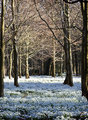
March Snowdrops by bobonacusComment: I love the scene. Since it's advanced challenge, I'd play with the shadow/highlights option a little more though, bringing up the flowers & down the lighting in the trees. |
| Photographer found comment helpful. |
| 02/23/2009 09:19:55 PM |
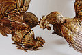
October, the Month of the Rooster by Canonguy39Comment: Fun & clever idea. I brought it into photoshop to play a little, and I'd recommend selecting the background and lightening it to almost a white. I think keeping the background white, or perhaps using a softer brown/beige for a backdrop would make it stronger. The grey tone doesn't work as well with the wonderful browns in the rooster. |
| Photographer found comment helpful. |
Home -
Challenges -
Community -
League -
Photos -
Cameras -
Lenses -
Learn -
Help -
Terms of Use -
Privacy -
Top ^
DPChallenge, and website content and design, Copyright © 2001-2026 Challenging Technologies, LLC.
All digital photo copyrights belong to the photographers and may not be used without permission.
Current Server Time: 07/23/2026 08:21:37 AM EDT.