| Image |
Comment |
| 03/14/2009 10:13:34 AM |
House Finch in Late Winterby MaryOComment: Very, very nice! I hope you don't get hit for having the tree branch OOF. One thought--have you tried cropping it in a little more from the right? The branch adds a nice diagonal to the picture, but I'm not convinced that you need to much of it. Try leaving the height the same, and crop of 1/4 to 1/3 of the branch and see what you think... - 8 |
 Photographer found comment helpful. Photographer found comment helpful. |
| 03/14/2009 10:10:11 AM |
|
| 03/14/2009 10:09:31 AM |
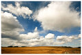
Big Alberta Skyby EisbaerComment: lovely! You've got it so that the clouds are so three dimensional. I feel like they're almost coming out of my screen! |
| Photographer found comment helpful. |
| 03/14/2009 10:08:44 AM |
Sunsetby StrykforceComment: Very nice shot. I like the soft colors. I'm curious what it would look like with the pole a tad darker. |
| 03/14/2009 10:07:39 AM |
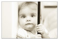
Graceby lentilComment: Very nice! The horizontal line on the right is distracting, but I'm not counting it in the vote. Even though it's still not clear to me if you can remove this in advanced editing, if you can't do it, you might want to consider dodging it a bit so it's not so dark. 8! |
| Photographer found comment helpful. |
| 03/14/2009 10:05:40 AM |
colour the skyby zoodiacComment: Hey! check it out -- [thumb]//www.dpchallenge.com/image.php?IMAGE_ID=761182[/thumb] -- The clouds are fun in yours--we had a very smokey day. I also liked when they made the turn. I especially like the sun coming through the curved part of the smoke. |
| 03/12/2009 12:24:15 PM |
|
| Photographer found comment helpful. |
| 03/06/2009 08:01:46 PM |
Adelaideby BMComment: nice shot. cropped in a bit close, however. You cut off of the flowers on the top and the hands on the bottom such a small amount, it doesn't seem like you did it on purpose, just by accident. |
| Photographer found comment helpful. |
| 03/06/2009 07:59:43 PM |
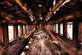
Impressionsby trevytrevComment: It's a fun picture. Small thing--I find the slight tilt to the floor distracting. I think since the line goes all the way across, it might have been better to straighten that and have the top of the picture a little wonky. I'm not sure...
Also, I think it would be stronger without the vignette in the corners.
It's a great idea, and a nice shot. |
| Photographer found comment helpful. |
| 03/06/2009 07:54:46 PM |
Attentionby mitalapoComment: very interesting, but the triangle of light and dark on the right is very distracting. |
| Photographer found comment helpful. |
Home -
Challenges -
Community -
League -
Photos -
Cameras -
Lenses -
Learn -
Help -
Terms of Use -
Privacy -
Top ^
DPChallenge, and website content and design, Copyright © 2001-2026 Challenging Technologies, LLC.
All digital photo copyrights belong to the photographers and may not be used without permission.
Current Server Time: 07/24/2026 12:42:50 PM EDT.