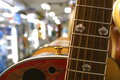
Ovation Guitarby
micComment: Greetings from the Critique Club!
Comment:
Greetings from Andi via the Critique Club
First Impression: I like the idea, but the shot seems kind of busy to me.
Composition: The composition is good, and I think it works well for rule of thirds. However, as you mentioned, the lights in the background are distracting. Two things I can think of that might have helped. First of all, I noticed that your aperture was set to 5.6. I might have experimented with a 3.5 aperture to fuzz the background even more. Light backgrounds aren't really that much of a problem, it's the fact that there are so many light spots in it. Opening the aperture and blurring them more might make it a little less busy.
Second idea: I could be wrong, but it looks like there are other guitars hanging behind this one. If that's the case, I'd try stepping to the left more for the shot. This way, you'd still have the front guitar as the main interest, but instead of the bright lights, you could have guitars fading into the distance. (Unless I'm wrong about more guitars :D
Technical: There's not a lot that you can do in basic editing. But there are, again, two options that I can think of. If you are using Photoshop, have you tried the shadows/highlights command? The main thing it does is to lighten the shadows, but you can pull that slider back to save all the shadows, but it does have the option to darken highlights. The other option is to shoot in RAW mode. Then you can adjust the exposure and try to recover the blown highlights. Feel free to PM me if you need anymore information on those two options.
Final thoughts: I think you did a nice job on this one. IMO, one of the reasons that it didn't score higher was because the subject chosen was interesting, but not very interesting. I like the choice to show just part of the guitar, but it's not something that's going to evoke much emotion in people. You're getting the hard parts down: the composition, getting better with the technicals. Now in your next challenge, find a subject that makes you think "oh wow!". Congrats on your personal best!