| Image |
Comment |
| 05/29/2010 03:53:41 PM |
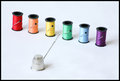
Inglorious Spinstersby beckydiComment: I wish you had enough depth of field to get the thimble a bit sharper. 6 as is -- 8 if the thimble had been as sharp as the thread. Nice setup. |
 Photographer found comment helpful. Photographer found comment helpful. |
| 05/29/2010 03:51:05 PM |
|
| Photographer found comment helpful. |
| 05/29/2010 03:50:27 PM |
|
| 05/26/2010 08:38:17 AM |
The Summit by TechoComment: This is such an incredible shot! I really have to go find a lady bug to try it -- it's truly spectacular! Congrats on the red! |
| Photographer found comment helpful. |
| 05/26/2010 08:37:18 AM |
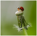
Dewdrop Damsel by DrAchooComment: Congrats Doc!!!
Oh my... Did you notice your average vote per commenter? I don't know that I've ever seen one that high! |
| Photographer found comment helpful. |
| 05/26/2010 08:34:02 AM |
|
| Photographer found comment helpful. |
| 05/26/2010 08:32:50 AM |
"Mickey" Lockby andrewtComment: Congrats on the HM!!! I love the colors and design of the door. What a great find and beautifully captured! |
| Photographer found comment helpful. |
| 05/26/2010 08:09:35 AM |
Piclockssoby bohemkaComment: Stellar shot!! Well deserving of a ribbon! (and did you notice how close you and the blue were?)
Plus, you made my day! I've never thought of myself as a legend... :) |
| Photographer found comment helpful. |
| 05/26/2010 08:05:38 AM |
|
| Photographer found comment helpful. |
| 05/26/2010 12:19:41 AM |
Hard Rock Hotelby MelethiaComment: You got hit by people who didn't understand they were handles -- there are a lot of people who don't see things like that too often. It is a spectacular shot. It must be, because I gave it an 8! |
| Photographer found comment helpful. |
Home -
Challenges -
Community -
League -
Photos -
Cameras -
Lenses -
Learn -
Help -
Terms of Use -
Privacy -
Top ^
DPChallenge, and website content and design, Copyright © 2001-2026 Challenging Technologies, LLC.
All digital photo copyrights belong to the photographers and may not be used without permission.
Current Server Time: 05/09/2026 05:17:56 PM EDT.