| Image |
Comment |
| 05/30/2022 08:49:29 AM |
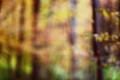
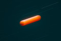
chasing autumnby skewsmeComment: This one was a seven from me. Probably should have been an eight. After 14 years, my eyes are still trying to figure out how to adjust to blur. But the colors are so spectacular in this |
 Photographer found comment helpful. Photographer found comment helpful. |
| 05/29/2022 04:07:37 PM |
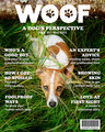
WOOF outtakeby rozComment: This one was too busy, so the dog got lost. One thing that would have made a difference was swap the dog and the title. Put the dog at the top of the page and the title of the magazine at the bottom, and crop the body off just above the ears. But, as is, the other was a much better choice. |
| Photographer found comment helpful. |
| 05/28/2022 12:48:41 PM |
|
| 05/23/2022 07:04:29 PM |
|
| Photographer found comment helpful. |
| 05/23/2022 07:03:10 PM |
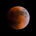
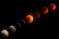
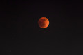
1st time for everything! by JulietNNComment: I like it -- but it's bothering me that their not evenly placed, and the lighting looks a bit odd on the brightest one. The patch of red seems too red compared to the rest of that particular moon. |
| Photographer found comment helpful. |
| 05/23/2022 07:01:14 PM |
|
| Photographer found comment helpful. |
| 05/23/2022 07:00:51 PM |
|
| 05/23/2022 07:00:15 PM |
|
| 05/23/2022 06:59:36 PM |
|
| Photographer found comment helpful. |
| 05/23/2022 06:59:07 PM |
|
| Photographer found comment helpful. |
Home -
Challenges -
Community -
League -
Photos -
Cameras -
Lenses -
Learn -
Help -
Terms of Use -
Privacy -
Top ^
DPChallenge, and website content and design, Copyright © 2001-2026 Challenging Technologies, LLC.
All digital photo copyrights belong to the photographers and may not be used without permission.
Current Server Time: 06/18/2026 01:12:34 PM EDT.